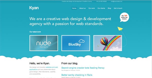
When I present design concepts to a client, whether it is a website, brochure or business card, clients are often tempted to fill up the white space to communicate something about their company.
Everyone knows what I’m talking about. There may be some unutilized space on the top right corner of the website and you are thinking to yourself, what can I put there? Or maybe the back of your business card simply has your tagline and for some reason, you think it’s a good idea to list all your services there as well. Even trained designers can be guilty of crowding up a design from time to time, but white space is a “must have” in every design.
White space, also known as “negative space” helps bring focus, balance and legibility to design. Having negative space around specific design elements allows viewers to focus on what’s most important – helping you to communicate your message quickly and clearly. The goal is never to communicate everything at once, it’s to communicate the most important message quickly.
Take a look at the two website examples below, both companies do the same thing, which one is a more effective design?
Web Design #1
Web Design #2
Clearly, design #2 is a more effective design because it communicates with ease and a visitor can easily find what they are looking for – the empty space allows us to focus on the most important message at hand. Also, just to clarify any misconceptions, “white space” doesn’t have to be white – it can be an area of color that is empty.
As you get to Spring Cleaning, would you ever think of adding to your pile of papers on your desk or putting more stuff in your closet? No, the goal is to simplify by getting rid of stuff! So when designing your next marketing piece, PowerPoint or brochure – keep it simple, get rid of anything that isn’t absolutely necessary and learn to embrace the white space.


