With the web being in constant flux, it is important for website designers to stay current with the most current web design standards. For new blog entry topics, I like to peruse other web design blogs for inspiration, and in turn, stay current with my web design skills. I recently visited a blog that stood out for discussing a topic that would seem to be common knowledge among the web designer community – screen resolution. After some thought however, it is a topic that needs to be discussed. Even though I consciously enter the pixel size of a window when creating a new website design, I never really focus on how it applies to the screen resolution. As a helpful refresher, I have looked into this further and have written a nice, simple, informational blog about this seemingly elementary topic. It turns out, there are some important terms and practices that correspond with these numbers that you might find helpful when devising your future website designs.

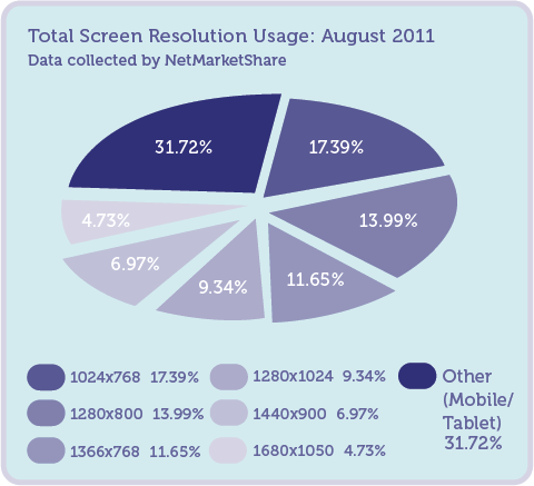
First, to show the different screen resolutions and the corresponding percent of users that utilize these particular resolutions, I created a visual aid. This data was collected by NetMarketShare and represents user activity in August 2011. There has been a lively debate on the proper resolution designers should use to design a website. A few years ago, it was common to design for a 1024×768 and 800×600 pixel screen. Now, it has become common to design strictly for 1024×768 pixels due to increasing screen size by leading computer manufacturers (referenced in visual aid). Even though many users have increased the size of their monitors, some thought leaders argue that users still keep the browser windows relatively small on their screens to view other task windows simultaneously.
There are different tools available to correct these issues. I enlisted the help of a less current but still very helpful blog that summarizes these tools. The key to addressing screen resolution issues is to optimize for (or design for) a 1024×768 pixel screen. This size is the most versatile for both larger and smaller screen sizes.
When designing for a 1024×768 pixel screen, use a liquid layout. A “liquid layout” is a tool that allows a website to easily adjust when resizing the browser window, while maintaining the design and content. Be sure to test this by verifying that the website still looks good when the browser window size is changed.
Ensure that the website has good initial visibility. “Initial visibility” is the content viewed when a visitor initially lands on a website. It is common for a viewer to scan a website like they read a book, from top to bottom, left to right. Have the most important brand information, both visual and textual, in the upper left part of the web page. This will also enhance website Search Engine Optimization (SEO), making it easier for search engines to crawl your site and index keywords based on the content in this part of the website.
Based on solid research, viewers do not like to scroll. Design your website so viewers obtain the majority, or preferably all, of their information from the upper-most part of the fold. The “fold” is where the screen gets cut off and a scroll bar is needed to see the bottom of the site. Think of most newspaper layouts. If you design with the fold in mind, your website will be successful in allowing viewers to get the information they need at a faster rate.
And finally, make sure the site looks good! Be sure your design fits flawlessly with all technical resolution requirements. Formatting the content is very important. As screen sizes grow larger and larger as technology improves, keep in mind that the wider a line of text spans the harder it is to read. Keep copy in smaller columns to avoid losing readability and creating clutter.
The use of mobile devices, such as smart phones and tablets, has dramatically increased in the past few years and will continue to rise. Because of this, designers also need to consider designing a separate screen ratio from the main site for compatibility with these devices. This will make websites, as well as the overall brand of the company, much more visible and marketable. And with improved operating systems on these devices, it is becoming easier to design and incorporate these mobile website designs to the web.
Keeping resolution consciously in mind when creating a new website design will ensure less updating in the future and more success in maximizing visibility and user traffic to your website.
For more about screen resolution and website design, visit Design Festival, Use It and NetMarketShare.


