With the recent controversy over the new University of Maryland Terrapins football helmet and the college football season in full swing, Bop Design, a design agency with offices in San Diego and New Jersey, has released their list of the top 5 college football logo designs. Read the article below for the list of Bop Design’s top 5 college football logo designs and lessons that can apply to small business marketing.
“It’s important that a college logo is versatile enough so it can be re-purposed on promotional items such as polo shirts, pens, field of play, etc. If the logo is too complex or ‘busy,’ it cannot be used in different situations. This is the problem with the current University of Maryland football helmet. The helmet is busy and distracting but most importantly, it cannot be easily utilized in other applications.”
Bop Design reminds businesses that the same lessons learned from college logo designs can be applied to the design of all marketing collateral – from website design to brochure design to print advertising design.
Here is the list of Bop Design’s top 5 college football logo designs and lessons that can apply to small business marketing
#5 Michigan State Spartans
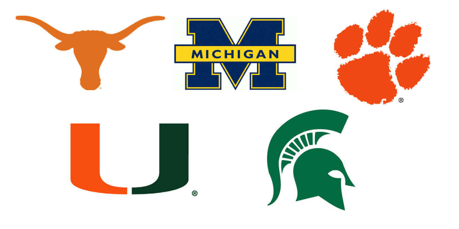
The Spartan logo design is a clean rendition of the Spartan mask headgear. The disciplined design could have easily been overdone with too much detail or clutter. Instead, the design is simple but memorable. Jensen adds, “The Michigan State logo gives off the feeling of intimidation and seriousness with sharp lines and angles – which is perfect for a college football team.” The logo has staying power and classic styling – it’s been consistent since 1983. “It definitely holds its own again the classic collegiate ‘M’ of their intrastate rival.” Bop Design remarks that a clean logo is always advisable for any business. Jensen comments, “As a business, a logo is most effective when it is simple and clean. It conveys a message or idea about a company but does not go overboard. With all marketing collateral, less is more.”
#4 Miami Hurricanes
Many teams use a school’s initials for their logo, but the University of Miami Hurricanes logo design is unique with a dual tone one-letter icon. It acts more like a symbol than a letter. The logo has been so impactful that many people refer to the school simply as “The U” in reference to the logo itself. The logo design is clean, contemporary and will never go out of style. Jensen adds, “The Miami logo captures the ‘style’ of the South Florida region and it’s understated – they could have overdone this and made it UM.” This logo design has staying power – it was redesigned in 1972 but still looks contemporary. Bop Design cites company logos such as the Starbucks and McDonalds logo as two examples similar to the Miami Hurricanes. “Just like the Starbucks siren or the golden arches, all you have to do is see the ‘U’ and you know it’s Miami.”
#3 Clemson Tigers
The Clemson Tigers logo design displays a rich texture and a fun personality. The logo is a bold color palette and as the Clemson website claims, “Clemson University ‘owns’ the color orange.” The orange used in logo and branding is actually called “Clemson Orange”. Jensen comments, “The logo is versatile and the paw makes a mark. The school does not need the literal tiger or mascot like other universities.” The design is balanced, showcasing a nice size ratio. The school also has fun with the logo application – Clemson typically uses the logo as the “o” in Clemson. The school redesigned the logo in 1976 as a dramatic upgrade from the previous “tiger” logo that was entirely too intricate. Citing the Clemson Tigers logo, Bop Design reminds small businesses that they do not need to “connect all the dots” in a logo. Jensen adds, “Many businesses want a logo to convey their entire process or product. That is not the point of a logo. It is to entice and convey a general idea about a brand. Clemson could have easily remained with the tiger mascot as their logo but then there would be no mystery or intrigue.”
#2 Michigan Wolverines
The University of Michigan Wolverines logo design showcases the classic collegiate styling with the strong “M” icon. The bold, bright maize and blue colors allow the logo to be seen from afar and make a dramatic impact. Jensen adds, “The Michigan logo design is versatile, clean and balanced with a logo that will never change. People see the ‘M’ and they immediately know it stands for ‘Big Blue’.” Bop Design remarks that going simple, traditional and big can convey boldness. “Michigan is simply content with a big yellow ‘M’. This showcases confidence and bravado. The same idea can be applied to small business marketing. A firm having a simple bright logo design implies they are secure and not overcompensating for something.”
#1 Texas Longhorns
The Texas Longhorns logo symbolizes the strength of the football team and truly stands for the entire Texas geographic region. Jensen comments, “The horns are iconic and even translate well to the ‘hook’em horns’ slogan and hand signal. It’s versatile with just the right amount of detail.” The logo was originally designed in 1950 and has never changed. With Austin being a design-centric town, the Texas Longhorns logo definitely conveys the strong design talent in this college town. Bop Design reminds small businesses that a logo acts as a brand reflection and should express a company’s internal culture. Jensen adds, “No logo is more effective in conveying a local culture than the Longhorns logo in conveying the ethos and region of Texas. The same should apply to business – a firm’s logo should imply something about their employees and culture.”


