With the beginning of the London 2012 Olympics, I thought it would be fun to have a Olympics competition with country websites. The countries I’ve chosen for the 2012 Website Olympics are the top 8 ranked countries from the Beijing 2008 Olympics.
The contestants:
- China
- United States
- Russia
- Great Britain
- Germany
- Australia
- South Korea
- Japan
To keep politics out of it, I will use the english versions of the official tourism website for each country. Each website will be judged by these main factors:
Look & Design – colors and layout/navigation
Web Development – Internet technologies used, official Google PageSpeed score
SEO – Google Page Rank, MozRank, Hubspot Marketing Grader
Let the games begin.
China

(https://www.cnto.org, https://www.cnto.org/aboutchina.asp)
Look & Design
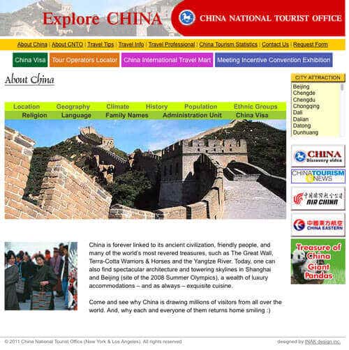
Colors: The China National Tourism Office website for China is visually generic. There is no color scheme unless you consider “Rainbowish” a color scheme. Unfortunately, the use of the primary rainbow colors (Red, Orange, Yellow, Green, Blue, Indigo, Violet) are ignored and an array of different color palettes are used.
Layout/Navigation: The layout is a simple blog style layout with standard placement of content. The website is left-aligned to the browser window, leaving much undesirable whitespace to the right. Some areas of the website need more padding to create a more balanced experience when reading the content. There are no drop down menus in the main navigation bar. There are however sublinks/boxes that appear underneath the menu bar on certain pages. There is also a way to view other pages using the right sidebar. Arial is the font of choice as it is used primarily throughout the website.
Bop Score: 4/10
Web Development
| Internet Technologies | ||||||
| Hosting | Framework | HTML5 | Layout base | Fluid Layout | Responsive Layout | Javascript |
| Windows IIS | ASP | No | HTML tables | No | No | Yes |
| jQuery | Social Media | Mobile optimized | Mobile version | Flash | Minimum Screen Resolution | Google PageSpeed Score |
| No | No | No | No | Yes* | 800×600 | 92/100 |
*splash page, page header, photo galleries
Bop Score: 4/10
SEO
Using the keywords “official china tourism website”, cnto.org is number 1 in Google search results
Google PageRank Score: 6/10
MozRank Score: 3.74
Hubspot Marketing Grader: 25/100
Bop Score: 5/10
Overall Average Score: 4.3/10
United States

(https://www.discoveramerica.com)
Look & Design
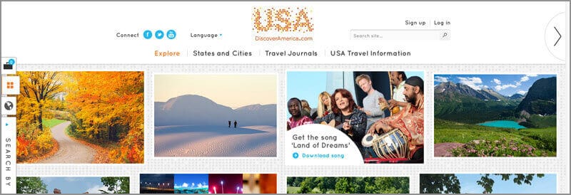
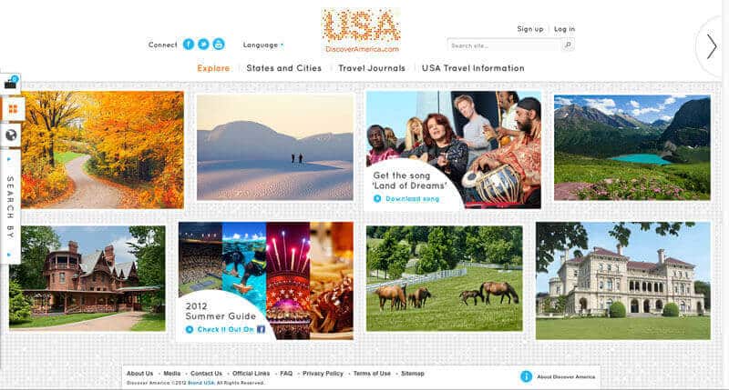
Colors: DiscoverAmerica.com uses a simple primary color scheme with the use of white and gray tones. The home page uses orange and cyan colors to highlight keep links. Upon navigating throughout the site, the use of red, yellow and blue can be found. The colors are well-balanced and do not strain the eyes.
Layout/Navigation: The layout is elegant and modern looking with easy navigation. The main menu bar consists of only four links. Each of those main links/pages have their own sub navigation either as thumbnail images or a slider with nifty rollover menus. Also on some pages there are floating side menus that slide in when clicked on. The custom font “Quicksand” is used as the main font throughout the site.
Bop Score: 9/10
Web Development
| Internet Technologies | ||||||
| Hosting | Framework | HTML5 | Layout base | Fluid Layout | Responsive Layout | Javascript |
| Windows IIS | ASP | Yes | CSS | Yes | No | Yes |
| jQuery | Social Media | Mobile optimized | Mobile version | Flash | Minimum Screen Resolution | Google PageSpeed Score |
| Yes | Yes | Yes | No | No | 1024×768 | 70/100 |
Bop Score: 8/10
SEO
Using the keywords “official united sates tourism website”, discoveramerica.com is number 2 in Google search results
Google PageRank Score: 7/10
MozRank Score: 5.76
Hubspot Marketing Grader: 70/100
Bop Score: 8/10
Average score: 8.3/10
Russia

(https://www.visitrussia.org.uk)
Look & Design
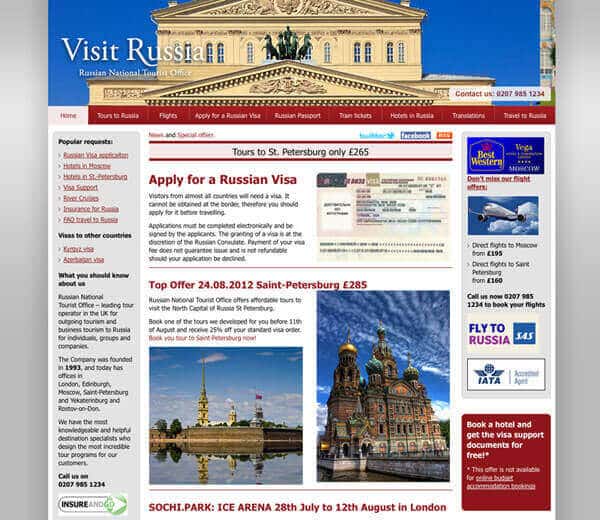
Colors: The website of the Russian National Tourist Office uses a reddish/burnt orange color and gray tones as its color scheme. There is a nice usage of drop shadows, gradients and rounded corners that soften the feel of the website.
Layout/Navigation: The website uses a simple 3 column layout. The main menu bar has drop down menus that link to the subpages of each section. Breadcrumb links are used on the subpages for easier navigation. Everything is solid and standard as far as the layout and navigation goes. The website also makes use of the not often used font Tahoma.
Bop Score: 8/10
Web Development
| Internet Technologies | ||||||
| Hosting | Framework | HTML5 | Layout base | Fluid Layout | Responsive Layout | Javascript |
| Apache | PHP | No | HTML tables | No | No | Yes |
| jQuery | Social Media | Mobile optimized | Mobile version | Flash | Minimum Screen Resolution | Google PageSpeed Score |
| Yes | Yes | Yes | No | No | 1024×768 | 67/100 |
Bop Score: 7/10
SEO
Using the keywords “official russia tourism website”, visitrussia.org.uk is number 3 in Google search results
Google PageRank Score: 5/10
MozRank Score: 3.79
Hubspot Marketing Grader: 57/100
Bop Score: 7/10
Average score: 7/10
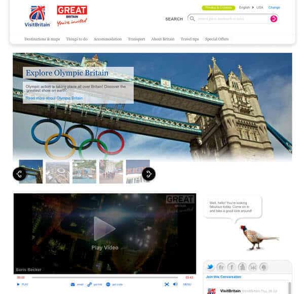
Great Britain

(https://www.visitbritain.com)
Look & Design
Colors: The VisitBritain.com website has a predominantly white color scheme with touches of some blues, pink, black, purple and a lime green color. Overall the website gives off a “news” type feel similar to Forbes’ website. The use of a very light drop shadow gives the website a sophisticated effect.
Layout/Navigation: The website uses a 2 column layout. The main content is in the wider left column, while miscellaneous content fills up the right side bar. The main menu bar has sub menus that appear after a main link is clicked on. It would be more effective if the sub menu appeared when the main link was hovered on. Overall navigation is very good, it is hard to get lost while browsing the website. Arial and Georgia on the main fonts used for the website.
Bop Score: 7.5/10
Web Development
| Internet Technologies | ||||||
| Hosting | Framework | HTML5 | Layout base | Fluid Layout | Responsive Layout | Javascript |
| Apache | PHP | Yes | CSS | No | No | Yes |
| jQuery | Social Media | Mobile optimized | Mobile version | Flash | Minimum Screen Resolution | Google PageSpeed Score |
| Yes | Yes | Yes | No | Yes* | 1024×768 | 85/100 |
*photo galleries, video player
Bop Score: 7/10
SEO
Using the keywords “official great britain tourism website”, visitbritain.com is number 1 in Google search results
Google PageRank Score: 8/10
MozRank Score: 4.46
Hubspot Marketing Grader: 58/100
Bop Score: 7/10
Average score: 7.2/10
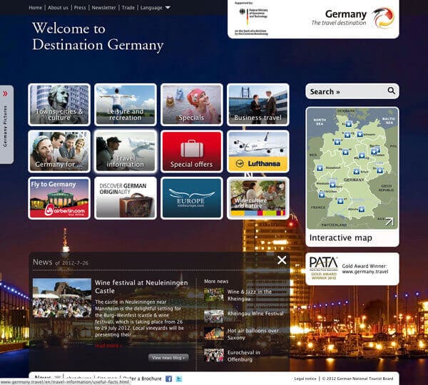
Germany

Look & Design
Colors: The Germany tourist website has a very busy feel to it. There is full width and height CSS background that randomly chooses a background image. The main colors used are white, black and gray tones with touches of the German flag colors highlighted certain in elements like the hyperlinks. The colors that pop out are the colors from the full screen background image. Almost all corners throughout the website are rounded corners.
Layout/Navigation: This website uses a slightly non-standard layout. The main menu bar resembles a toolbar at the very top of the page with a minimal amount of links. The main header logo is also located to the far right instead of the usual far left. Instead of drop down menus, sub bubbles are used and are located above the main content area which is split into a standard 2 column layout. Some pages also make use of the floating slide-in side menu. The most impressive feature of the website is the non-flash interactive map section of the website. The Arial font face is the font of choice for this website. This website offers a mobile version of the website for smartphones and such devices.
Bop Score: 7.5/10
Web Development
| Internet Technologies | ||||||
| Hosting | Framework | HTML5 | Layout base | Fluid Layout | Responsive Layout | Javascript |
| Apache | PHP | Yes | CSS | Yes | No | Yes |
| jQuery | Social Media | Mobile optimized | Mobile version | Flash | Minimum Screen Resolution | Google PageSpeed Score |
| Yes | Yes | Yes | Yes | Yes* | 1024×768 | 79/100 |
*video player
Bop Score: 8/10
SEO
Using the keywords “officia germany tourism website”, germany.travel is number 1 in Google search results
Google PageRank Score: 7/10
MozRank Score: 3.69
Hubspot Marketing Grader: 69/100
Bop Score: 7/10
Average score: 7.5/10
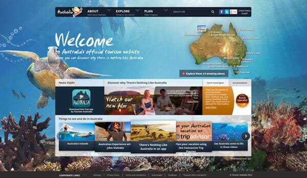
Australia

Look & Design:
Colors: The color scheme of Australia’s Official Tourism website is absolutely beautiful. It uses dark, earthy colors in combination with photos of the natural colors of Australia’s land and water. The website makes wonderful use of the readily available landscape that Australia provides.
Layout/Navigation: This websites layout is unique because it uses the negative space between the menu bar and the main content area as the header area. That header area is then filled with the picturesque background image of the page. The menu bar uses an impressive mega menu that is neatly organized. The layout is fluid as well as responsive. There is also a mobile version of the website available. The main font used is a custom font called Open Sans.
Bop Score: 10/10
Web Development
| Internet Technologies | ||||||
| Hosting | Framework | HTML5 | Layout base | Fluid Layout | Responsive Layout | Javascript |
| Windows IIS | ASP | Yes | CSS | Yes | Yes | Yes |
| jQuery | Social Media | Mobile optimized | Mobile version | Flash | Minimum Screen Resolution | Google PageSpeed Score |
| Yes | Yes | Yes | Yes | Yes* | 1024×768 | 77/100 |
*video player
Bop Score: 9.5/10
SEO
Using the keywords “officia australia tourism website”, australia.com is number 1 in Google search results
Google PageRank Score: 7/10
MozRank Score: 5.98
Hubspot Marketing Grader: 69/100
Bop Score: 8/10
Average score: 9.2/10
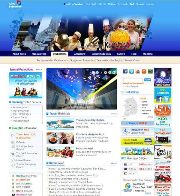
South Korea

(https://www.visitkorea.or.kr/intro.html, https://english.visitkorea.or.kr/enu/index.kto)
Look & Design:
Colors: South Korea’s tourism website uses mainly blues, beige and white with an assortment of pastel style rainbow colors that highlight certain titles and links. The variation in colors gives it a very busy look and feel.
Layout/Navigation: This website has a main splash page where the user chooses the website language they want to view. This page has the old school Flash image slideshow. The layout uses a Flash slideshow as the header and the main content area of the home page resembles a standard portal website layout. The rest of the website have a two column blog style layout. These pages have a sticky “Quick Menu” that stays afloat to the top right of the browser window when the page is scrolled downward. The menu bar is of the tabbed variety using a submenu the appears underneath the main menu bar. It works well in junction with the layout. Verdana is the main font used in the website.
Bop Score: 6/10
Web Development
| Internet Technologies | ||||||
| Hosting | Framework | HTML5 | Layout base | Fluid Layout | Responsive Layout | Javascript |
| unknown | Java/JSP | No | CSS | No | No | Yes |
| jQuery | Social Media | Mobile optimized | Mobile version | Flash | Minimum Screen Resolution | Google PageSpeed Score |
| No | Yes | Yes | No | Yes* | 1024×768 | 42/100 |
*slideshow
Bop Score: 5/10
SEO
Using the keywords “official south korea tourism website”, english.visitkorea.or.kr/enu/index.kto is number 1 in Google search results
Google PageRank Score: 8/10
MozRank Score: 6.07
Hubspot Marketing Grader: 31/100
Bop Score: 7/10
Average score: 6/10
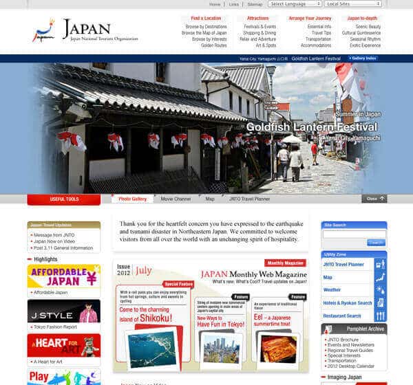
Japan

(https://www.jnto.go.jp, https://www.jnto.go.jp/eng/)
Look & Design:
Colors: Japan’s Tourism website uses mainly the colors of the Japanese flag (red and white) blended with light gray. The home page is very smilier to South Korea’s home page as it uses light rainbow style colors for title backgrounds and gradients. Through out the rest of the website, the appearance is a clean and professional looking layout.
Layout/Navigation: The home page of Japan’s Tourism website shows a Flash image gallery that can be hidden with Javascript. The Flash image gallery is hidden on the rest of the pages but can be viewed/hidden with a slider button. The home page like the Korea’s Tourism site has a portal style layout that is very busy with buttons and with multiple feed lists. The rest of the pages of the website vary. Some use a standard three column layout while others use a 50/50 two column layout. The header area is combined with the menu bar, while underneath it is the toolbar that controls and navigates the Flash image gallery. Tahoma and Arial are used as the main fonts in the website.
Bop Score: 7/10
Web Development
| Internet Technologies | ||||||
| Hosting | Framework | HTML5 | Layout base | Fluid Layout | Responsive Layout | Javascript |
| Apache | PHP | No | CSS | No | No | Yes |
| jQuery | Social Media | Mobile optimized | Mobile version | Flash | Minimum Screen Resolution | Google PageSpeed Score |
| Yes | Yes** | Yes | No | Yes* | 1054 pixels wide | 55/100 |
*video player
** Only Facebook and YouTube
Bop Score: 7/10
SEO
Using the keywords “official japan tourism website”, jnto.go.jp is number 1 in Google search results
Google PageRank Score: 7/10
MozRank Score: 6.76
Hubspot Marketing Grader: 42/100
Bop Score: 7/10
Average score: 7/10
Summary of final Average Scores:
- China: 4.3
- United States: 8.3
- Russia: 7
- Great Britain: 7.2
- Germany: 7.5
- Australia: 9.2
- South Korea: 6
- Japan: 7
