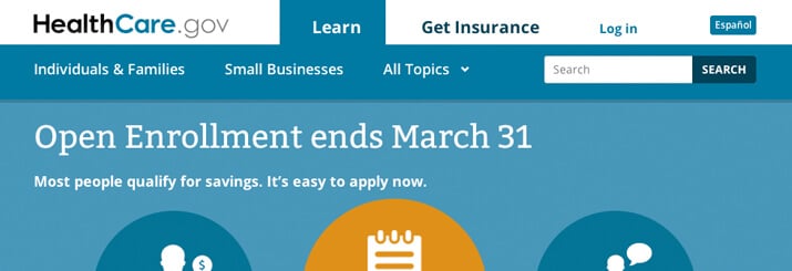
As Healthcare.gov continues to be patched together after a nightmare launch last month, another report released last week stating 60% to 80% of visitors to the E-commerce site fail to complete their checkout.
There are many reasons as to why users may abandon traditional E-commerce (e.g. online retailers such as electronics, clothing, and books), yet the high percentage is alarming when users are purchasing what is now a required commodity. Web optimization company Qubit, who released the data, suspects the issue stems from “confusing website directions on the purchasing process, which may lead consumers into mistakenly believing they have adequately enrolled for coverage.”
Yikes! As Healthcare.gov works to improve their conversion rates, here are some tips every E-commerce provider can implement:
Transparent pricing
Oftentimes users leave their full shopping carts due to sticker shock upon checkout. If you’re selling products or services on your website, communicate costs upfront before users even begin the shopping process. For example, our luxury health & wellness retreat client VeraVia Fitness, clearly states each retreat packages’ cost and features so guests fully understand their investment.
Confusing checkout process
While the steps from browsing to sale may seem simple, highlighting where an individual is in the checkout process is critical to reduce confusion and frustration. Allowing as much flexibility as possible for shoppers to change shipping and billing options, modify their cart, or even save and return at a later date makes a big difference between a loyal and angry consumer.
Excessive security checks
It’s important to ensure spam bots aren’t attempting to purchase and hack into your sales process, but it’s equally as important that those security checkpoints aren’t driving away your customer. Pick one method (such as a CAPTCHA) and use sparingly in the checkout process (e.g. in the very beginning or before point of sale).
Not user-friendly form completion
It may seem picky, but having to meet a company’s specific format requirements can be trying on a visitor. Do you complete your phone number as “555-555-5555” or “(555) 555-5555”? If you only conduct business in the U.S., why would your list countries alphabetically? Seconds saved on the customer end translates to dollars earned for the business.


