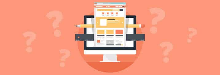
Just like a business card or a brochure, your B2B web design gives certain overt and subtle cues about your firm. From the layout of your website design to how your website displays on a smartphone, your website tells current and potential clients more than you think it does.
So what does your B2B web design say about your firm?
Outdated Design: We Are Too Old School
If your website design hasn’t been updated in the last five years or so, it’s outdated. An older, outdated web design tells prospects that you don’t care about recent advancements in technology or current trends. Many potential clients take an outdated website to mean that your company is outdated or has fallen behind the times. You could have the most current, cutting-edge equipment and techniques in use at your office, but potential clients will think that you are trying to send emails from a typewriter.
Check out what makes a website look old and outdated. If your website has any of these features, it’s time to contact a San Diego web design firm for a new website.
Responsive Web Design: We Listen
It’s very name, Responsive Web Design, says it all. A website with responsive design finds out what device the visitor is using to access the website and then serves up the right layout for that device. A responsive web design lets potential clients know that not only are you integrating current technology, you are taking the first steps to listen, accommodate, and make it easy for them to be a client. Being able to view your website on any device means that users can get information from your website, learn more about you, and get in touch with you in a way that they prefer and is convenient to them. When it comes to customer or client service, listening, convenience and responsiveness are three important factors. Make sure your B2B web design exhibits these things.
Easy to Navigate: It’s Easy to Work with Us
Why would you make it hard to learn more about your company or get in touch with your sales staff? That’s what a potential client thinks if your web design is tough to navigate or it’s difficult to locate information. In many cases, the visitor gets frustrated, curses your site and your company, and leaves, never to return again.
A simple, straightforward website layout without much hierarchy in the navigation helps visitors and potential clients find the information they need with the least amount of clicks or scrolls. Web designs that are easy to navigate demonstrate that your company is easy to work with and understands what information current and potential clients need.
Great, Helpful Content: We Like to Help
Similar to how images and text are essential in a brochure design, so they are in a San Diego web design. Only showcasing sales driven content on a website tells potential clients that your number one objective is sales. Your number one objective should always be a great client experience.
A B2B web design that hosts educational, easy-to-read or view content tells prospects that not only do you care about their needs, but your firm is a credible and authoritative resource on the products or services you offer. Credibility is one of the main differentiators in the market that also enables firms to charge a premium.
In our experience as a San Diego and Orange County web design firm, the most common mistake we see is when B2B firms view their website from their own perspective, and not from a potential client’s perspective. Shifting the focus from the company to the customer and the solutions they need is the best way to create a strong web design that rocks!
Starting a new web design project? Check out our B2B web design checklist to make sure you’ve got all your bases covered.


