Goodbye 2015, hello 2016!
It’s time for this year’s B2B Trends + Predictions for 2016. Find out what you need to know to stay ahead of the trends in 2016.
1. Minimalistic Design
In the age of information overload, it’s time to get back to basics – minimalistic web design. Businesses are starting to say more with less, because they must in order to keep the attention of their audience.
In 2016, the shift in B2B web design is moving away from complex, intricate designs to more minimalistic designs that highlight a few different elements. This means there are a fewer number of pages and the design, visuals, information architecture are all carefully constructed to only have the essentials. The entire web design now focuses on the sales funnel and only provides the type of navigation needed to get more potential clients into the funnel.
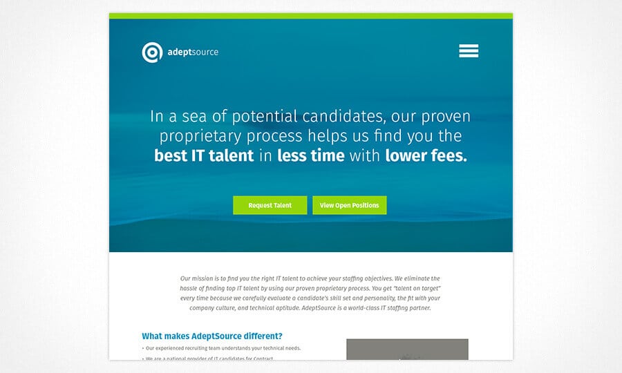
The AdeptSource website is a great example of minimalistic design. The layout, content, and visuals have been paired down to create a strong message and design that focuses on getting potential clients into the sales process.
2. Flat Design
Recently, in 7 Web Design Trends that Died in 2015, we touched on Flat Web Design being the new trend in web design. Digital marketing continues to focus more and more on the user or customer experience. Flat design is the perfect fit for an industry focused on getting their message across to the user, as this simplified design approach places emphasis on visual simplicity.
Rather than focusing on design for design’s sake, flat design hones in on how the user will interact with the design. It includes 2-D images for use on 2-D devices and is most compatible for responsive design. Check out the Beginner’s Guide to Flat Design for a quick intro to flat design.
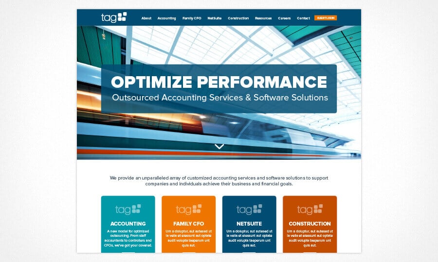
The recently launched website for TAG is designed using flat design elements. The images and icons are all flat and don’t use features like shadows or extra details that would complicate the designs.
3. Design That Tells a Story
While it’s started to gain popularity in 2015, B2B web design that tells a story will become a major trend in 2016. Rather than having a complex website with an in-depth navigation menu, website design will focus on taking the website user on a journey. The journey has a logical flow and tells the story of why the user needs the products or services offered.
The major shift in this type of web design is the approach. During the initial brainstorming for the website design, the brand message and main call-to-action are woven into the design and content strategy. When fleshed out, the design should present the content in an engaging and visually interesting way so that the user is motivated to explore and learn more about the B2B company’s offerings. The content and the design work as a cohesive unit to tell a story to get the user to complete a specific goal (enter the sales funnel).
This effort at storytelling through website design is also a move towards conversion marketing rather than content marketing. Content marketing focuses on providing information, but conversion marketing uses content to find out what a user is looking for, why they need it, and then providing the information they need.
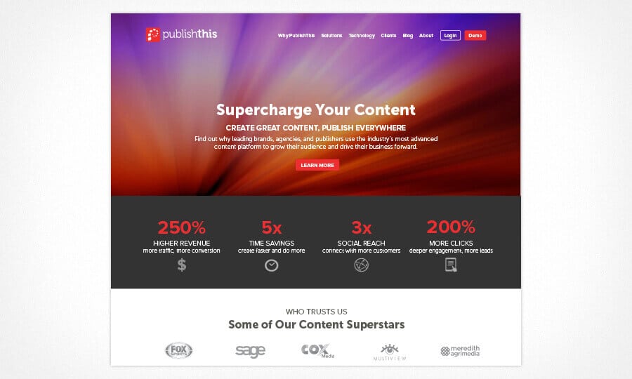
An example of storytelling in web design is the PublishThis homepage. When a user lands on the homepage, they are guided through content that draws them in and sells them on the service that PublishThis provides.
4. Streamlined Navigation (Selling the Experience)
This will be the year of streamlined navigation menus on B2B websites. Only the absolute necessities are featured in the top of page navigation, typically calling attention to only 2-3 links to product or service pages. A website design with this feature often doesn’t include anything about the company itself listed in the main navigation. This trend is becoming rapidly popular, especially for SaaS firms.
The focus on these B2B websites is the main product/service offering and getting people into the selling process as quickly and efficiently as possible. Any additional information about the company or other products will be listed in the footer or bottom of the website.
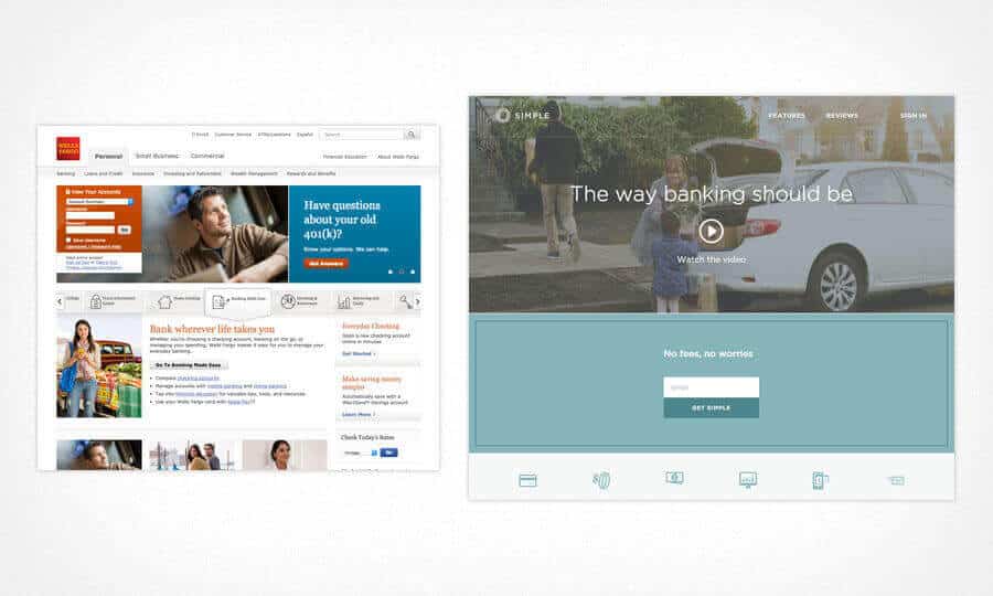
Several examples of a highly streamlined navigation are the Meldium, AutomatedInsights, and Simple.com websites. Check out the side by side comparison of Simple.com to a traditional website from Wells Fargo (both are banks).
5. Customer Service Centered
In an era of unlimited options and choices, the number one differentiator ends up being customer service. Often, many consumers will sacrifice cost savings and convenience for better customer service. According to recent reports, 66% of customers switch companies due to poor customer service.
This shift back to quality customer service is also influencing web design and digital marketing. Companies must implement a holistic approach to customer service, accounting for how a prospect interacts with sales on the front end all the way to how a customer interacts with customer service on the back end.
Websites will be designed to accommodate this and to work in connection with email automation, retargeting, and social media to create a personalized experience. A B2B website won’t be created in a silo, rather it will be crafted and managed to positively contribute to the overall customer experience.
6. Interactive Content
The trend of interactive content is really two-fold. First, a website design in 2016 must allow for various types of content to be hosted on the site. This includes content types such as whitepapers, e-books, webinars, podcasts, infographics, case studies, videos, blogs, etc.
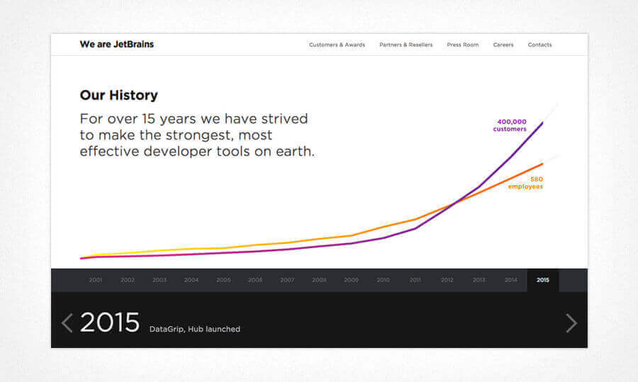
Secondly, the media on the website is going to be interactive. We are talking about hosting a map on the website that changes when clicked on or timelines that pop-up information as the user moves along the dates in history. Web developers and designers take a source of data and make it interactive in order to let website visitors engage with the data in an interesting and new way. Unique visuals that engage the user to interact allows them to learn about the B2B company and potentially helps them through the sales funnel quicker.
Check out the About Page on JetBrains to get an idea about what types of interactive content websites are going to be showcasing in 2016.
7. Less Code to Achieve Better Functionality
Minimalism is also impacting the back-end web development of B2B web designs. App and web developers are making an effort to use less code to achieve better functionality. This is absolutely necessary as more and more users are accessing websites through mobile devices.
A great example of this trend is Google’s AMP Project. AMP stands for accelerated mobile pages. Unless you are a web developer, much of this won’t make sense to you, but the simple story is that development is shifting to reduce the amount of code needed for pages – especially pages viewed on mobile devices.
8. Mobile Design First
You’ve seen the statistics on mobile search. However, until very recently, many web design projects are accommodating mobile design as more of an afterthought. Even websites with responsive design are designed first and made responsive later. In the upcoming year, expect to see websites that are designed first for mobile devices and adapted to desktop afterward.
9. Users Expect More in Less Time
Many of the web design trends in 2016 focus around speed and efficiency as website users expect more in less time. They don’t have time to spend 10 minutes searching for information; they need it immediately. The design and quality of the website must increase and be streamlined. All filler or fluff content and design will be eliminated. Copywriting will be intentional and focused on truly connecting with the website visitor. Everything on a website will work in tandem to move the user down the sales funnel.
10. Message Unification Across Channels
We mentioned earlier that a website can no longer be designed in a silo and this is certainly true when it comes to the complete digital marketing plan. Web design is going to be one piece of the puzzle that creates continuity across all marketing channels, including websites, social media, white papers, sales documents, emails, apps, etc. As users interact with a brand online, every part of their interaction must reinforce the brand and provide a seamless experience.
For example, our web developer, John, advises clients to take questions posed on social media page to create an FAQ on the website. Or, in response to questions on social media, companies can share a helpful FAQ or blog from the website with that user.
11. Social Regains Prominence
Last, but not least, social is going to rise in prominence again. Everyone jumped on the social media bandwagon back in 2014 because they thought it would be a lead generation tool. When it didn’t produce leads, many B2B firms took a step back and focused resources elsewhere.
Social media is will likely never be a lead generation tool – but it is an excellent customer service and retention tool. If your company boasts excellent customer service, you absolutely must have a presence on social media.
For many online users (and your customers) it’s easier to reach out to a brand via Facebook or Twitter. By carefully monitoring and responding to comments and questions on your social media, you are meeting the consumer in a spot that is convenient and familiar to them. That is a great step towards excellent customer service.
Think there is a trend that we missed for 2016? Let us know what you think is going to be a hot topic in the coming year.

