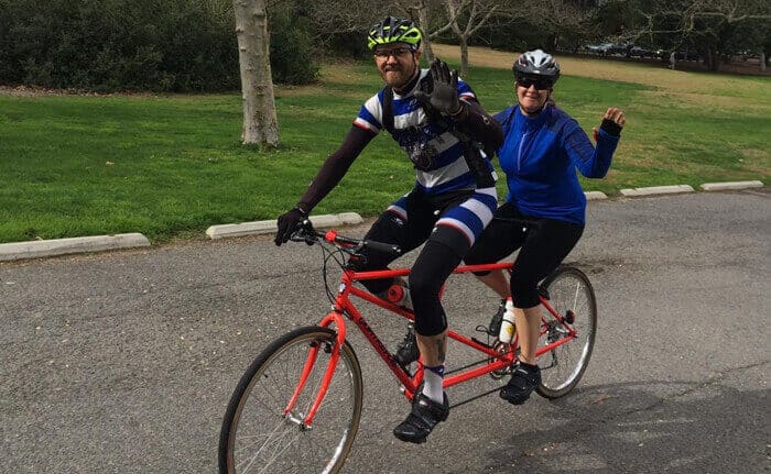
In my free time, I like to ride bicycles. All types of bicycles, single speeds, road bikes, tandems, you name it! One of my favorite bikes is the red tandem that my husband and I can ride together.
Recently, my husband started riding the tandem with a legally blind person on the back of it (see picture below). As it turns out, a tandem bicycle is a great way for a person with visual impairments or total blindness to get out on a bicycle and ride around the city.

In speaking with Maria, the blind person who rides with my husband, I’ve learned quite a bit about how technology enables her to communicate, read, write, and more. Did you know that many smart phones have built-in accessibility features for users with varying abilities? Maria is able to text, browse the internet, look at pictures – all through these types of accessibility features.
So what does all this have to do with web design?
Great Web Design Is Functional
Great web design is not only dynamic and lovely, it’s also highly functional. Functionality covers a very broad topic – but in a general sense, it means that website design and development enable all online users to access the information on the website (including images, videos, text, etc.). All users includes individuals with disabilities, such as those who are colorblind, have low vision, are blind, have hearing impairments, are dyslexic, are prone to seizures, have motor or mobility impairments, etc.
Check out the Web Accessibility Initiative to learn more about resources for developers and designers.
Ways to Make a Website Accessible
Let’s take a look at general ways web developers and web designers can make a website accessible to users with disabilities. More technical information and guides for implementation are available on the WAI website. (If you need tips on web accessibility and SEO, read our quick blog on How to Make Content Accessible to Search Engines.)
Provide Text Equivalents of Non-Text Elements
Non-text elements like images, graphs, maps, animations, buttons, sounds, audio files and videos are great additions to a B2B website but aren’t accessible by every user. One way to make these elements accessible is to include a text explanation or “alt” text that explains the element.

Ensure Color Differentiations Are Clear
On many websites, color is used to differentiate between sections, buttons, and anchor text or hyperlinks. Users with color blindness won’t be able to see these differentiations, so underlining anchor text, adding alternatives to color-based distinctions, and including appropriate markup allows all users to identify the different sections, buttons, or anchor text.

Identify Changes in Natural Language
It’s common to have the text called out on the side of a website as a CTA or a caption, but for text-to-speech software – this might create a confusing experience for a blind user. Using semantic HTML to identify changes in natural language enables the website to be translated clearly and coherently.
Avoid Flash or Flickering Effects
Flashing and flickering effects can put individuals prone to seizures at risk. Eliminating flashing content from your website ensures that these individuals can safely browse your website without discomfort or risk of a seizure. To be honest, the flashing and flickering bother more people than those who enjoy it, so it’s best to leave it out entirely.
Make Documents Accessible Without Style Sheets
Style sheets are common for creating consistent font and layouts for documents. We aren’t telling you not to use them at all because that would make for an inconsistent user experience. However, a best practice for usability is to make those documents possible to read even if the style sheet doesn’t render. Check out the 6 Simplest Web Accessibility Tests Anyone Can Do to learn more.
Use Clear, Straightforward Language
Many people think that in order to communicate, complicated language must be used. It’s not true. Even technical concepts can be communicated in a clear straightforward manner. Ideally, you’ll use an experienced copywriter on your web design project who can take complicated ideas and concepts and write text that is accessible to non-technical or non-industry users.
Create Large Clickable Links & Areas
Motor and mobility issues can make moving and clicking a computer mouse difficult. In order to make your B2B website easier to navigate for users with motor or mobility impairments, it’s important to make clickable links and non-text elements larger so links aren’t inadvertently clicked when browsing the website.
There you have it, a high-level snapshot of how to integrate accessibility features into a web design. More extensive and in-depth discussions are available on accessibility, but they are primarily for developers and who understands what they are saying anyways? Just kidding. But seriously, our intent was to highlight the general principles of web content accessibility as it relates to individuals with disabilities as things to keep in mind when designing and developing a new website.
Questions about web content accessibility? Let us know in the comments below.


