A SaaS Buyer’s Journey
A few years ago, when researching a new project management software tool for Bop Design, I did what most prospective buyers do. I came up with a list of requirements, searched the web for top project management tools and talked to other people in the industry. This resulted in a very short list of contenders—one of which swept me away with their beautiful, compelling website and charismatic sales people. Finally a tool that was going to solve all of my project management woes!
I sign a contract and start the promised “3 week implementation” period. Fast forward three months later, this expensive software is still not being utilized and my staff being trained to use it, hates it. The user-interface (UI) is confusing and the user-experience (UX) is even worse.
Unmet Expectations
So, what went wrong? The hype created in the sales process and cutting edge website, didn’t match the software experience. This is a perfect example of a poorly executed brand promise.
Your brand is more than your logo. It’s the expectations and experience a buyer has about your products and services, from the first touch point to sales engagement to user experience to customer service. A good brand aligns marketing and delivery. Let’s take Starbucks as an example. We are sold the idea of community, seasonal beverages, and fair-trade. When I go to Starbucks that’s exactly what I get. I don’t get unfriendly people, a static menu, and a lack of social-consciousness.
What Makes a Good SaaS Brand?
In this day and age where SaaS products come and go and buyers are more impatient than ever, there are several things that can make a SaaS brand get noticed and stand the test of time including:
- A tool that solves legitimate problems
- Clean and intuitive UI & UX
- A tool that doesn’t require months, weeks or even days to learn
- High adoption rates (The easier it is to use, the higher that adoption rate. No one is going to pay for software they don’t use for very long.)
- Accurate and honest marketing
Below are 3 SaaS brands that are getting it right:
![]()
Basecamp
How they are getting it right
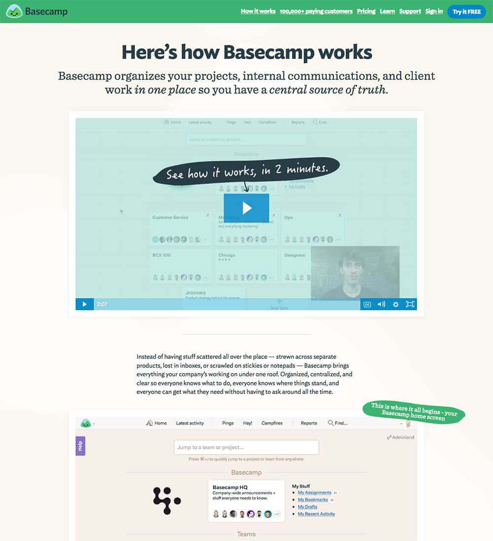
- Basecamp’s website and their software have a consistent look and feel.
- The home page clearly spells out use cases and showcases social proof.
- The “How it Works” page is accurate and looks exactly like their software.
- The software is incredibly easy to use, and that’s saying something for a project management tool.
- It requires almost no training.
- It has had a tremendously high adoption rate.
- The visionaries at Basecamp are very focused on improving their flagship product and aren’t getting distracted by continually trying to create spin-off products to expand their market.
Slack
How they are getting it right
- What seems like overnight, Slack has become an indispensable tool in many workplaces.
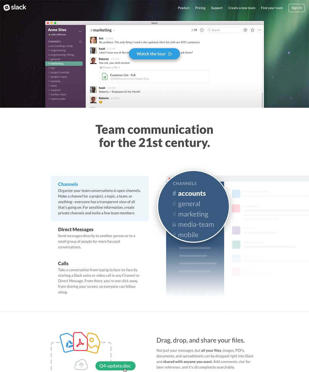
- The user-experience on desktop and mobile is exactly the same.
- While most chat apps are very easy to use, even Slack’s more advanced features are intuitive and require no training.
- Their visual brand is super consistent—from their ads and commercials to website and software, it’s a consistent look that is undeniably Slack.
- The app has extremely high adoption rates.
![]()
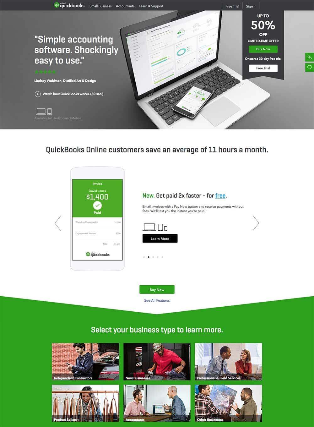
Quickbooks
How they are getting it right
- Quickbooks has been around forever (in software years anyway) and has adapted as the market has changed.
- Their new SaaS platform has made the software incredibly easier to use.
- With the help of my CPA, I was able to learn what I need in Quickbooks in less than an hour.
- The UI is very intuitive, visually appealing and consistent with their marketing.
- Their website displays social proof and honestly speaks to their target market of small businesses.
The Takeaway
With the marketing of a SaaS product, make sure your company can live up to its brand promise. This will translate into long-term, happy customers.


