Motion and animation in web design are great tools for conveying messages or feelings, drawing attention to certain features, and explaining complex topics. There are a lot of B2B websites out there that are using motion and animation in interesting, unique ways. There are also a lot of websites who are falling short in their implementation.
With the rising popularity (and efficacy) of motion and animation in web design, I wanted to share tips to effectively use motion and animation in B2B website design.
Use it purposefully
Animation used exclusively for the sake of motion is only going to detract from a user’s experience. Instead, animation on a website should serve a purpose. For example, animating an important piece of content to draw attention to it or using a pulsing button to indicate a user can interact with something adds to the user experience. In these examples, using motion and animation amplifies the user experience by highlighting its intended purpose.
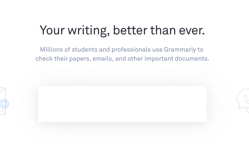
Grammarly, an online grammar tool, uses animation purposefully on its website: https://www.grammarly.com/

On the Grammarly website, fun animation and motion are used throughout the website to showcase how the product functions.
Use it minimally
At the end of the day, your B2B website is a brand communication tool in which you want your story and value proposition to come across loud and clear. You don’t want it looking like a first-year multimedia student got a hold of it and threw in every bell and whistle, possibly distracting from your story.
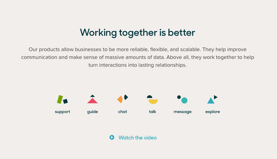
Zendesk, a customer service software platform, uses animation minimally on its website: https://www.zendesk.com/
The B2B website design only animates the custom icons, which it’s done tastefully on the home page and throughout the website. Combined with their minimal, but colorful layout, the animation doesn’t overwhelm the user but encourages them to pay a little extra attention to the areas that are animated.
Budget accordingly
Incorporating motion and animation into your website will increase the cost of your web design project and the time it takes to develop or build. However, it can add that extra wow factor that keeps a user engaged and set your firm apart from other competitors in your industry.
Do a Quick 5 Minute B2B Website Design Audit.
When working with a firm to design your B2B website, it’s a good idea to outline your goals for the website and any preferences you have on the design. If you have examples of animation or motion you would like to see incorporated, be sure to share that with your creative team. Also, prioritize your list by outlining “must-haves” and “nice-to-haves” so your B2B web design agency can put together options for pricing and budget, as well as implementation.


