As Art Director at a B2B web design agency, I see a lot of website designs. While some of what defines “good” web design is subjective (color palettes, image choices, movement, etc.), there is a fair amount of design choices that are better than others for very specific reasons.
In this article, I take a quick look at 3 different website designs that I think work well and explain why they work well from a marketing and design perspective.
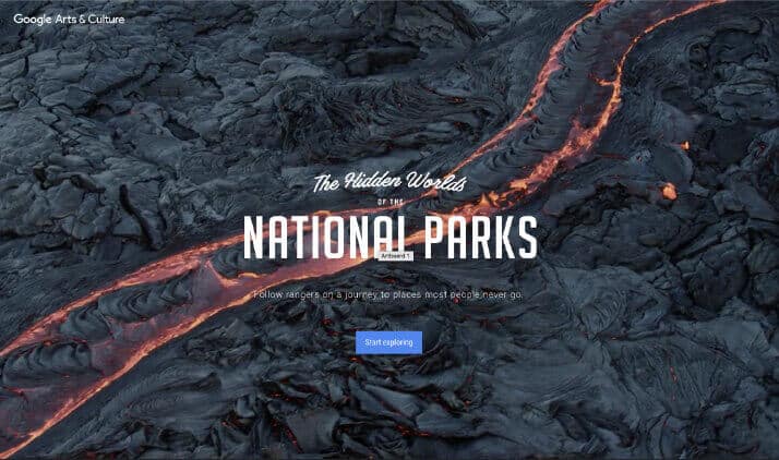
Google Arts & Culture: The Hidden Worlds of the National Parks
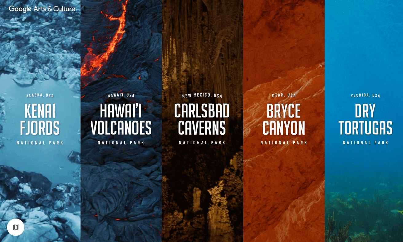
To celebrate the 100th anniversary of the US National Park Service, Google Arts and Culture created a virtual online tour of 5 historic national parks.
Why This Site Is Great
Celebrating milestones and anniversaries is a powerful marketing opportunity. Leveraging milestones into promotions helps differentiate you from the competition, attract new prospects and enable growth.
Site Features that Standout
- The website design includes beautiful videos that tell a dynamic story and engage the visitor.
- Each park has a unique story/brand and tour guide, but they all work well together.
- The Google fonts used also have a lot of personality.
- The sound on the site integrates very nicely with the visuals but is not overpowering or intrusive to the viewer.
- The navigation is straightforward and easy to use which is critical for guiding visitors throughout the website design.
Litmus
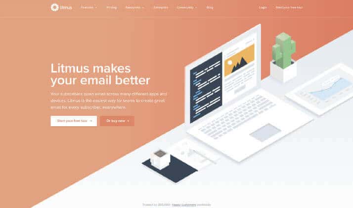
Litmus provides a suite of email design and email marketing tools to help build, design, test, and analyze emails across different platforms.
Why This Site Is Great
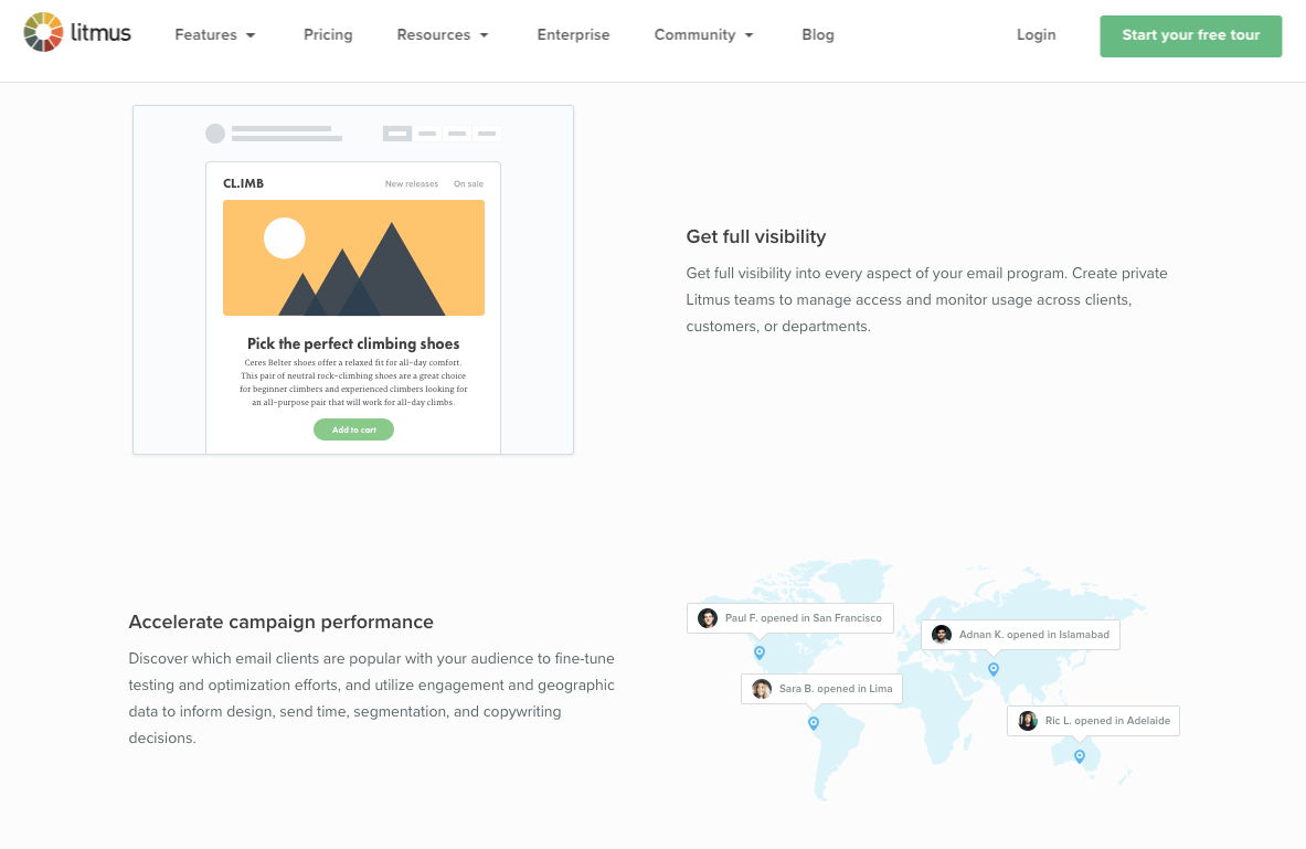
The Litmus website is a tool and a very practical and utilitarian website, but it still looks nice and is engaging. The detail in the B2B web design and usability helps created trust and creates a better brand experience. Their use of testimonials from clients also builds trust and reach new clients.
Site Features that Standout
- They use a lot of icons/illustrations to help with navigation and to explain their extensive offerings.
- The visuals, along with the written explanations caters to different learning styles, making everything really easy to understand.
- A very clean, modern, hip and easy to use website. There isn’t much clutter which streamlines the user experience and gets the visitor to the section of the website they are looking for quickly.
Epicurious
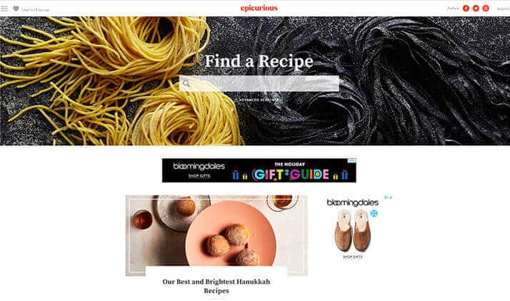
Since 1995, Epicurious has been the ultimate food resource for the home cook, with daily kitchen tips, fun cooking videos, and over 33,000 recipes.
Why This Site Is Great
The Epicurious website is simple and straightforward with warm, friendly colors and gorgeous photography. People come to the website to look for recipes so the site focuses on making it easy by positioning the “Find a Recipe” search bar front and center. Thoughtful, clear, and clean navigation really makes this site great.
Site Features that Standout
- The photography used on the website is inspirational and resonates well with the foodie audience.
- The site also does a really nice job promoting their enewsletter, the pop-up and CTA bar really entice the viewer to sign up to receive the latest recipes and expert tips.
Great Website Design Matters
Great B2C and B2B website designs can have a significant impact on the user experience, brand perception, and overall lead generation. It’s critical to put a lot of thought into crafting quality website designs. For this reason, effective website design takes time and a well-executed design from a professional web designer.
