Ever hear the phrase: “you never get a second chance to make a first impression”?
Although this is certainly true for meeting new people, it also applies to your company’s B2B website design. So how do you tell your brand story online?
Consider the preparation necessary for a business meeting. You likely outline and practice your presentation, as well as pick out and wear the appropriate attire. Appearing polished and prepared helps create a great first impression.
In B2B website design presentation is also key. Clear content organization, creative writing, and custom graphics all combine to create an excellent user experience. The desired outcome for both an in-person meeting and your online presence is the same: A good first impression from which a great business relationship can grow.
A great story starts with a compelling introduction
With a digital world cutting short our attention spans, it’s now more important than ever to consider your website’s content and design. Your homepage is likely the first point of contact for any new visitor, whether potential client, partner or employee. It’s important to make it clear what you do. This lets a user know they are in the right place, which is especially important for people arriving via search engines. This clarity can be accomplished through a pithy headline combined with supporting graphics.
Consider this homepage design for InnoVint.us:
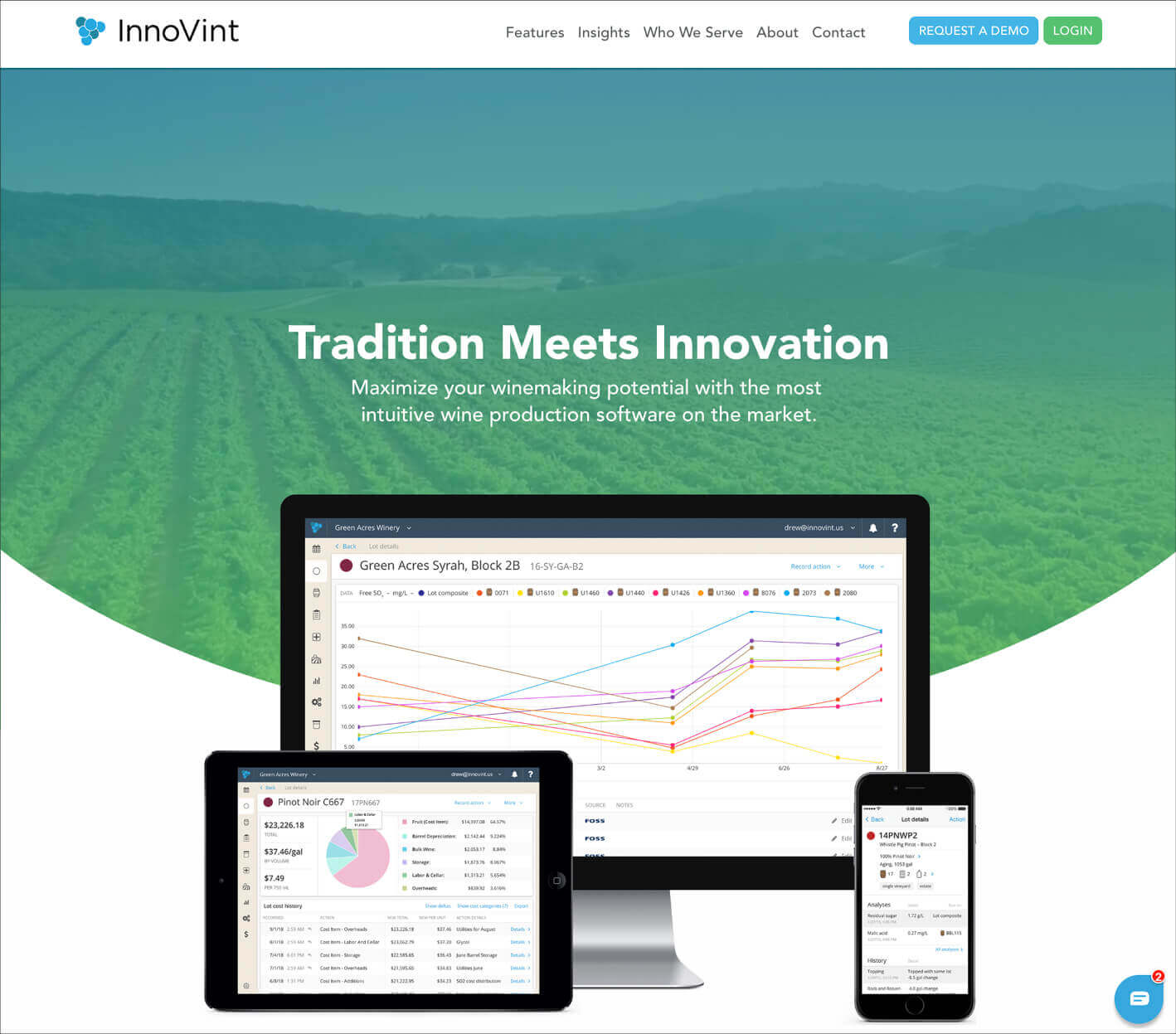
The combination of just three ingredients, creative copywriting, subtle background video, and clear product imagery gets the brand story off to a great start!
Include all the homepage essentials
The homepage should be like your B2B website’s highlight reel. A short introduction engages users and as they scroll easily digestible overviews convey the breadth of your various products, services or areas of expertise. Make sure to keep the visual design cohesive with consistent typography, color, and iconography.
Adding navigational elements such as “Learn More” or “View All” buttons is essential. They help visitors easily navigate to other pages containing the detailed information they are interested in.
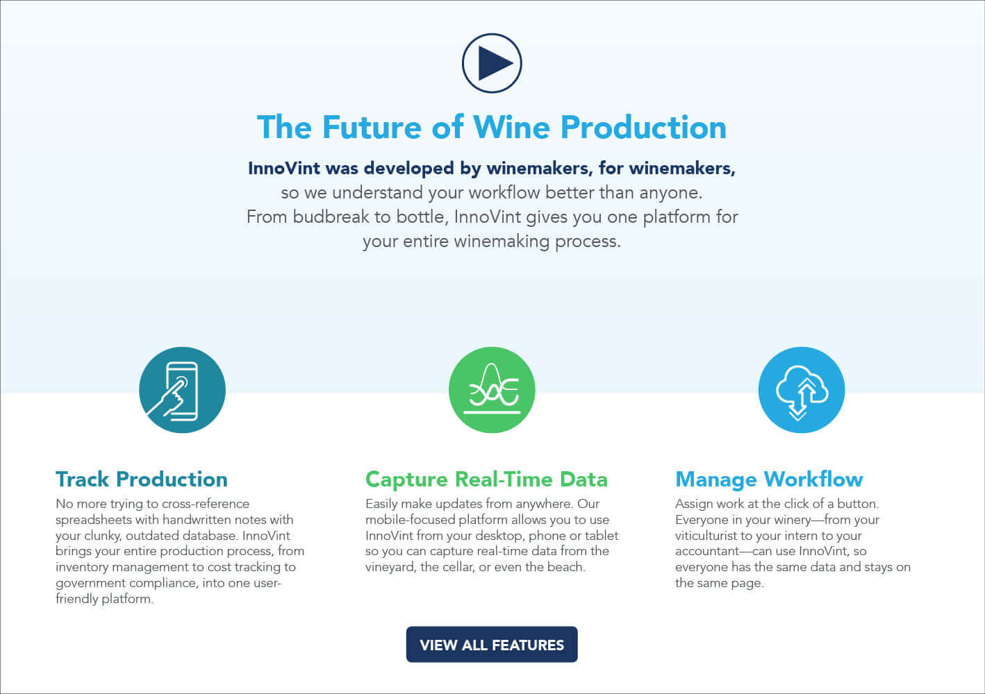
Don’t forget to highlight what makes your B2B firm different! In today’s competitive online environment, adding your company’s key differentiators can make all the difference. Keep it short and sweet and consider adding a supporting, video, statistics or testimonials.
Most importantly, your B2B website should serve as a lead generation tool! Adding an easily accessible “Contact” or “Request a Demo” form is crucial. You can also gauge visitor interest by including a newsletter signup or downloadable content offer.

Universal Tips for Success
Although every company’s brand story should be unique and written for target audiences, the following are a few universal tips to keep in mind.
1.) Don’t Overwhelm
Don’t present too much information too quickly. Although your business may be complex, beginning with too much detail is not advisable.
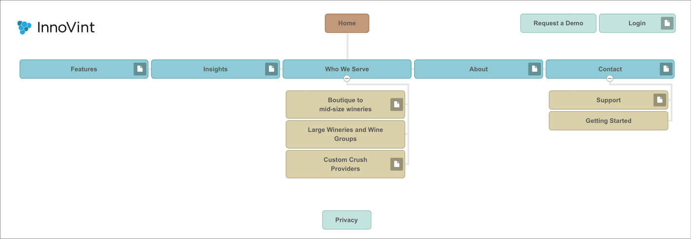
A good B2B web design process starts off with a sitemap. This organizational tool helps create a top-level overview of your website’s navigation and subpages. Placing detailed content into subpages, rather than on the homepage will help keep your brand story clear.
2.) Differentiate Yourself
With so many businesses competing online, it’s important to understand and highlight what makes your company different!

3.) Build Trust
Add elements to position your company as authentic and trustworthy. You can build this credibility by featuring your partners, customers, testimonials, company success statistics, or case studies.

4.) Add Value
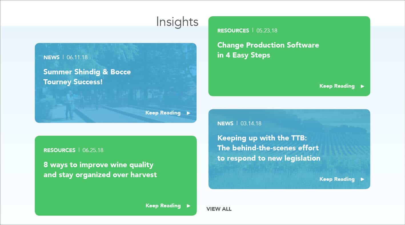
Consider adding a “Resources” or “News” section to your website. Not only are these sections a great place to add new content, but keeping them updated will help with your search engine optimization. Beyond SEO, visitors like to see that your company is staying current and involved in your industry. Providing downloadable content pieces also helps add value to your visitors. These pieces can serve as teaching tools and double as promotional pieces.
5.) Convert Visitors into Leads
Adding that contact form throughout your website is crucial. Users shouldn’t have to hunt around for a way to contact you. For even better customer outreach, consider adding downloadable resources and maintaining a chat feature.
There is a lot that goes into creating a compelling brand story, particularly in B2B website design. Given the high visibility potential and ubiquitous nature of the web…the effort will prove well worth it.


