Do visitors leave your site without engaging with content, completing your opt-in form, or clicking through to another page? Not finding new leads or seeing an increase in organic traffic?
If the answer to these questions is yes, it’s possible that your B2B website design is lacking. Read on to find out what design mistakes may be holding your B2B website back and how to fix them.
Design Mistake #1: Poor Functionality and Bad Information Architecture
Anticipating your customer’s journey is a key factor to keep top of mind when designing your B2B website. By getting to know your target audience you can anticipate their wants and needs—helping you figure out ways to build trust and create positive emotions about your brand.
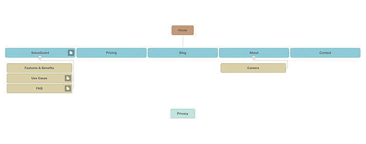
Effective B2B website design always starts with a good sitemap. The functionality of your website should carry more weight than anything else. Below is an example of a detailed, well-organized sitemap, the first step in engaging your target market and creating a beautiful and well-thought-out B2B web design.
Do your customers read industry news? Then a well-thought-out news page or blog section will help increase organic and repeat traffic.
Once the user is on the site, is there intuitive placement of navigation? Allowing the user to click through to your product or services offerings with ease, will help them make that big purchase.
Want to start a conversation with a potential client? A bright, bold “contact us” link helps users reach you and builds brand trust and loyalty.

Design Mistake #2: Confusing Website Navigation
Website navigation should be clear, consistent, and easy to use. The below example has consistently made the list of top 10 worst websites due to poorly designed navigation. The navigation is overshadowed by the company’s tagline and phone number— making the user unsure about how to travel through the site.
How would you feel if someone asked you to drive a car that had no steering wheel? Frustrated, confused, and disappointed—this is how users feel when they can’t navigate with ease through your site. These call-to-action elements would be better placed in a call-out lower on the page. The top portion of the site should be dedicated to brand recognition (logo) and site navigation.
The color palette used in the navigation is also a problem. Poor contrast and using colors that are too close in color scale make the copy/content hard to read. Navigation that has no rollover effect is another problem on this website. Users don’t know that a specific image, button or text is a link to another destination unless you give them a cue.
Leading your customer through your B2B website with clear, consistent navigation will help drive engagement and keep users coming back.

Design Mistake #3: Too Many Choices
Science has proven that simplified websites are better. In a 2012 study by Google, researchers found that not only will users judge websites as beautiful or not in less than a second, but also that “visually complex” websites are consistently rated as less beautiful than their simpler counterparts.
One of the main reasons for this is the paradox of choice. When it comes to good B2B website design, less is more. Giving customers too many choices or bombarding them with complicated jargon, confuses and disorients the customer. Your top-level pages should be inviting and explain in clear, simple terms how you can help your customer. Going into too much product or service detail right away is too much too soon. Instead, build trust and tell potential customers how you can help them solve their problems. Give them an introduction to your product and service offerings. This will build curiosity and lead them to dive deeper into your B2B website and learn more about how you can provide them with solutions.

Good B2B website design should increase positive emotions and decrease negative emotions. Keeping these key design element top of mind when designing your website will ensure potential clients find and keep coming back to your site and your business.


