It’s a fact: digital content is consumed differently than print content.
For example, you might read a B2B website in a more disjointed way than you would a brochure. You may enter on the homepage, or on a subpage, or on a blog post. You likely navigate the website in a non-linear fashion, and you may only visit two or three pages. And since you’re insanely busy and distracted by a bazillion other forms of online content, you probably scan websites rather than read every word.
As such, as a copywriter, you’ll want to adjust the way you write for the web. In this post, I share best practices for B2B marketers and writers creating copy for websites and other digital media. Let’s jump in…
Website Copy Isn’t Linear
When drafting or reviewing copy crafted to fit into a B2B web design, remember that websites are not read in a linear fashion. Simply put, don’t write each page assuming that readers have read other pages or remove something you feel is “repetitive” because you’ve discussed it on another page.
As mentioned above, your website visitor may not have read the home page or services page or a blog that was drafted last year. While you don’t want to repeat your ideas verbatim on each page, it’s perfectly fine to reiterate them for readers who haven’t read other pages.
Don’t Bury the Lead!
If there is an important point to make, put it in a subhead, a call-out box or its own separate section. For the love of all that is holy, don’t bury it in the middle or end of your paragraph – or at the end of the webpage.
See what I did there? I wanted to be sure you didn’t miss this point, so I gave it its own subhead and section.
Focus on Benefits to the Customer
Whenever possible, focus on benefits to the customer rather than the company. Busy readers will always be more engaged when the copy is directed toward how they can benefit. One way to do this is to start with an action verb that applies to something the customer can do.
Example: Instead of “We create efficiencies through our easy-to-use platform,” you might say “Simplify your job with our easy-to-use platform.” The focus is on the customer.
People always want to know “What’s in it for me?” So tell them.
Read more: How to write copy to engage readers and search engines.
Avoid Walls of Text
Internet users DO NOT READ. They scan, skim, jump around, scroll quickly, and page hop. Website visitors want information fast. Make it easy for them to find they are looking for. Headlines, subheads and links to other pages should be clear and unambiguous. Avoid crafting the dreaded “wall” of text – multiple, long, contiguous paragraphs that are hard to scan for information.
- Break up large paragraphs into smaller paragraphs.
- Use clear headings and subheadings.
- Use bullets and lists.
- Edit down your copy to what’s really necessary.
Remember, website and digital copy are not read like a novel, cover to cover. While it should flow and be consistent, digital copy should deliver valuable information in each snippet.
For website copy, consider how your copy will look in the B2B website design. Try to deliver content in “chunks” rather than a series of paragraphs for some of your sections. This works especially well when describing features and benefits.
Here’s an example (this applies to website copy and brochures more than blog or white paper content):
Instead of:
Why Example Software?
Example Software gives you the rare combination of people, technology and business expertise to make your operations thrive. Our software delivers data and reporting tools for business insight and smarter decision-making across your enterprise. The easy-to-use platform increases efficiencies and integrates seamlessly with your CRM. All this combined with our passionate, hands-on team of experts make Example Software the smart choice across your operations.
Try this:
Why Example Software?
Example Software gives you the rare combination of people, technology and business expertise to make your operations thrive.
-
- Data & Reporting
Get data and reporting tools for business insight and smarter decision-making across your enterprise. - Efficiency
Simplify your job with an easy-to-use platform for all your employees. - Integrations
Easily integrate with your CRM and other technology. - Amazing Team
Leverage our passionate team of experts, with you every step of the way.
- Data & Reporting
We’re saying the same thing (with about the same word count), but it is more likely to get read and appears more engaging in design. Note how the individual headers for each point make it easier to scan.
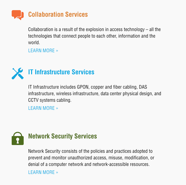
See how text broken up in chunks looks in the design (much easier to read & scan than a long paragraph):

Copywriting for a Great User Experience
These tips are not a personal preference or the requirement of Bop Design. Rather, these are all best practices to ensure that your reader is able to access, read, and engage with the content on your B2B website. Keep your novel writing best practices for your novel and your digital media writing best practices for web copy and other digital sources.


