As an Art Director at a B2B website design agency, I see all types of websites. Some are great and some are not great. In this post, I share my favorite website designs and what makes them stand out.
-
AppCard
Why We Love Them: Smart Use of Color
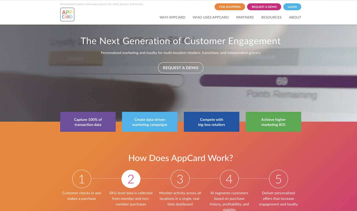
AppCard is an Application software for retailers and grocers who need a turnkey, yet customizable, customer retention and loyalty marketing program for their clientele. AppCard has a colorful logo that is upbeat and appealing to its broad target market.
AppCard’s website has the same great appeal and broad reach. You can’t help but feel happy, bright, and optimistic on their B2B website. Think California sunsets, rich jewel tone color combinations, and gradient overlays. The site invigorates and creates immediate interest in the product. Rich and strategic use of color sets AppCard apart from competitors and engages users.
2. cSubs
Why We Love Them: En Vogue Isometric Illustrations
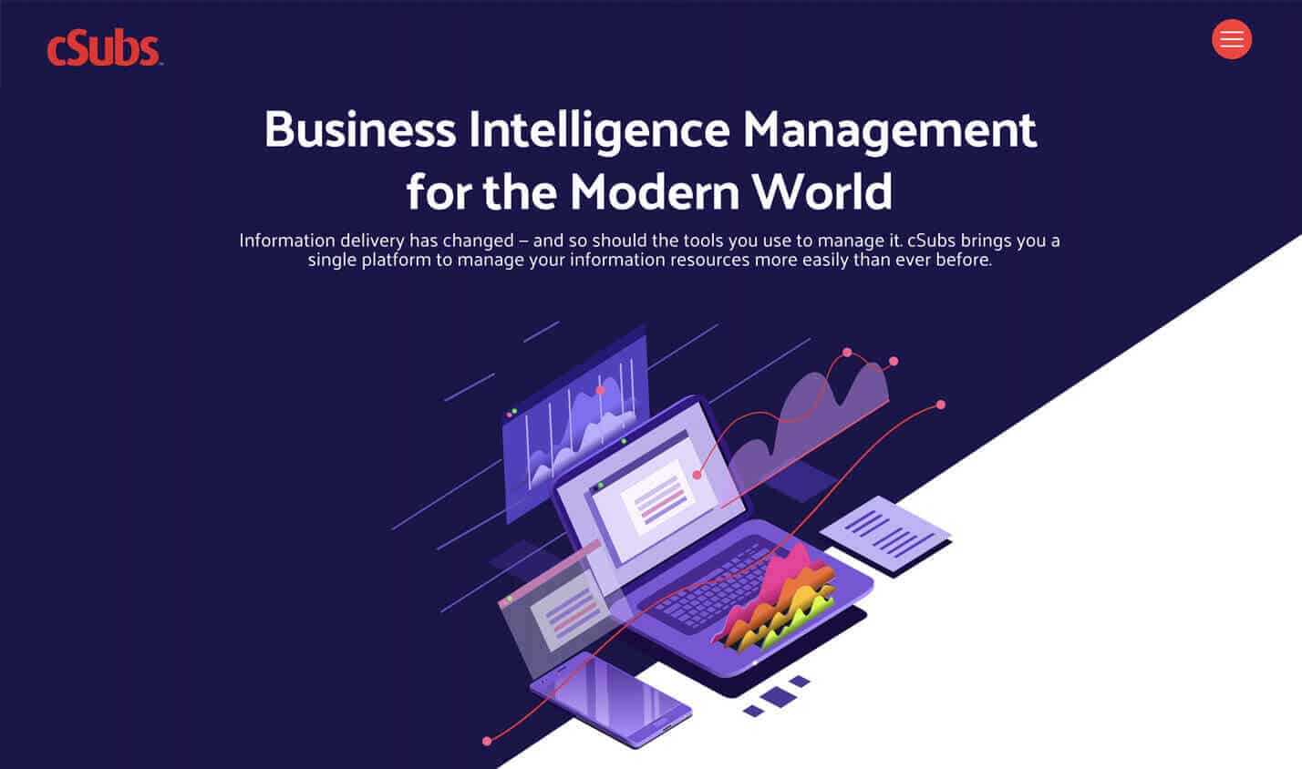
cSubs provides software solutions for the corporate library market. Specializing in the management of information, spend, licenses, contracts, and subscriptions, all within an integrated single platform.
This B2B website design delivers an impressive visual brand journey right out of the gate with isometric illustrations and animations. What is an isometric illustration you ask? Isometric illustrations are a depiction of a three-dimensional object on a flat surface. Isometric illustrations create depth and dimension to any flat drawing. Angles of an isometric illustration are drawn at a 30-degree angle, this means they never meet and are infinitely parallel. This style is currently all the rage and will continue to be a trend-setter as we move forward into 2020. cSub’s homepage holds our interest with rich visual storytelling and gives meaning to a product that is otherwise impersonal.
-
AJ Hackett Bungy
Why We Love Them: Video Storytelling
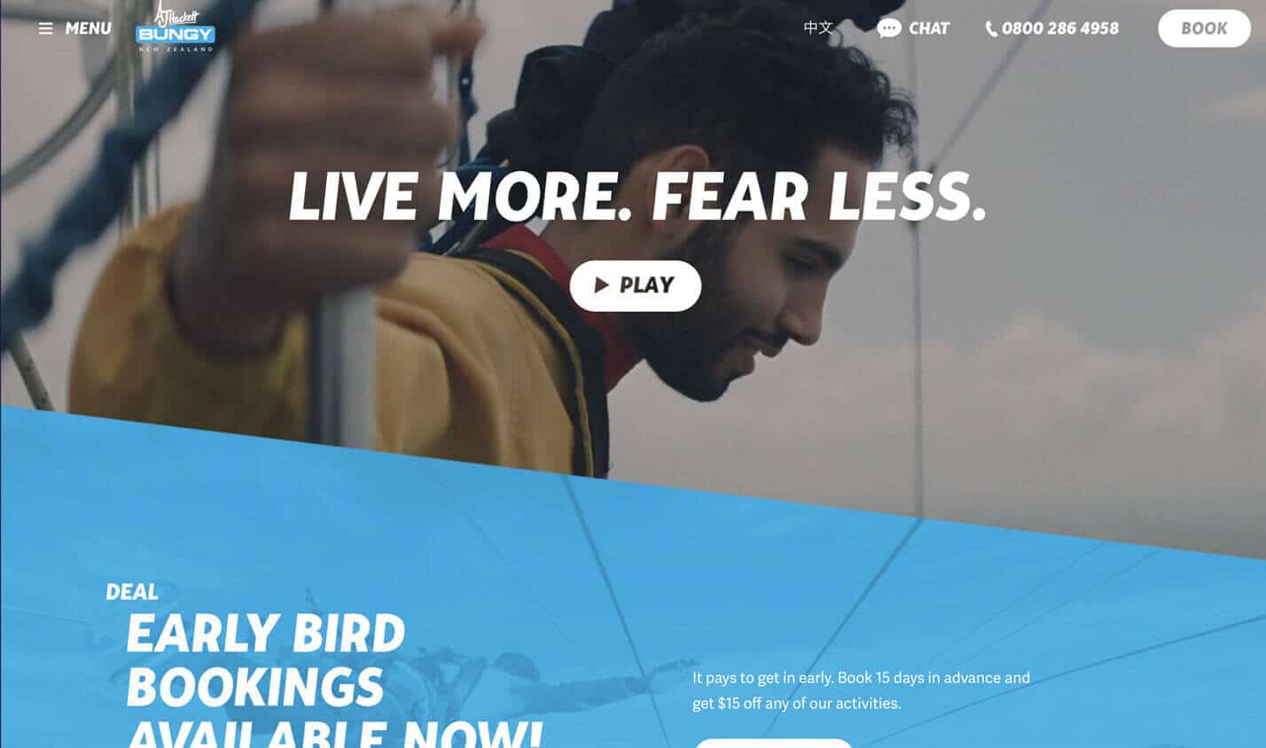
From the world’s home of bungy jumping, AJ Hackett Bungy New Zealand showcases their amazing range of extreme activities in Queenstown and Auckland.
Inspirational and breathtaking videos inspire us to live life to the fullest, take risks, and face our fears with extreme sports. Video is absolutely the best conduit to deliver a sneak-peek into the variety of adrenalin pumping activities AJ’s has available. You can literally see exhilaration, excitement, and accomplishment on participants’ faces. Video tells a story quickly and keeps users on the website longer.
-
Aljoaib Engineering
Why We Love Them: Clean Design + Subtle Movement
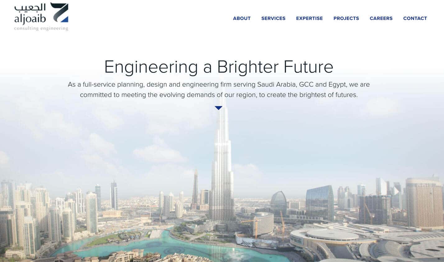
Aljoaib Consulting Engineering is a premier design and engineering firm specializing in energy, infrastructure and technical services for Saudi Arabia, GCC and Egypt.
Attention to detail and uncluttered design help create amazing cities, these traits also create amazing websites. The design and animation of Aljoaib’s site reflect the nature of the company, resulting in a visual identity that resonates well with clients. The design and animation on the site build brand identity and gain client trust.
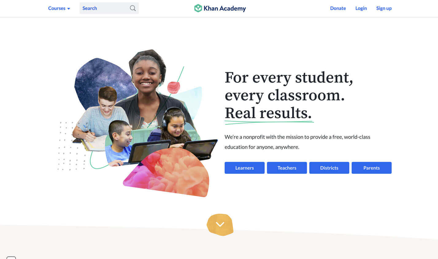
5. Khan Academy
Why We Love Them: Cool Graphics and Concise Messaging
Khan Academy is a non-profit, educational organization that provides free video tutorials and interactive exercises. The Academy’s declared mission is “changing education for the better by providing a free world-class education to anyone anywhere.”
Learning can sometimes be a daunting, scary endeavor. But, the design and message of this website instantly alleviate any worry. Brightly colored collage-art and friendly photos greet us on the homepage. Clear, concise messaging make things easy to understand and navigate. Learning feels fresh, simple and empowering.
Great Web Design Is Inspiring
A website’s design should be functional and user-friendly but that doesn’t mean it can’t also be inspiring. It should inspire the user to act and feel connected to the website content. There are many great web designs out there, but hopefully, these few examples make you feel inspired!

