In this blog, Bop Design is presenting some of our favorite B2B website designs and providing reasons why we contend they hit client marketing objectives. The following are 5 websites for B2B companies from very different industries—from biotech to life sciences to radio technology to SaaS. All of these B2B web designs have one thing in common: each B2B company wanted to generate more leads through their website.
In each website cited below, we discuss how the design and content strategy execute on B2B lead generation.
Accurate
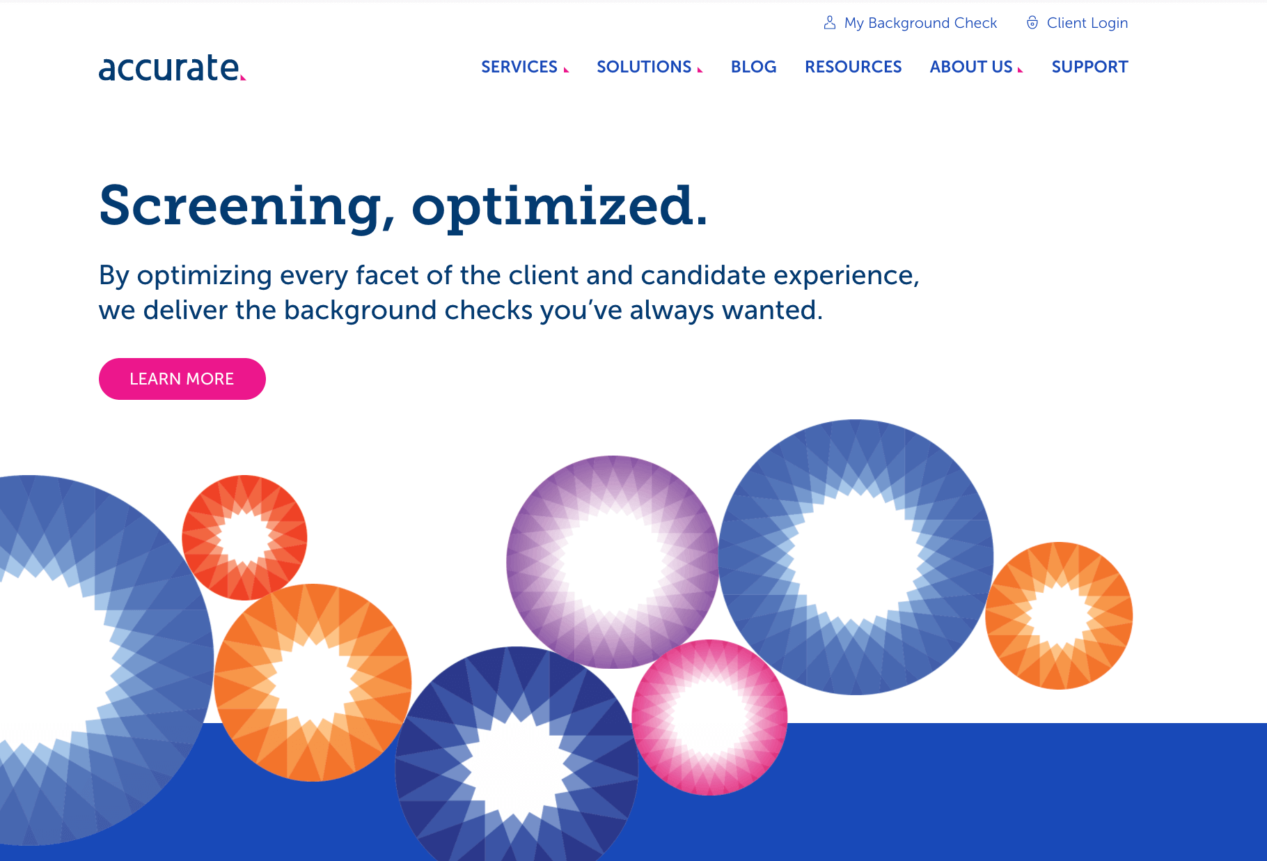
The website for background check software company, Accurate, solves a typical challenge in B2B web design. Accurate needed to present all of its solutions and services in a concise, intuitive manner so that a visitor can find what they’re looking for within two clicks. Most B2B website designs need to communicate a niche product or service to a diverse set of visitors. Accurate’s web design does this seamlessly.
The homepage immediately engages the visitor and helps visitors qualify and disqualify themselves as a good prospective client. Even though the website primarily targets enterprise, large companies, the homepage does not alienate small to mid-sized companies. Lastly, the homepage features a time-tested approach to build credibility: listing your most known customers.
The flipbook style resources on the resource center takes unnecessary steps out of the conversion process and allows visitors to view content within the page without downloading or opening another browser tab.
Meanwhile, there is always at least one call to action for conversion on the browser screen. The end result is a B2B web design primed for conversion, lead generation, and business development.

Silvus Technologies
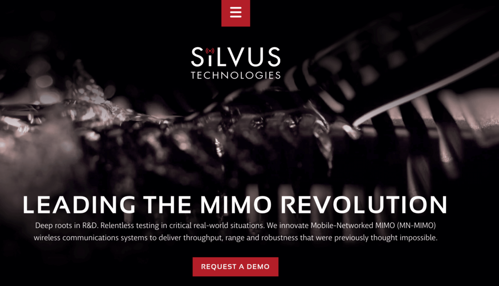
The custom video on the Silvus Technologies website not only grabs a visitor’s attention but showcases a core benefit of the Silvus product technology. In B2B marketing, it is all about working back from the motivators and preferences of the target market. The dark motif resonates well with law enforcement and military decision-makers—the top two target verticals.
The center hamburger menu is different than most more traditional B2B website designs. It helps position Silvus Technologies and its products as technology-driven and innovative. If your product or service is breaking the mold, the B2B web design experience should be consistent with that.
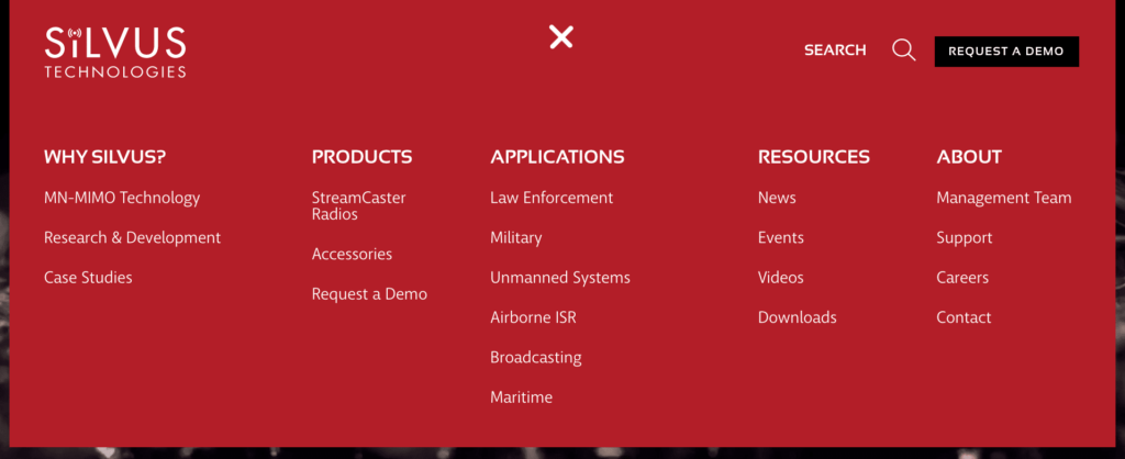
We often receive praise for this client website, primarily for the video and navigation. With the video, the page speed is still relatively high thus helping with SEO, user experience, etc.
View the Before & After website comparison for Silvus Technologies.
CorTechs Labs
Bop Design constantly hears positive feedback from prospective and current clients on the CorTechs Labs website. Like all Bop Design designed websites, the website is B2B. Most of the positive feedback on CorTechs Labs is about how we presented a complex solution in a digestible manner.
The website content strategy on the homepage cuts right to the chase and immediately differentiates CorTechs Labs in the marketplace with “Why CorTechs Labs?” with the core differentiators.
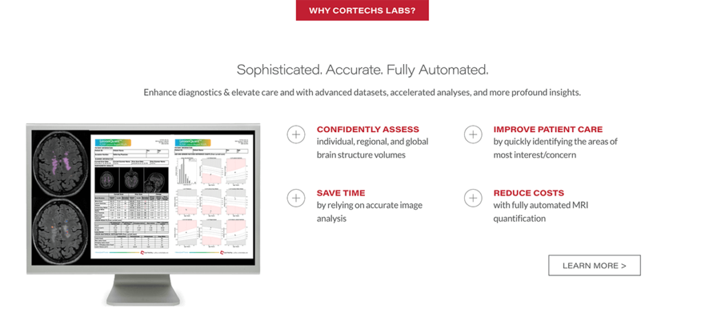
The homepage then prompts a visitor to select a product option. Video and animation are on each product page, helping hold a visitor’s attention.
It is definitely one of Bop Design’s favorite B2B web designs in the biotech, life sciences space.
Matillion
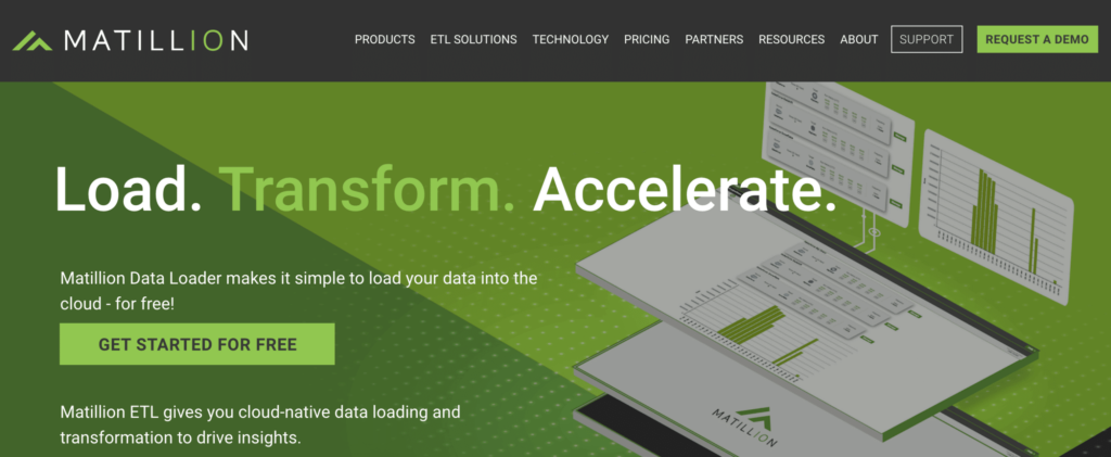
Data transformation company, Matillion, utilizes its B2B website design to maximize lead generation. One of the best lead generation tactics on a B2B website is a chat feature. We see our B2B clients be very successful with business development via chat. Typically people associate chat with B2C marketing but we recommend a chat feature on all websites we launch, no matter the product, service, vertical, etc. in the B2B market.
We are especially proud of the Matillion resource center listing ebooks, webinars, white papers, and assessments. The thumbnail photos display consistent imagery adhering to brand guidelines. Content is both gated and ungated in the resource center—serving as both lead generation and nurturing tools.
View the Before & After for Matillion’s website design.
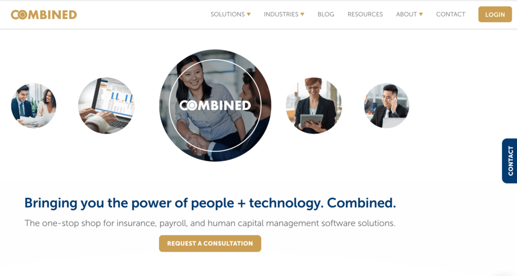
Combined
The final B2B website design we are especially fond of is human capital management firm, Combined. This website needs to cater to both prospective and current customers, channeling each persona to the appropriate area of the website in a timely manner. The majority of the traffic is current customers so the website interface cannot alienate them. The login button is prominently displayed at the top of each page so that current customers can log into the Combined platforms.
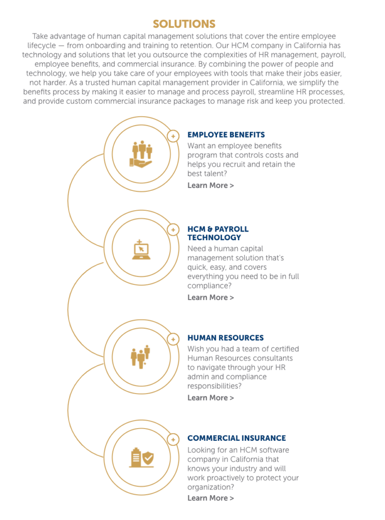
On the B2B web design interface front, we would like to highlight the animation on the solutions section on the homepage effectively showcasing the full breadth of Combined’s service in an efficient manner.
Conclusion
As of 2020, Bop Design has launched 367 B2B websites in our 11-year history. We launch 35 client websites a year. We look forward to showcasing our favorite B2B web designs regularly.
Ready to find out how Bop Design can transform your B2B website? Contact us today for a consultation.
Read more: How to find a B2B marketing agency to achieve your goals.
