Website design trends are constantly evolving.
This evolution, although much faster than anything we see in the natural world, is driven by similar forces:
- Environment – Current norms & best practices
- Competition – Number of businesses that are competing in the space
- New Features – Development of new tech or functionality over time
Let’s take a quick look at B2B websites as if they were organisms.
If a business provides a niche product or service and there isn’t much competition in that space, there probably isn’t much incentive for that website to change. In fact, there is still a slew of B2B websites out there that are living fossils. Like the goblin shark, these sites have been around for a decade or more and are still surviving today.
Unlike these fascinating outliers, the majority of B2B websites are facing ever-increasing pressure in a crowded space and so must undergo updates more frequently to stay competitive.
Intense competition and the development of new features can produce a wide variety of outcomes. Like the intricate displays of a male bowerbird, B2B sites that are too eager to set themselves apart can end up flashy but also confusing or inefficient. Adding too many novel elements whether interactions, colors, textures, videos, animations or type treatments can weigh down the user experience as well as the site speed.
Truly successful B2B web design balances form and function, beauty AND purpose. These websites tend to have a few key traits that are proven to drive business goals.
Common Traits of Successful B2B Web Designs Include:
Concise Communication
Whether a company provides software, products or services, it’s important to make the offering clear from the start. The websites below do a great job of combining concise messaging with supporting on-brand visuals to attract and convert target audiences.
The Keystone homepage shows off a bold brand promise with custom illustrations and animations. A consistent, modern and minimalist approach allows visitors to easily navigate, focus on content and retain key messaging.
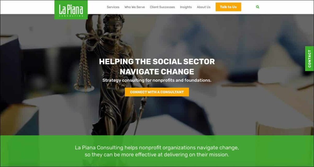
LaPiana incorporates a looped video background that reflects the type of work their clients are passionate about. Video or motion graphics should be used selectively to enhance messaging.
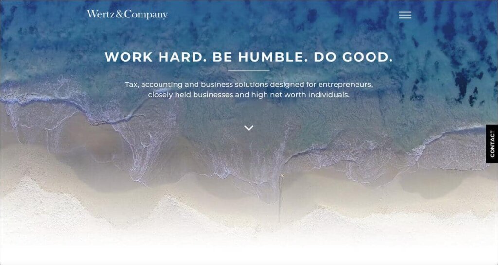
Wertz&Company chose to distinguish its business by emphasizing its core values. The calming ocean cinemagraph homepage background not only entices visitors to scroll down and learn more, but also references this company’s culture and location in southern California.
Clear Differentiators
B2B company websites are closely compared to the competition before a buying decision is made.
So how do the successful ones make their product or service stand out? The sites below don’t make their visitors guess.
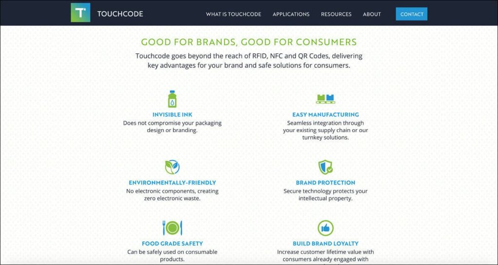
Touchcode lists out their benefits. On-brand icons help visually organize content into easily scannable sections.
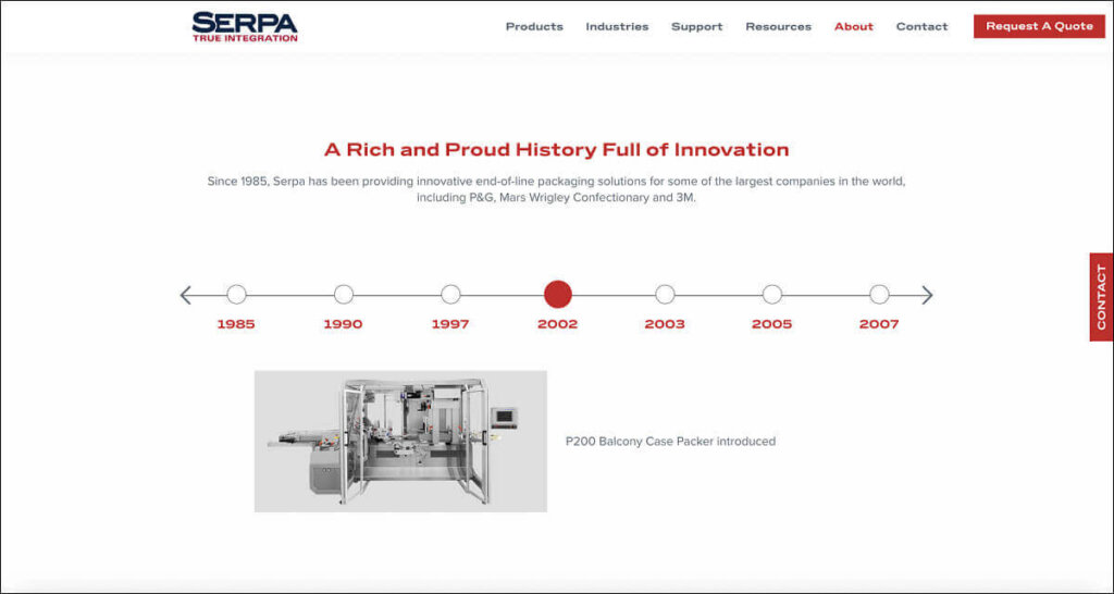
Serpa shows off their longstanding expertise through an interactive timeline. Years in business help build trust and set them apart from any new competition.
Product or Process Visualizations
What products does a company offer? How will it meet a buyer’s needs?
These key questions need to be addressed in a visually appealing way if a website is to increase traffic and leads.
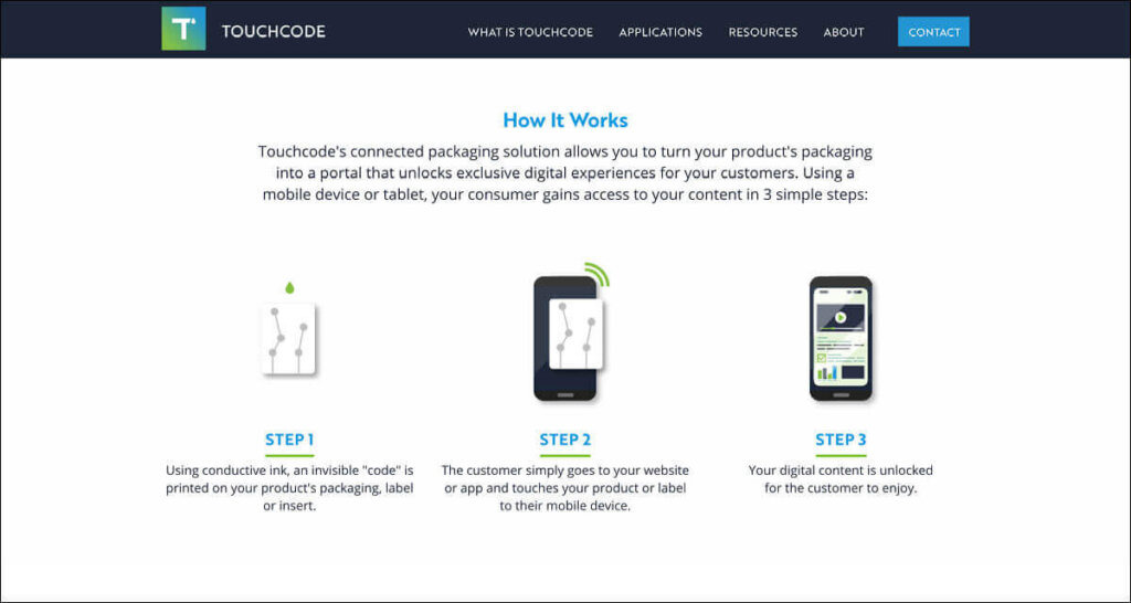
Touchcode illustrates how their connected packaging works in a simple three-step process.
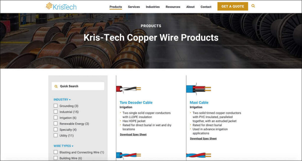
Kris Tech includes product illustrations to increase interest in their offering. Search functionality, product filtering and product spec sheets are included for a better user experience.
Convincing Proof Points
Websites that offer data differentiators have a better chance of impressing visitors. This is especially true for B2B companies. Business-oriented audiences tend to favor metrics to support their buying choices.
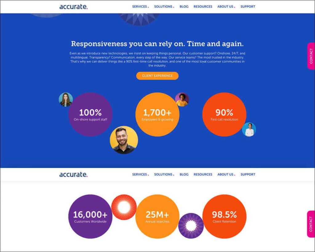
Accurate highlights impressive statistics throughout their site to help bolster their company image, expertise, responsiveness and customer focus.
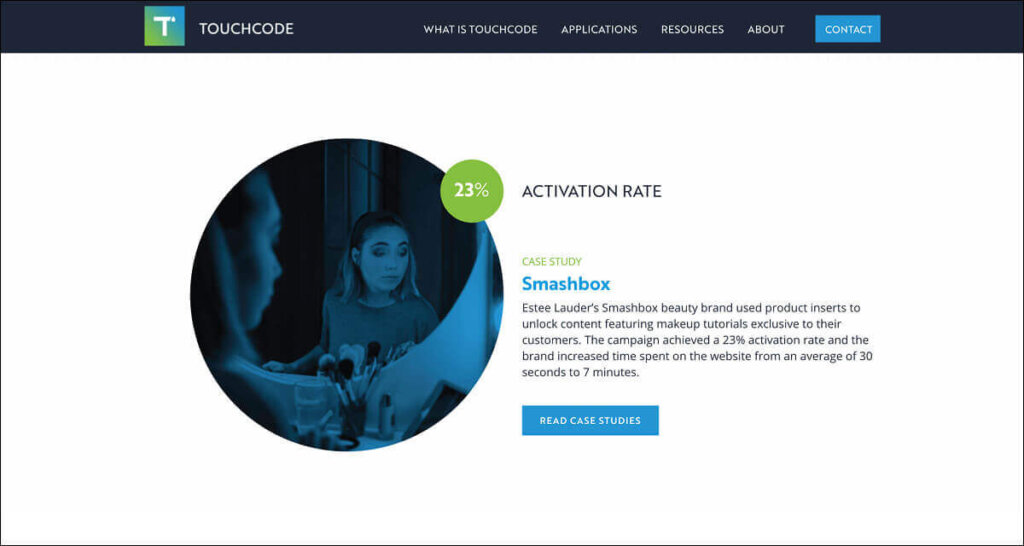
Touchcode shows off their past success metrics to entice visitors to read their case studies.
Valuable Content
B2B websites that offer information in addition to self-promotion tend to be more successful. Creating timely articles or resources that appeal to and benefit target audiences not only helps with SEO. A website that is positioned as a resource makes it more likely to attract repeat traffic as well as referrals.
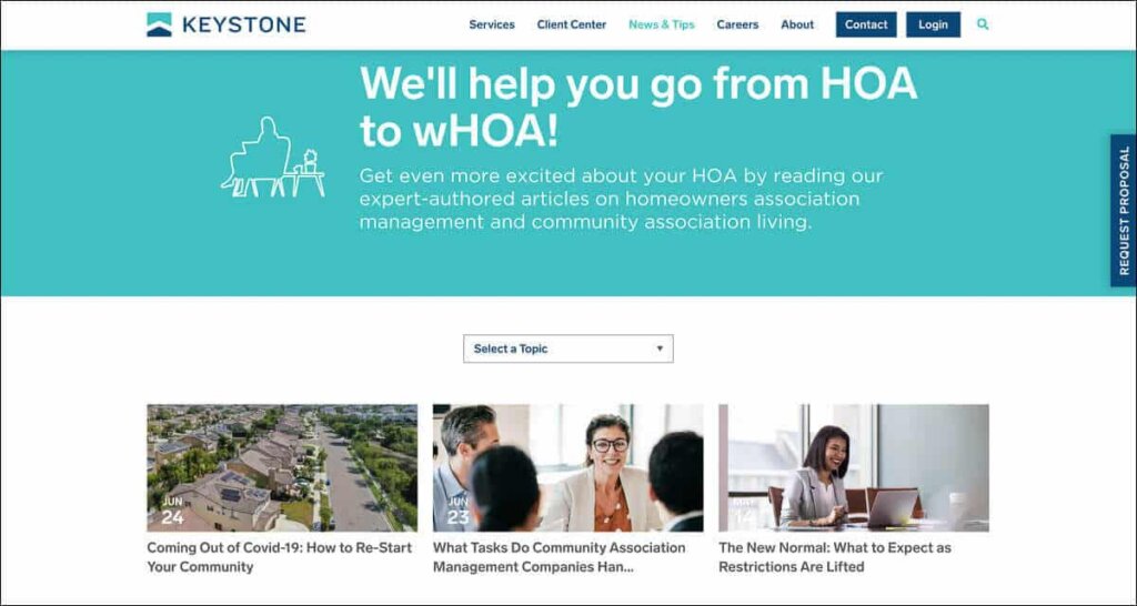
Keystone boasts a robust News & Tips section on their website full of valuable HOA content.
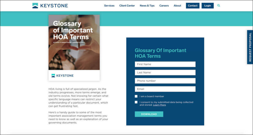
Their client center also contains longer downloadable resources. These longer thought leadership pieces are accessible once a simple form is filled out, creating a database of interested prospective clients.
Targeted Calls to Action
Successful websites guide visitors on a journey and provide multiple ways to get in touch. Different calls to actions should be present throughout a website to appeal to audiences at every stage of the buying process.
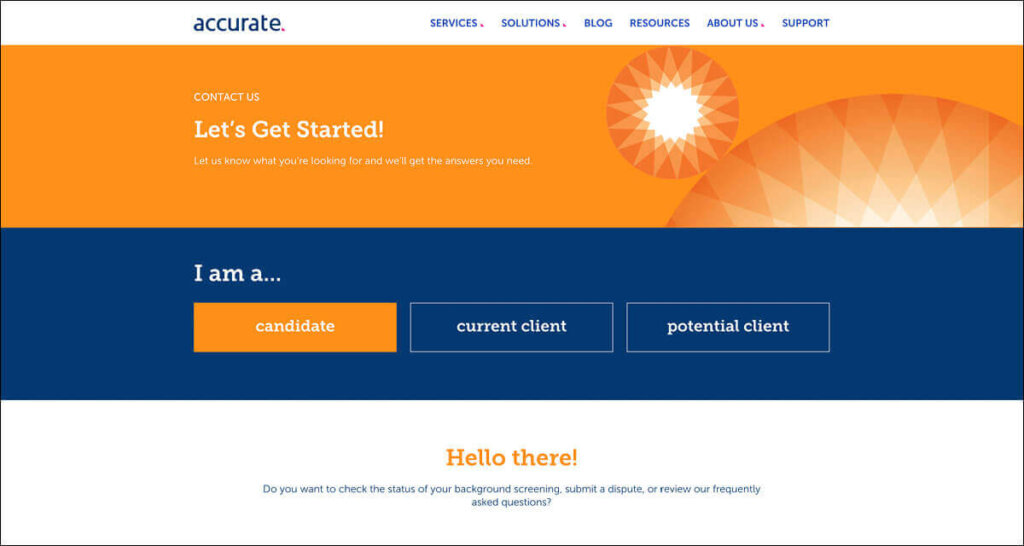
Accurate has a tiered contact page that helps funnel different types of visitors to the appropriate forms and resources.
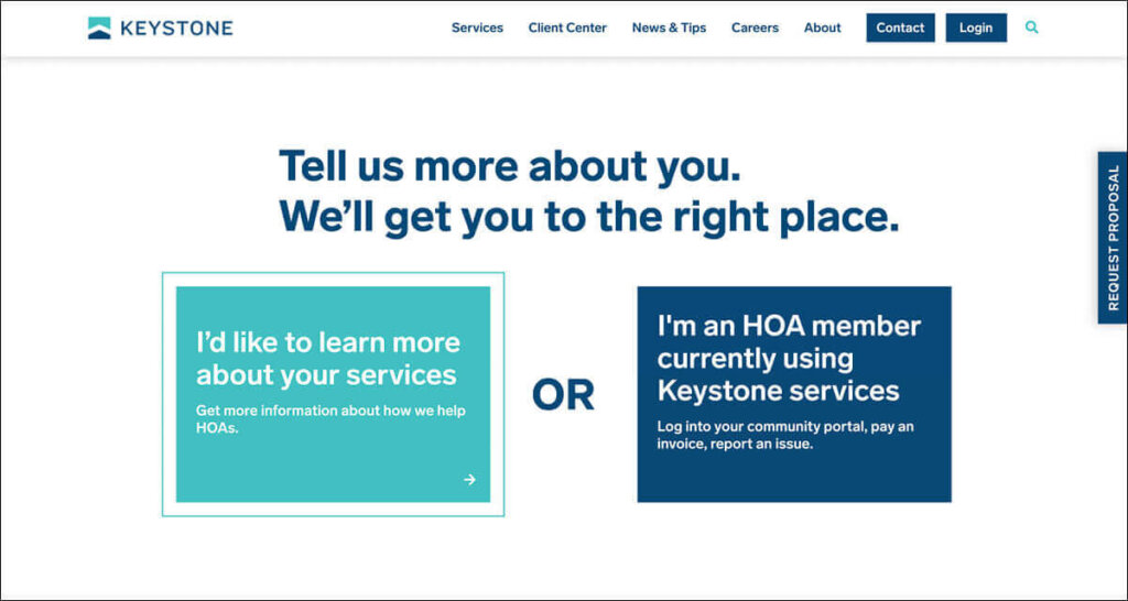
Keystone includes a self-identifying section right on their homepage. Potential customers and current clients are directed to content that would be of specific interest to them.
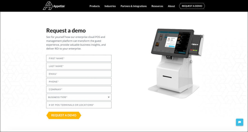
Instead of a generic “Contact Us”, Appetize includes a more targeted “Request a Demo” form. The animated gif shows off their software in action and helps entice visitors to learn more. Incorporating a chat feature also allows more eager visitors to ask questions in real-time.
For a B2B website to be successful, it must not only accurately communicate its brand promise but also stand apart from the competition. New visual and interactive trends however should be used with intention and always with the target audience and business objectives in mind.

