Redesigning your B2B website is always a large undertaking and sometimes it’s hard to know where to start. It’s always good to ask yourself questions – like what’s working and what’s not working. Keep a running list.
Next, it’s helpful to see what’s the latest and greatest in B2B websites – do research and find inspiration.
To help provide some inspiration, we put together a list of some of our favorite B2B websites and what we love about them. Check it out and hopefully, it will get your creative website juices flowing.
Justworks
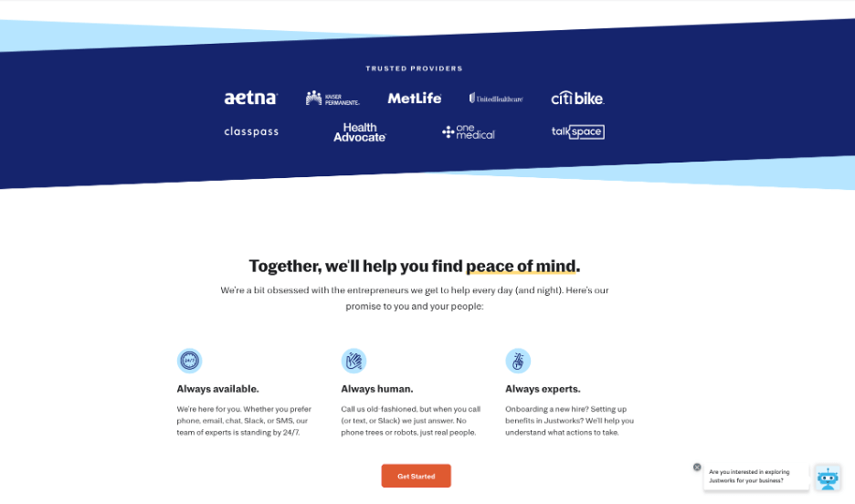
Justworks is an HR and benefits software platform and service provider. The company caters to business owners and entrepreneurs and, while the world of HR, payroll, benefits, and compliance is complex, its B2B website design and value are simply and clearly defined.
The website does a great job of giving a solid overview of the platform in a concise and user-friendly manner. In addition, the site has a consistent call-to-action that stands out. Lastly, it does a good job of building credibility by touting the firm’s insurance providers and makes it easy to reach out with a chatbot.
MailChimp
https://mailchimp.com/resources/marketing-tips/
MailChimp started off as an email platform provider but has grown into an “all-in-one Marketing Platform for small businesses”. While the website is good, its resource section is top-notch. For most B2B companies – the resource or blog section of the B2B web design is a critical feature of the website. It demonstrates thought leadership, builds credibility, drives organic traffic, and provides value to prospective and existing clients. Visually, this site’s resource section has cool, custom illustrations that pair with each article. In addition, it’s easy to navigate and has a ton of terrific content, that you can easily sort through by topic.
Evernote
https://evernote.com/why-evernote
In my opinion, Evernote is one of the most elegant pieces of software I’ve ever used. It takes no time to learn and is incredibly powerful. It’s no surprise its website captures this essence with powerful, concise copy and a minimalist but punchy design. While many B2B websites tend to go into too much detail and not clearly define their unique value proposition, Evernote stands out in particular with the “Why Evernote” page. The page clearly defines its competitive advantages – both with copy and visuals. Subtle animation keeps the user engaged without overwhelming them with too much info.
Zeotap
Zeotap is a customer data intelligence platform the helps marketers leverage customer data with privacy and security in mind. Bop Design worked with the marketing team at Zeotap to create a new website and it’s one of our favorite of this year for a few reasons.
First, the home page clearly and concisely describes Zeotap, highlights its value proposition, and builds credibility with all its awards and recognition. Second, the B2B website is rather large, but the main and secondary navigations make it a breeze to get to any area of the website in one or two clicks. Last, but not least, the case study section is visually intriguing and immediately builds value with client logos and key statistics without having to even read the full case study.
Atila
Atila designs and manufactures custom jewelry for brands. Bop Design worked with its founder, to create a B2B website design that showcases the beauty, process, and value of its custom jewelry. This website is a stunning example of how to utilize video and imagery to create an engaging B2B brand story and concise, compelling copy to bring it to life. The site also utilizes elegant movement and animation subtly guiding the user into key areas of the website.
Ready for a cool, new design for your B2B website? Schedule a chat with Bop Design today to discuss your new website.


