You’ve decided it’s time to redesign (or if you’re a startup, design from scratch) your B2B website.
You’re pumped.
You say to yourself, “This is going to elevate our image and generate a ton more leads!”
Then you sit down and stare at that blank screen thinking, um, so what do I put on this thing?
Start Here
Start with your B2B website’s homepage. Your homepage is the first thing your site visitors see. It sets the tone for the rest of your website and serves as a guide the rest of the pages will follow.
In this post, I’ll discuss some of the key elements your B2B website’s homepage should have. Naturally, not every homepage will have all of these elements, and some may have elements that aren’t on this list. What ultimately ends up on your home page depends on the nature of your business and its goals, but these should spark some ideas.
Hero Section
Whenever you land on a business’s homepage, the first thing you see is called the “hero” section. This is the section at the top of the page, usually directly under the site navigation. It should include a captivating headline and strong graphic element, whether it’s an image, video, or infographic.
In the hero section, you want to capture the viewer’s attention, provide a brief overview of what your company does, and briefly explain your unique value proposition. B2B website visitors will leave your site in a matter of seconds if they don’t see what they are looking for, so engaging them immediately is crucial.
Learn more about our B2B web design services.
Navigation and Site Map
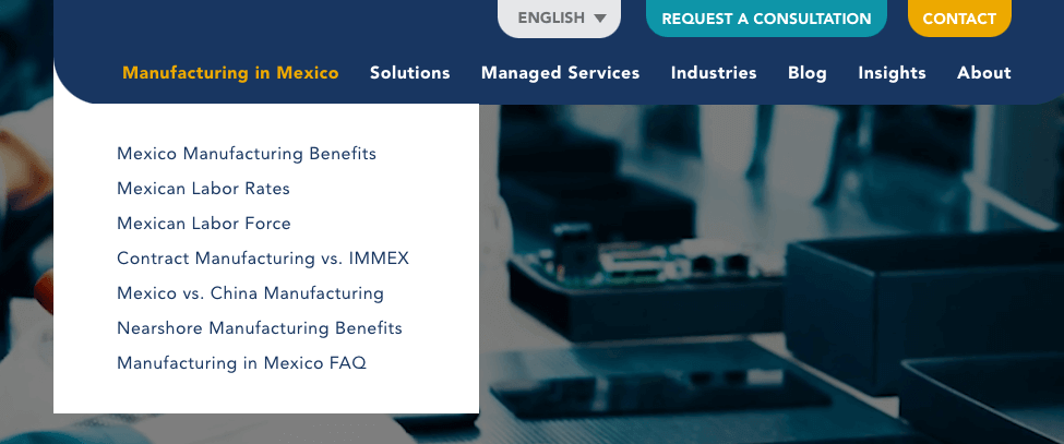
While your homepage is the star of the show, your subpages (e.g., product pages, process pages, case study pages, etc.) are where prospective customers get important details about your solutions that can help close the sale. Whether site visitors are browsing around or they know exactly where they want to go, be sure your menu of pages is highly visible and easy to navigate.
Your site navigation should appear at the top of your homepage (and every page). Don’t get fancy and put your navigation somewhere else for the sake of being different. Website visitors want familiarity when it comes to function and always look to the top of the page to find your menu.

You can also include a full sitemap at the bottom of your B2B web design. This isn’t necessary – and it doesn’t need to include every page – but website users may also look at your footer if they want to see your first, second, and sometimes third level pages quickly.
Products or Services
B2B website visitors are looking for solutions to their problems – problems your products or services can help them solve. If your company has several products, you can list some of them on your home page with a brief description and link to a subpage that covers your offering in more detail. If you only have one product, you can spotlight it on your home page with a few highlights, then link to its respective page.
Read more: B2B web design tips.
Benefits
The age-old question on all of your website visitors’ minds is, “What’s in it for me?”
They want to know how your solutions help make their job easier, more efficient, streamline workflows, or enable them to save money. Be clear about how your offerings will help solve these problems for them.
How It Works
If your solution is complex, it’s helpful to briefly describe how it works. Keep this concise, and simply provide a high-level overview so they understand the different facets of the solution. Breaking this down into steps or components in a visual manner, like in an infographic, helps aid in understanding.
Read more: Why B2B web design projects are emotional…and what you can do about it.
Industries
If your B2B business works with specific industries, list them out on your homepage. Seeing their industry highlighted on your homepage gives your prospects confidence that you have experience working with someone like them and understand the nuances and challenges of their particular job.
Read more: How to write for your buyer personas.
Credibility Builders
Now that you’ve explained who you are, what you do, and how it works, it’s time to build credibility. Prospects want to see some kind of evidence that you actually do what you say you can do.
Credibility builders can include:
- Testimonials: Glowing reviews from clients provide proof that you deliver on your promises and keep customers happy.
- Case studies: Client stories give prospects a glimpse into what it’s like to work with you. It details the challenge, how you approached the challenge, and the results. When prospects see you’ve gotten outstanding results for others, they feel more confident in your ability to get results for them, too.
- Client list: Including a list of clients tells prospects at a glance the caliber of clients you’ve worked with. This works best if you have a roster of clients prospects recognize. They think, that if this Fortune 500 company trusts this business, it must be legit.
- Awards: If your company or product has won industry awards, showcase them on your home page. Third-party validation goes a long way in reassuring prospects that you’ve got an exceptional product or service.
Thought Leadership
Many B2B companies are in niche markets. Demonstrating expertise in your area through blog posts, videos, ebooks, infographics, webinars, and reports shows you are an expert in your field and understand the pain points of your target audience.
Including thought leadership content is great for top-of-funnel prospects who may not be ready to contact your sales team yet. If they value your content, they are more likely to share the content with colleagues (directly or via social media), and importantly, return to your B2B website for more content or to make contact.
Gated Content
This one could also fall under thought leadership, but gated content refers specifically to content the visitor downloads only after completing a form. If you are gating content, it should be a high-value offering like a white paper, e-book, or webinar that includes compelling information the visitor would be willing to exchange their contact information for.
You should avoid gating sales materials or anything that focuses on your company, products, or services. Deliver content the reader can use to help them perform their jobs better, or offer expert insights on the industry they won’t find elsewhere.
Gated content is excellent for lead generation – the contact information can feed directly into your CRM, or you can forward the contact to your sales team for lead nurturing.
Calls to Action (CTAs)
So you’ve made a convincing case for your target audience to buy your products or services – now make it easy to do so! Provide many ways to get in touch with you, whether it’s to request a demo, get a free trial, or just reach out with questions. Make your CTAs large and clear – attention spans are short and you don’t want to lose your prospects because they’ve tired of hunting for ways to get in touch with you.


