Why is a website page that most people get to by “error” and don’t see very often, so important for a B2B website?
It is an opportunity to create a personalized experience and engage directly with a potential customer. A unique, informative, and creative 404 page will transform an “error” into a positive moment.
What is a 404 page?
A 404 page informs a visitor to a B2B website they have reached the domain they requested (specific web address), but the URL path provided no information. Below are several reasons why a 404 “error” page would come up for a user:
- A mistyped URL—the page link is typed incorrectly into the user’s address bar.
- DNS settings issue—most likely to happen with recently registered domain names. It will usually resolve itself with time.
- Caching issues—a user’s browser has cached the B2B website before it was made available.
- Missing asset—an asset (download, video, etc.) or a page has been moved without providing a proper redirect.
Great examples of custom 404 pages
Let’s take a look at a few examples of custom 404 pages and what makes them great.
Liongard’s 404 page is a great example of creative branding that is carried out in every detail of the site. The company’s brand, logo, and playful messaging have been incorporated into the page.

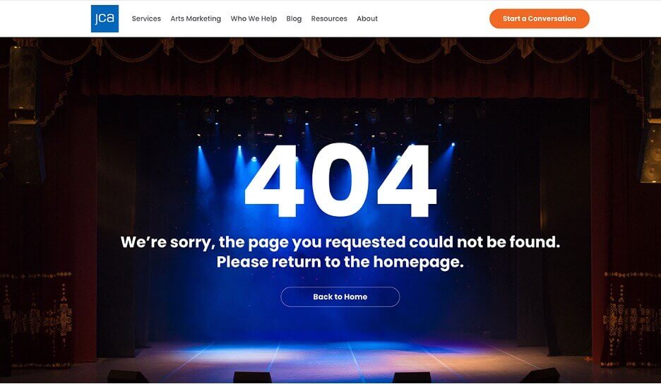
JCA’s 404 image showcases a real-life environment of their target market, a professional stage. The image is also a playful metaphor for “no information found”, and demonstrates JCA’s expertise, and knowledge within the industry.
Bop’s 404 page uses bold, playful, direct messaging to inform the user that they have reached this page in error, while also offering up some good alternative roads to take.
What are the benefits of including a uniquely designed 404 “error” page?
1. Can affect a user’s emotions in a positive way
Humorous, well-written, and visually interesting 404 pages have made me laugh out loud or smile to myself. It’s an unexpected moment for the user, in most cases a user has arrived at this page through their own error. Seizing the opportunity to engage positively with a potential client who is “lost” on a B2B website is touching and thoughtful. It also indicates to the visitor that the company cares about their interests and provides great customer service.
2. Website continuity
Whenever I see 404 pages that are in different fonts, colors, or layout styles than the rest of the site it makes me think that the company is not detail-oriented or informed. Getting a 404 page that is unattractive feels abrupt and jarring—creating negative feelings about the overall website and B2B company.
Read more: How fonts affect the look and feel of your B2B website.
3. Indicates a helpful, competent B2B company
Today, 404 pages are a necessity. User errors and mistakes happen. Having a web page that informs the visitor that an error has occurred and provides some link options to get the user back on track, indicates a helpful, problem-solving company.
Read more: Will video slow down my website?
4. Demonstrates attention to detail
We all know that strong attention to detail indicates quality and accuracy. A well-designed 404 page conveys the company’s commitment to every need that a customer puts forth.
These 404 pages are an integral part of your B2B website design.


