A guide to crafting a B2B web design that provides a great customer experience and improves conversions.
The success of a B2B website design depends on its ability to convert visitors into new clients. The Bop Design team put together this comprehensive guide to help you build an effective new website.
What’s Included:
- Understanding B2B Website Design
- Creating an Effective B2B Website
- B2B Web Design Best Practices: Above and Beyond
- B2B Web Design: Frequently Asked Questions
- Working with Our B2B Web Design Agency
Understanding B2B Website Design
What is B2B website design? B2B web design focuses on creating websites that are tailored to meet the needs of businesses selling to other businesses. The main goal is to present a reliable and professional image while creating a great user experience (UX). Core components in B2B web design are product or service explanations, clear messaging and branding, easy-to-use navigation, excellent storytelling, and inviting calls-to-action. Everything on the website is crafted with the target audience in mind.
The Buyer’s Journey
What differentiates B2B website design from B2C website design are the special considerations and preferences of business decision-makers. It’s crucial for a website design agency to understand the buyer’s journey and the role of the B2B website during the decision-making process. For B2B services or products, the decision-making process often involves multiple stakeholders, influencers, and decision-makers at various levels in the company and across different departments. As such, a B2B website design must speak to all those who impact the buying decision. An experienced website designer is able to accommodate all those involved on the buyer’s side and craft designs that are coherent and flow well.
Content Marketing in B2B Web Design
B2B website design is not merely the look and feel of a website, but also the content housed in the design and the messaging. While web design helps to guide the buyer visually throughout the site, messaging and various content marketing pieces are essential to educate and connect with the buyer as they navigate through the website and the decision-making process. It’s important to not only write website pages that build trust while explaining the products or services but also to provide other valuable content resources for all those involved on the buyer’s end. Pieces like blog posts, downloadable guides, case studies, client testimonials, videos, and white papers must be integrated into the B2B website design to convert the website visitors into leads and to provide resources to get internal buy-in from other influencers and decision-makers.
Learn more about how to create content for all stages of the buyer’s journey.
Creating an Effective B2B Website
At Bop Design, we often hear our clients express a desire for a B2B website that mirrors the ones they admire. However, web design is not a one-size-fits-all solution. The right website design for your business should match your brand and resonate with your specific audience.
Your Brand’s Value Proposition
There are website elements central to effective lead-generating websites. One is a clear representation of your brand’s value proposition. Visitors must get this value proposition within a few seconds of arriving on your website, or they will likely leave.
Page Speed Load Times
A second element is a website that loads quickly, as any delay will cause your potential clients to leave and go to a competitor’s site. How quickly your B2B website loads for all users, regardless of the device they are using or the speed of their internet, is essential for an effective website. B2B buyers often have heavy workloads and a variety of responsibilities, so time matters. Ensure your website design loads quickly and seamlessly without any delays. Additionally, page speed is a critical factor for search engine rankings so it’s essential to ensure visitors can find your website and get to the information they need on the website.
User-Centric Design
Needlessly complex web designs can negatively impact the visitor’s experience, so it’s ideal to keep a design simple and the navigation intuitive. Clear website menus and expertly laid-out navigation paths create a frictionless and enjoyable experience for website visitors. Successful B2B websites are crafted with user-centric design that provides an easy-to-follow flow and path through the website without anything that jars or hinders the website visitor. Part of this includes thinking and designing around what the website visitor needs, any challenges they have, and what matters most to them.
Consistent Brand Across All Platforms
A B2B website design does not exist in a vacuum. It’s often the hub or centerpiece of a larger digital marketing strategy. Effective website design incorporates all platforms (social media, email, ads, etc.) and sets the stage for a consistent brand experience. Cohesion is the name of the strategy when it comes to high-performing websites. A person interacting with your brand should have a consistent experience whether they are reading a blog, viewing a web page, reading an email newsletter, or viewing your social media.
Optimized for SEO
Search engine optimization should not take place after a website is launched, but must be considered when crafting a B2B website design. Things like site architecture, web page content, headers, URL formats, blog positioning, image sizes, video integrations, etc., all impact the search engine rankings of a website. As such, it’s important to work with a B2B web design agency that incorporates SEO best practices into website design and content creation.
Content that Converts
Content is crucial to attracting and converting visitors into leads. It must speak to the visitor’s needs and motivate them to continue exploring the solutions your firm offers. High-converting websites describe all products and services plainly, without a lot of industry jargon or unnecessary technical language.
Well-crafted, effective website designs make an immediate impression when a visitor arrives and ensure the potential client understands what your brand offers, the benefits to them and their business, and the next steps to take in the buying process.
B2B Web Design Best Practices: Above and Beyond
The B2B buying journey tends to be longer than the B2C buying process and often requires in-depth information and more points of contact throughout the process. Additionally, the cost of the product or service tends to be higher for B2B and may require full customization based on the company’s needs or requirements. A major differentiator for the B2B buying process is that it’s focused on building a relationship, rather than a quick transaction. With this in mind, the best B2B websites stand out by setting the stage for a unique, tailored experience for each person in involved in the buying process.
Best B2B Website Designs of 2023
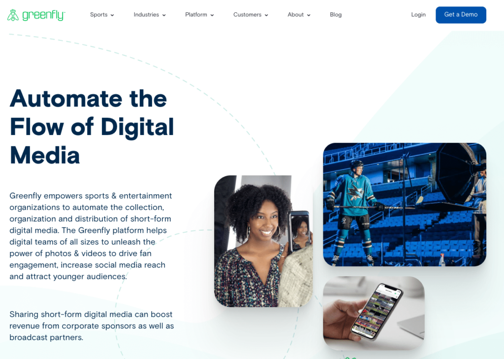
Greenfly: https://www.greenfly.com/
The website design for Greenfly incorporates a subtle illustration and animation that is on-brand, while maintaining a simple and clean look. Additionally, the photo frames create compositions and are animated when the visitor scrolls down the page.
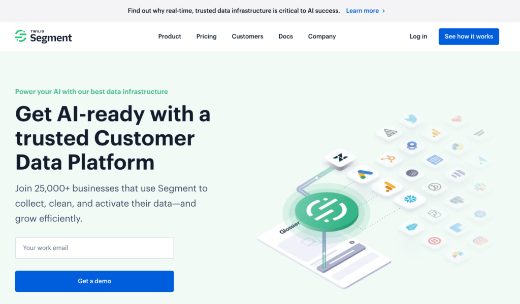
Segment: https://segment.com/
The overall look and feel of Segment’s website is a pared-back color scheme, but it’s not boring at all. The use of large shadow effects help to add depth and the site showcases custom on-brand graphics.
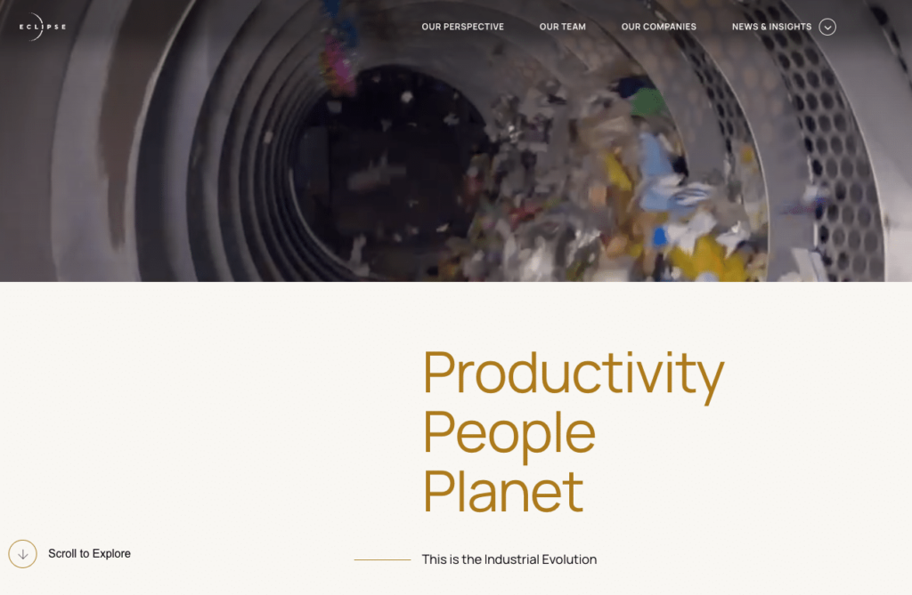
Eclipse: https://eclipse.vc/
Eclipse’s website is primarily photo-driven with custom client photography the helps to build credibility for the brand. All the messaging on the website is simple and the type is enhanced by animation to create interest. The color scheme is also simple, contributing to a clean look and feel.
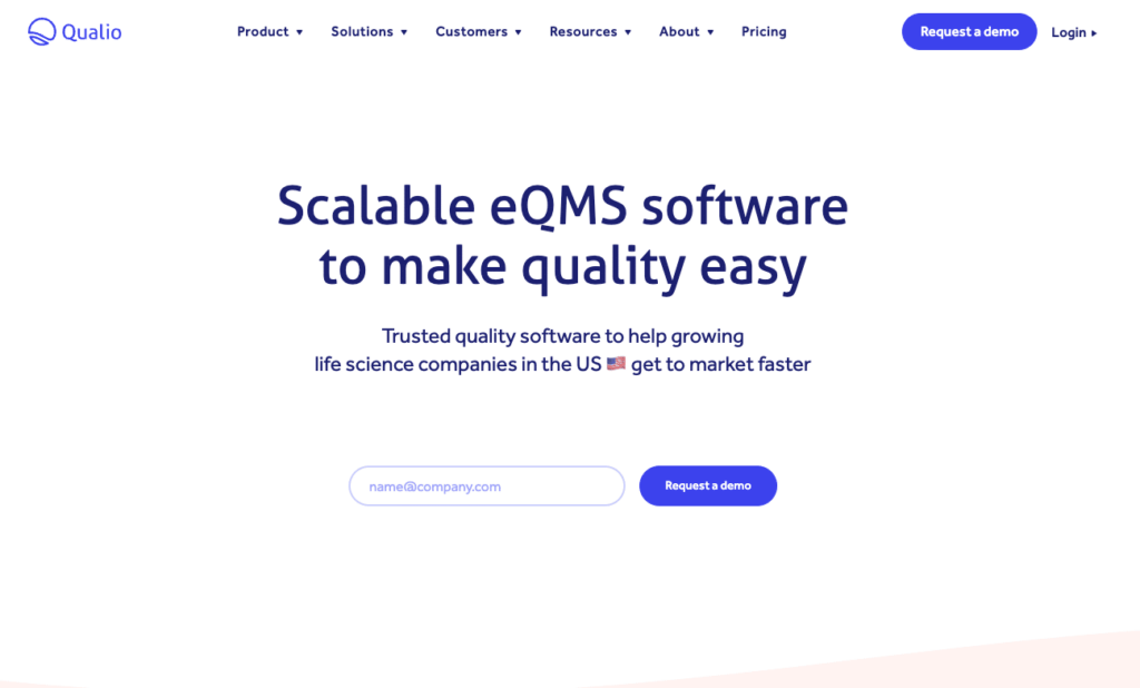
Qualio: https://www.qualio.com/
This website has an interesting pastel color palette and uses organic icons and shapes while still remaining professional. Product visualizations and a robust customer stories section further enhance the quality of the design.
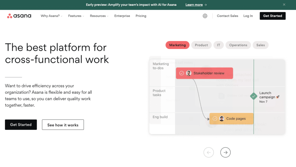
Asana: https://asana.com/
The project management platform provider’s web design makes clear what they offer, illustrates the process with cool page scroll effects, and is easy to navigate. A great example of a large, complex website with an intuitive UX.
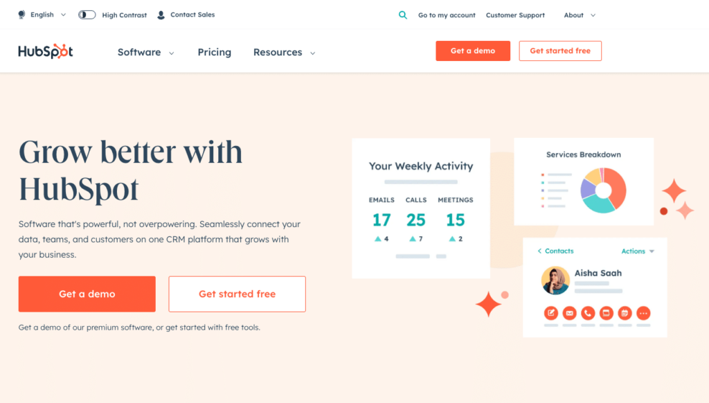
HubSpot: https://www.hubspot.com/
The design of the HubSpot site is fun and uses illustrations to emphasize customer outcomes/benefits. We like this design because it takes a complex theme and makes it simple. Also, the product walk-through is nice feature to educate visitors on the features and benefits of the solutions.
Acme: https://acme-world.com
This is a great example of a streamlined and simple website, but it still looks very cool. The site only has a few modules that do all the heavy lifting. Overall, the site showcases a consistent style and a treatment of photography, considering the subject matter.

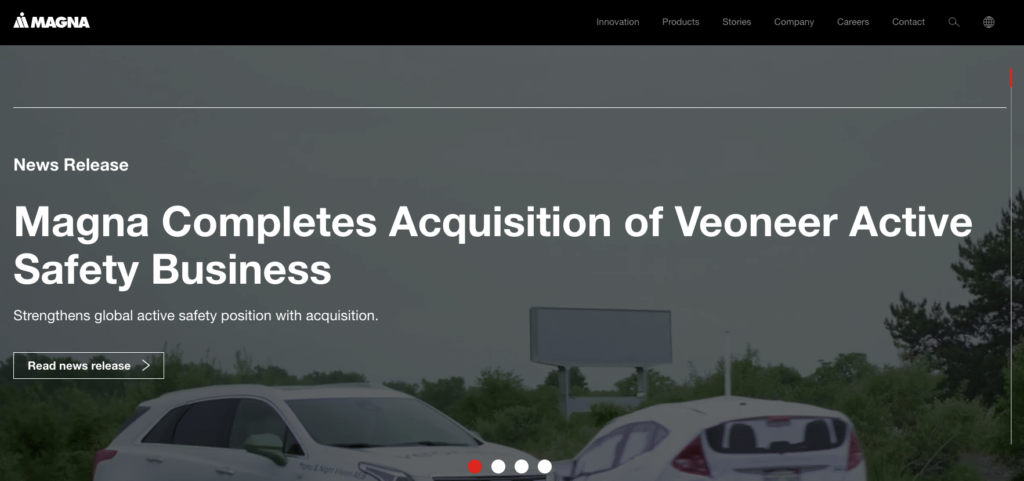
Magna: https://www.magna.com
Magna’s web design is simple in terms of layout, fonts, and colors. However, the page scroll makes the design feel high-end. The large fonts and full-screen photos and videos add interest to the design and engage the visitor.
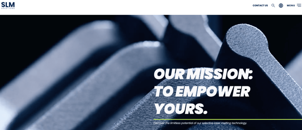
SLM Solutions: https://www.slm-solutions.com
Big powerful brand messages make an impact on the SLM Solutions website. While the colors are limited, they are bold and the site expertly incorporates video and imagery for maximum effect. It does have an unorthodox navigation, which is consistent with the overall brand.
ClickUp: https://clickup.com/
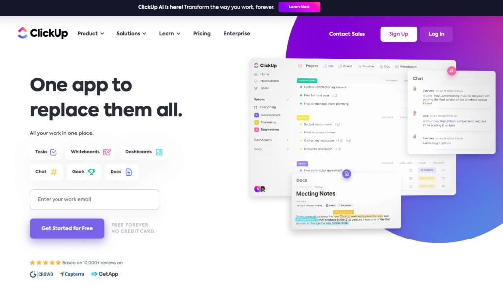
ClickUp’s site navigation is very user-friendly for such a robust website. The use of animation to illustrate product benefits is exciting. Overall, the web design implements good use of color and strong yet concise brand messaging. What differentiates the brand from competitors is clearly communicated in the content.
Outcome Security: https://outcomesecurity.com/
The website design for Outcome Security has a great use of typography as the core design element. The copy is clear, concise, and benefit-oriented despite covering a highly technical topic. The cool use of graphic layering of movement guides the visitor through the website. The design is user-friendly and relies on color to indicate action.

Laserfiche: https://www.laserfiche.com/
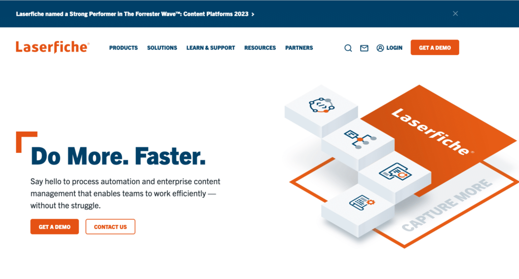
Here is another example of a super clean design with a limited color palette. The site has a user-friendly navigation and nice use of animated graphics to show value. The site’s brand messaging is engaging and concise. Lastly, the design makes good use of credibility-building elements, like awards, stats, client logos, etc.
B2B Web Design: Frequently Asked Questions
-
Why is B2B web design important?
B2B website design because it’s the digital face of your business and is often the first interaction a potential buyer has with your business. It’s the first impression your prospects have of the products and services you provide and what separates you from your competition. A well-designed website should demonstrate your brand values, showcase your expertise, and increase conversions and sales.
-
What should I consider when designing a B2B website?
First, it’s crucial you understand your target audience and what matters to them. Then, you need to make sure your website is easy to find (think SEO), simple to navigate, displays properly on any device the visitor is using, and loads quickly. Providing quality content that resonates with your audience is essential, along with clear call-to-action buttons.
-
How is B2B web design different from B2C?
B2B websites often showcase more complex products and services with longer sales cycles. The information on them typically includes more detailed information, technical specifications, white papers, case studies, and other resources to help buyers evaluate the product or service. B2B websites must speak to various stakeholders at the prospect’s company and their individual needs and concerns.
-
How often should I update my B2B website design?
The answer to this depends on many factors like your industry, competition, and the products or services you provide. However, a good rule to follow is to update your website every 3 – 4 years to keep it fresh, engaging, and current on the latest design and technology trends in the marketplace.
-
How can I measure the success of my B2B website?
Measuring the success of your B2B website includes a variety of different metrics. These may include the number of website visitors, time spent on the website, results (like form completions or content downloads), and ultimately the revenue it generates from the converted leads. By regularly monitoring these metrics, you can get a grasp on the overall performance of your website and any opportunities for improvement.
Designing and launching an effective B2B website is a strategic process that requires understanding your audience, showing them the value of your solutions, and creating an engaging user experience. It’s not just about the visual appeal of the site, it’s about creating a powerful tool to grow your business and improve your brand’s digital presence.
Working with Bop Design on Your B2B Web Design
At Bop Design, we understand what it takes to create websites that are not just aesthetically appealing but also deliver results. Our web design process starts by getting to know your business, your target buyers, and your overall goals. We use this information to craft custom website designs that express your brand and resonate with your target audience. From intuitive navigation and responsive design to high-quality content and powerful calls-to-action, we ensure that every aspect of your B2B website is polished, professional, and effective.
With our years of experience in B2B website design, you’ll get a website that helps you stand out in your industry and achieve your business goals. In an increasing online, digital world, you website is critical to the success of your business. We’ll work with you to craft a well-designed website that converts website visitors into qualified leads and improves the client experience. Contact us today to take your B2B web design to the next level.
Key Takeaways for B2B Website Design
Successful B2B website designs don’t just happen. They require strategic planning, a focus on excellent user experiences, and deep expertise in design best practices. Functionality and great design can exist together on a website when you work with the right B2B web design agency. Your B2B website should be an asset to your business, helping you stand out in a competitive market, attracting new clients, and driving the growth of your business.


