Lately, there has been significant momentum towards Digital Accessibility for websites. This can be attributed to several factors, including the growing emphasis on DEI (Diversity, Equity, and Inclusion), and the COVID-19 pandemic—which sped-up the timeline for content making the digital leap. Together, these factors have propelled the importance of Digital Accessibility for B2B websites to new heights.
Ensuring accessibility has become an essential aspect of B2B website design and development, guaranteeing that individuals with disabilities can access and use websites or mobile applications without encountering access barriers. However, achieving accessibility compliance is often a challenging endeavor that demands a comprehensive evaluation of a website’s design, content, functionality, and code.
Below are a few simple things that you can do to improve upon the overall accessibility of your B2B site.
Provide alternative text descriptions for images and graphics
‘Alt text’ is short for ‘alternative text’ and is an attribute that is added to an HTML image tag. Its purpose is to convey image content to visitors who are unable to see the image. It is also helpful if an image fails to load—alt text will display in its place. Search engine bots also index alt text information and consider it a determining factor for search engine rankings. Providing alt text is a B2B website best practice and is easy to accomplish in the WordPress backend.
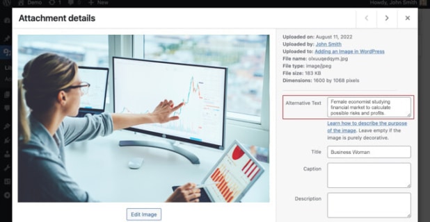
Example of alt text option on the backend of a WordPress site. Pro tip: make sure your “alt text” and “title” are not the same, this is redundant for a screen reader. Alt text should elaborate on the visual, making it easier to understand.
Ensure that website content is easy to navigate and can be accessed using a keyboard
A website that is accessible does not exclusively rely on the mouse, touchpad, or screen for navigation. Instead, it provides all functionality through the keyboard as well. There are many reasons why a website user may prefer not to use a pointing device for navigation—an injured limb or weakened muscles are just a few examples. Keyboard accessibility also enables individuals who utilize assistive technologies that mimic the keyboard, such as voice control devices.
Below are some basic keyboard navigations:
Tab – move to next interactive element
Shift + Tab – move to previous interactive element
Return/Enter – activate elements (links, buttons, etc)
Spacebar – activates buttons (such as to pause/play videos, submit forms, etc)
Esc – close opened content (modals, navigation menus, etc) or cancel current action
Arrows – navigate within widgets (tablists, checkboxes within a disclosure button, etc) and navigate around a page
Provide captions and transcripts for all video and audio
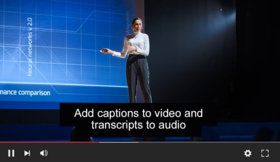
Example of captions placed in a YouTube video
A transcript is a written record of the audio contained in a video or audio file, including all spoken content as well as significant non-speech sounds or tone indications when someone is speaking.
Captions, on the other hand, are timed transcripts that appear synchronized with the audio as a video plays. Closed captions can be turned on and off by viewers, while open captions are always visible and cannot be switched off.
If there is audio content without accompanying video, transcripts should be provided; if video content is present, captions should be provided, and a transcript may also be provided for the video in addition to the captions.
Transcripts and captions are essential because they provide access to audio or video content for individuals who are deaf or hard of hearing. They also benefit a diverse group of users, including those who are not fluent in the video’s language or are unfamiliar with the speaker’s accent.
Use clear and simple language that is easy to understand
In the Web Content Accessibility Guidelines, WCAG 2.1 (the global standard for developing accessible digital content put out by the W3) understandability is divided into three main areas of concern:
1. Readable: Various people with disabilities experience a challenge when recognizing written words or when inferring the meaning of a word from context. It is important to identify the language used, as well as any unusual words or abbreviations in your website content.
2. Predictable: Presenting your B2B website content in a predictable order and having your site behave predictably is essential for people with disabilities to successfully use and navigate your B2B website. Examples: left to right, top to bottom, consistent navigation, clear headings.
3. Input Assistance: People with disabilities, and their assistive technologies, often make mistakes more frequently when entering information. For them to better understand the problem and correct the issue, websites should provide clear error messages and help prevent errors whenever possible.
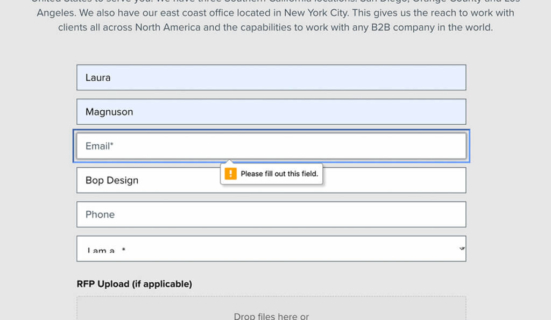
Websites should provide clear error messages and help prevent errors whenever possible.
Ensure that all website functionality is accessible using assistive technologies
25% of people in the U.S. have a disability. Below are some of the technologies used to help assist those with a disability navigate the Web:
Magnification Software
Allows people with bad eye site to read your website using magnification software.
Screen Reader Software
Helps someone who is blind navigate a site by reading the site for them. Runs by keyboard command instead of a mouse.
Keyboard Accessibility
Access to website using a keyboard only.
Dictation Software
Works with voice commands. Users use voice commands to navigate websites.
Providing a “skip navigation” link at the top of webpages, allows people who use screen readers and other assistive technologies the ability to ignore navigation links and skip directly to webpage content. Most major corporations have this feature on their site. This feature/button appears if you hit the “tab” key when entering a site.
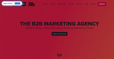
Example of skip navigation link.
Ensure that website colors and contrast are easy to read for people with visual impairments
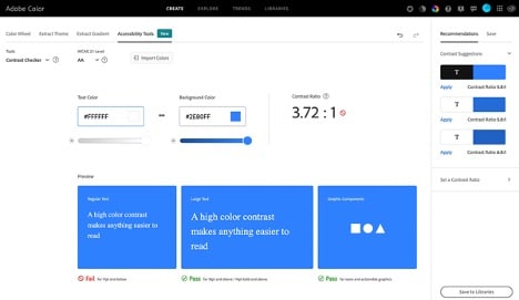
Adobe’s new accessibility tool helps in adhering to contrast guidelines.
Always meet level AA criteria: contrast ratio of 4.5:1 for normal text and 3:1 for large text. For people with moderately low visual acuity (20/40), the contrast ratio between text and its background should be at least 4.5:1. For large-scale text (at least 18-point normal or 14-point bold), a contrast ratio of at least 3:1 between text and its background is recommended.
Adobe provides a great tool to test your contrast to see if it complies: https://color.adobe.com/create/color-contrast-analyzer.
Ensuring equal accessibility for digital content is not only important for legal reasons, but it is also the right thing to do. By making digital content accessible to everyone, businesses and organizations can ensure that they are reaching the widest possible audience and providing equal access to their goods and services.
