While the term dark mode has gained traction for mobile apps, gaming, and other UI platforms, it’s popping up more in B2B website design discussions and requirements. If you are curious whether you should consider a dark mode design for your B2B web design, here is what you should consider first.
First, we’d like to make a distinction between “dark mode” vs “dark design.” They are not technically the same and as a B2B web design and development agency, we want to be clear.
Dark mode defined
Dark mode is a global setting an individual user can turn on or off on their own device, be it a computer or smartphone. Essentially, it makes everything appear reversed out so that the entire browser or interface is dark-themed.
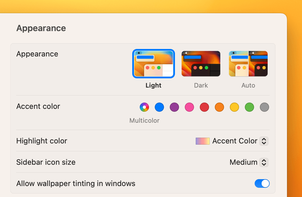
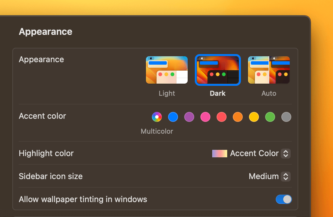
For example, macOS allows you to select “light mode,” “dark mode” or “auto mode.”
You’ll see even from the example of the change in the setting panel that the text and backgrounds are reversed when “dark mode” is selected.
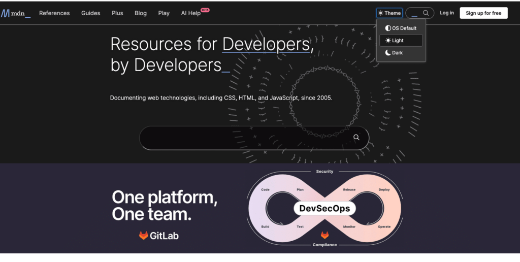
An example of a website designed specifically for the dark mode setting is: Mozilla Developer Network: https://developer.mozilla.org/en-US/
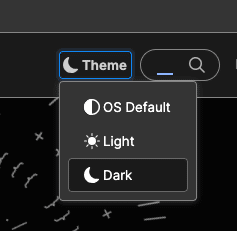
The design even incorporates a toggle for selecting light mode or dark mode that the user can select.
Dark design defined
Dark design, when considering desktop and mobile web design, is an intentionally dark palette that is crafted using the brand colors, rather than just a simple reversal of the light design.
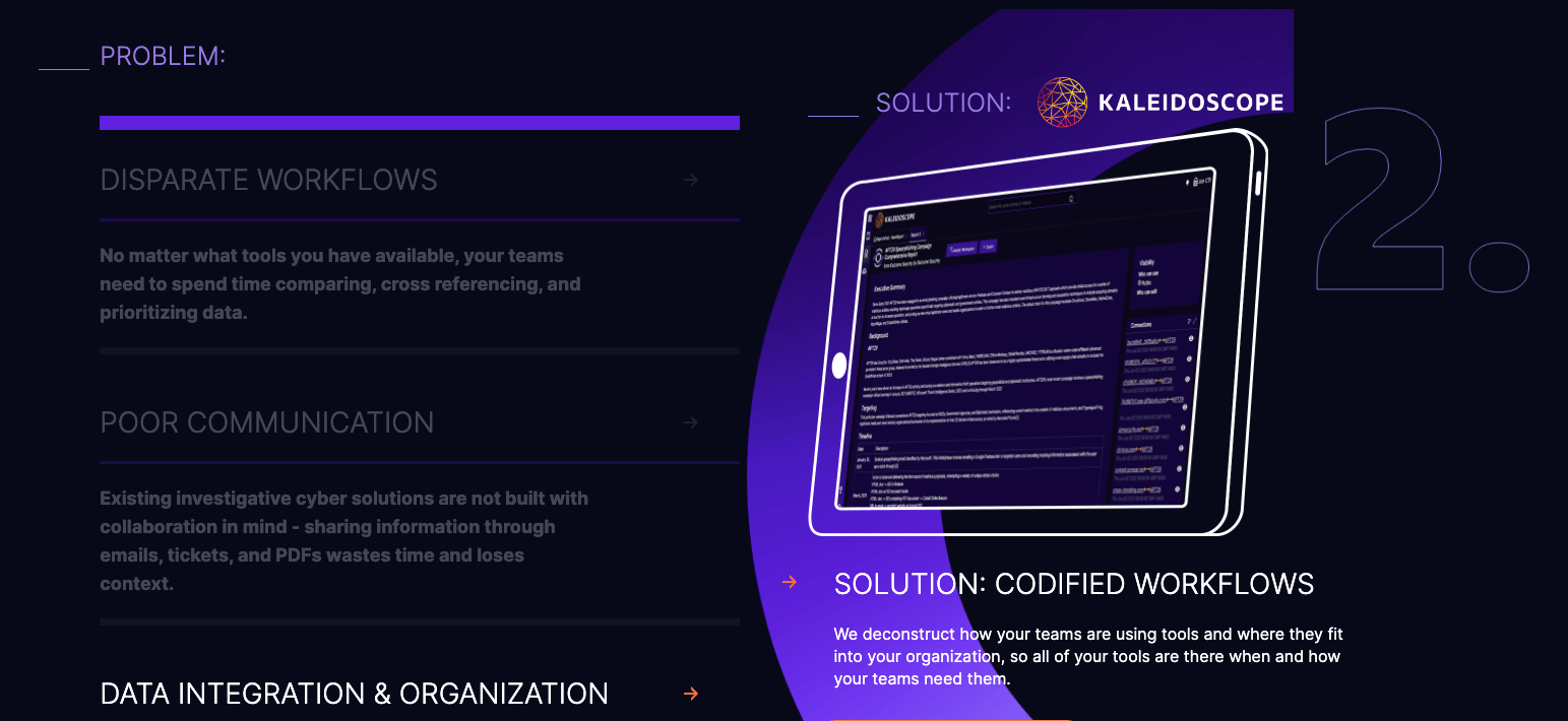
An example of a website using dark design is Outcome Security.
You’ll notice the website isn’t using a pure black background, but is using a blend of navy blue and different saturations of purple. It does incorporate sections that have a white background for interest and variation.
Why companies want dark mode for B2B website design
While dark mode for web design is not a major trend affecting all B2B website design, it does tend to be more common in certain sectors, particularly in the technology and cybersecurity markets.
Companies may elect to go with a dark mode website design due to the following factors:
- The target audience of users and decision-makers predominately use dark mode on all their own devices. This applies to companies targeting website or app developers, IT professionals, and cybersecurity specialists. As such, it makes sense to create an experience customized to the preferences of those visiting the B2B website.
- Primary device usage is also another major factor when deciding on dark mode design. If visitors are accessing a website primarily on a mobile device (>75% of traffic) rather than on a desktop computer, dark mode will provide a seamless user experience. These levels of dark mode adoption on mobile will vary depending on whether the user is on an Android or iOS phone as well.
- A website that relies on text-heavy content and includes little to no imagery or visuals is also a candidate for a dark mode website. Again, the Mozilla Developer Network is a text-heavy, minimal imagery site that works well for dark mode as the main design feature.
Companies that are not great candidates for a dark-mode first design are the opposite of all the factors listed above. Additionally, if ADA compliance or accessibility is a concern or if the company is not targeting a technical audience, dark mode first design is not necessary.
Pros and cons of dark mode for B2B website design
With every type of website design, there are pros and cons to consider. Weighing these out can help you determine if dark mode is a must-have, a nice-to-have, or an unnecessary element of your website design project.
Pros:
- Eye strain reduction is one of the primary positives for using and implementing dark mode on operating systems and designs. However, eye strain is really only a factor for people who don’t have visuals in their day-to-day work – like developers who work primarily with lines of code all day and cybersecurity professionals who are checking system logs, verifying user data, and looking at network security protocols.
- Mobile battery life is another positive point for dark mode in that it can reduce battery usage for displays. However, this gets into OLED vs. LCD displays and if users aren’t spending more than 10 minutes on your site, it isn’t really a large factor for consideration.
- Depth and interest in website design is an interesting pro for dark mode. There are a lot of cool things and forced challenges that come from designing for dark mode. However, the majority of these benefits come from a “dark design” rather than designing for “dark mode” which tends to be more flat.
Cons:
- Accessibility is a crucial consideration in more and more B2B website designs. While it’s extremely time-consuming to make a website look and function well AND be 100% ADA compliant, more sites are doing as much as they can to accommodate visitors with varying ability levels. For example, dark mode negatively impacts users with dyslexia and astigmatism.
- Branding challenges are abundant with dark mode as the primary focus. Even if you work with a highly skilled designer and developer well-versed in dark mode, it is tough to flip many brands to be dark mode-centric. The spectrum of colors that provide enough contrast is limited and the color palette itself is often reduced to high-contrast colors eliminating the option for visual treatments and pastels or lighter color combinations.
- Difficult and time-consuming to implement on image-heavy websites. A true dark mode website design is extremely difficult to create and develop as every single element (icons, fonts, CTAs, and visual elements) needs to be considered in the context of dark mode.
- Limitations for compliance abound with dark mode. For example, if a company is using client logos, industry certification badges, or partner logos as credibility components on a site, the agreement to use these comes with major compliance restrictions. These restrictions can include not inverting colors on the logo, not using in certain shapes, and not skewing the font colors themselves.
- May negatively impact the overall user experience if it’s not tailored to your audience’s needs. If your audience is primarily engineers or construction professionals or accountants, they likely aren’t using dark mode in their everyday work since it would be difficult to read drawings, renderings, or charts with dark mode.
B2B website design recommendations for dark mode and dark design
Before you decide whether dark mode or dark design is the right fit, we have a few recommendations on how it impacts your overall B2B website design.
Research your audience + track usage
Before you decide that dark mode is essential, research your audience. Ask questions like, do the primary stakeholders and decision makers tend to use dark mode? And how many visitors have dark mode enabled?
Ideally, you’ll also track how many users of your existing site are using dark mode. The results may or may not surprise you. Consider that even if you don’t use dark mode, your website visitors may; and that if you do use dark mode, your ideal buyer may not.
Legibility
According to our website design team, legibility is the number one consideration for deciding on dark mode or dark design as it applies to text and visuals. If your brand palette turns into something that is hard to read or look at, dark mode likely isn’t a good fit.
Do colors desaturate and look off-brand?
If you do determine that dark mode is the best fit for your brand and audience, consider how the brand colors look. Do the colors desaturate and look off-brand? The last thing you want to do is create an inconsistent digital experience for your target audience.
Visuals and animations with a white background
The purpose behind dark mode is to reduce the blinding change from a dark theme to a bright theme. If your website is designed in dark mode but your main images have a white background, those will show up as an unwanted visual element to the design. Additionally, stock photography tends to use lighter color palettes. It’s certainly possible to find photos that fit in a dark design, but your choices will be more limited.
ADA compliance standards
Depending on your company’s goals and objectives, accessibility for your B2B website design may be a leading factor. Things like fonts, contrast ratios, and visuals are all considered when designing a website for accessibility. Check out our recent article on accessibility in B2B web design for more details.
Dark mode plugins vs. dark design
Lastly, it’s important to consider your options for dark mode and dark design. For websites that run on WordPress, there are various plugins that you can use to achieve dark mode without having dark mode as your primary design. When using a dark mode plugin, you’ll need to consider the effort level to customize the plugin and optimize the brand experience. The other option is to consider a dark design rather than a dark mode website. Dark design, like the one listed above for Outcome Security, leans into dark colors as the primary palette and incorporates a bright color palette to provide interest and control the visual experience for the website visitor.
Takeaway on dark mode
If you think your core market and website visitors are using dark mode regularly, it’s best from a design and development perspective to go with a dark design to start with rather than to try to accommodate dark mode. It requires fewer concessions, more control, and overall better experience.

