Looking for a little inspiration for your B2B website design? You’ve come to the right place. In the competitive world of B2B marketing, a well-designed website is no longer just a “nice-to-have” – it’s your 24/7 salesperson and often the first impression you make on a potential client.
An effective B2B website design must do more than just look pretty. It needs to attract your target audience, then engage and convert them into leads. This is done through the right blend of creativity and strategy, wrapped up in an experience that feels effortless for the visitor.
In this list of the top 20 B2B website designs for 2024, we’re shouting out the sites that shine above the rest. Spoiler alert: Some of the sites we designed, and some we didn’t – we’re happy to give credit where credit is due.
So grab a cup of joe (or a glass of wine – we don’t judge here) and let’s dive into the B2B web designs that led the pack in 2024.
AddUp
Who they are: 3D printing machine manufacturer
Why we love it:
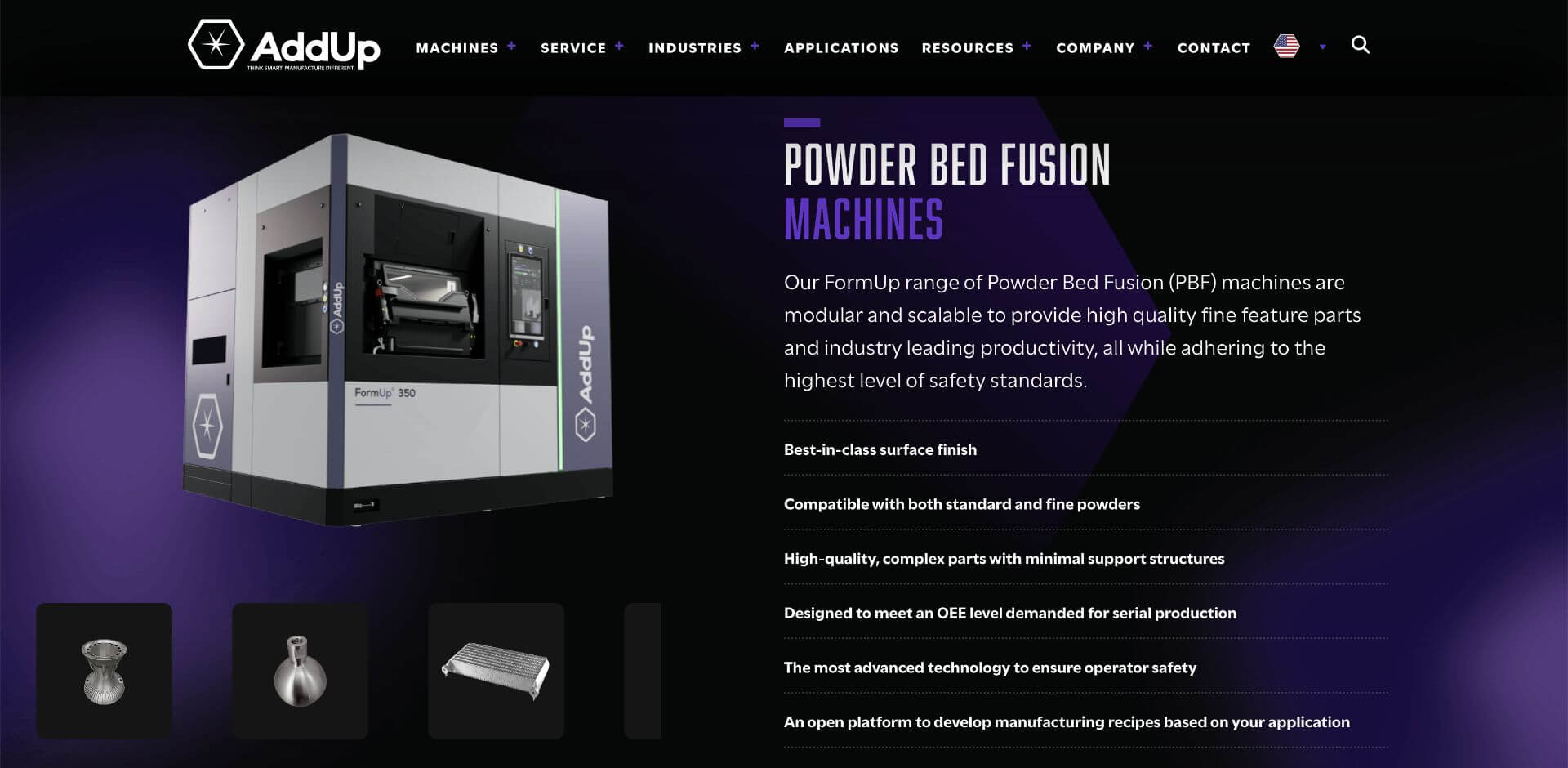
AddUp’s website shows off a sleek, dark-themed design that feels more like a high-end automobile site than traditional tech. With striking imagery of sophisticated machinery combined with intuitive navigation, the user experience (UX) is smooth and engaging. The B2B website, which also has versions in English, French, and German, contains a powerful resource library packed with blogs, videos, webinars, and downloads. The overall vibe is modern and futuristic – a perfect fit for this innovative brand.
Area
Who they are: Workspace solutions company
Why we love it:
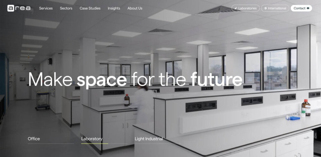
The Area website showcases a seamless combo of design and functionality with its timed photo animations in the hero section, highlighting various business applications without relying on a video or carousel. Bold typography and smooth scrolling animations elevate the UX. Gorgeous photos of the workspaces they create take center stage in this B2B website design, allowing the visuals to communicate the brand’s value with minimal copy.
Backstage Networks
Who they are: IT and data networking provider
Why we love it:
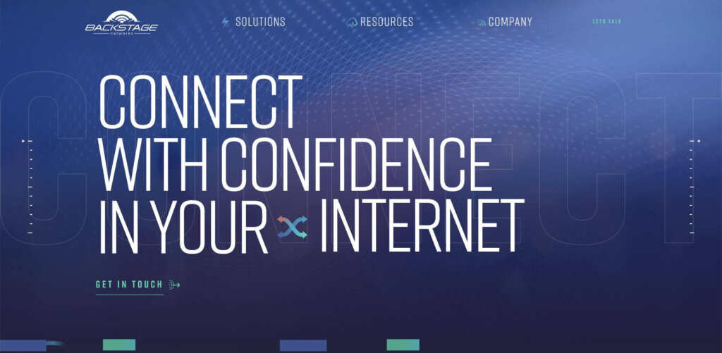
The Backstage Networks website impressively balances high-end professionalism with a tech-savvy aesthetic, appropriate for this provider of data networking solutions. The sleek background paired with bold graphics and engaging animations, creates a dynamic visual experience for target audiences that expect this kind of innovation from a technology firm. With a streamlined navigation of just three menu items, site visitors can easily explore solutions by service or event type, depending on what they’re searching for. Scroll animations and parallax effects add an extra layer of engagement, making the website not just informative but also a visual smorgasbord for visitors.
Bryhel
Who they are: Global cosmetics manufacturer
Why we love it:
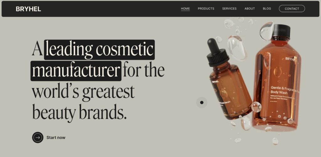
Bryhel’s B2B website captivates the audience with its elegant design and subtle scroll animations that deliver an engaging UX. The “floating” skincare bottles in the hero section create a mesmerizing effect while the minimalist layout showcases stunning product imagery. A well-crafted horizontal scrolling graphic describes their process, making it clear for readers.
Bungee Tech
Who they are: Retail analytics software provider
Why we love it:
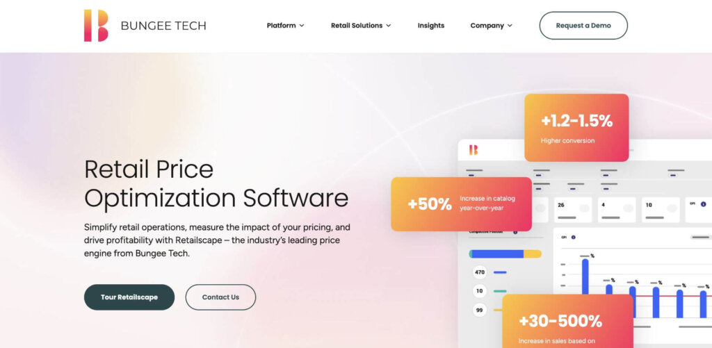
The B2B web design for Bungee Tech marries clean design with bold colors and subtle motion for an eye-pleasing effect. But the real star here is their smart use of metrics to prove their solution’s ROI. With a mockup of its platform, the hero section calls out hard numbers that demonstrate increases in conversions, sales, and catalog. Customer success stories also highlight data-focused results to show the platform’s effectiveness in the real world. Bungee Tech does a great job calling out benefits for each buyer persona.
Dean Dorton
Who they are: Public accounting firm
Why we love it:
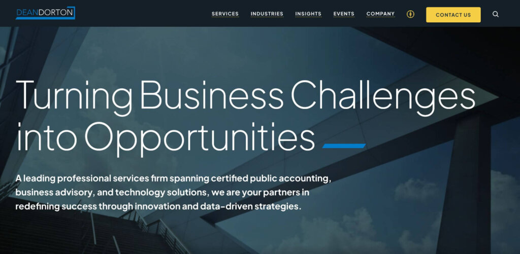
The Dean Dorton website makes a strong first impression with bold typeface and hero copy that clearly states what they do from the start. Despite offering numerous services, the organized navigation keeps everything easy to find. Thought leadership is front and center, with expert-written articles to build trust and encourage repeat visits. The site also uses lazy loading, allowing content to load smoothly as users scroll, creating a faster, more efficient browsing experience (and a boost for optimal page speed).
Deel
Who they are: HR software provider
Why we love it:
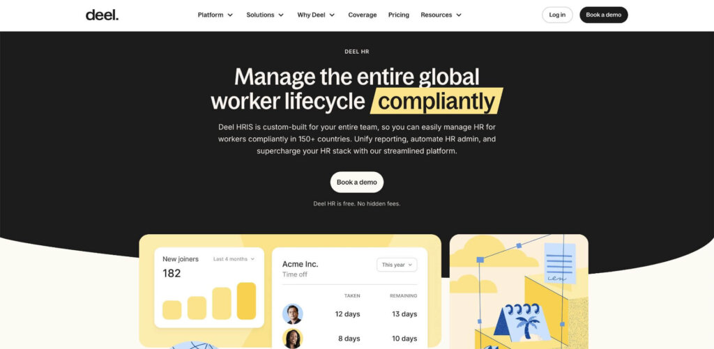
Modern design, custom illustrations, and organic shapes impart a professional yet approachable feel on this B2B website design for Deel. The interactive explainer graphic is the standout here, engaging visitors and making complex concepts easy to understand. Coupled with numerous client testimonials that enhance credibility and clear calls to action in the hero section, the site effectively drives user engagement.
Descript
Who they are: AI video editing software provider
Why we love it:
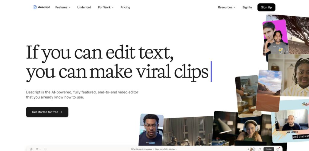
The Descript website stands out with its bold headlines and engaging storytelling that highlight the ease of using their AI-driven video editor. Eye-catching graphics showcase the platform’s capabilities, while numerous mini-videos feature social media content creators, illustrating real-world applications and driving relatability. It’s a visually compelling and informative experience for users.
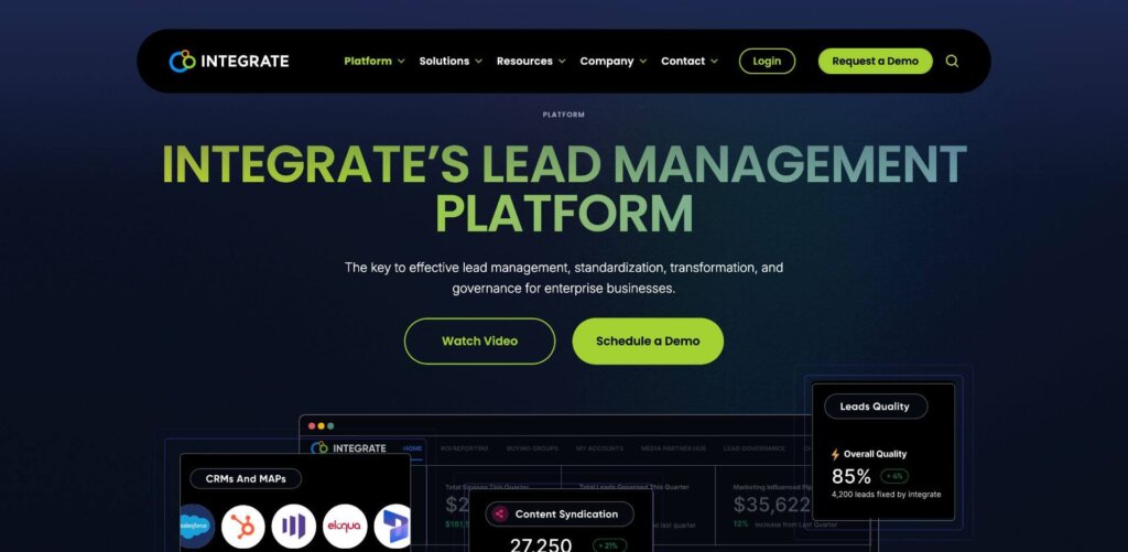
Integrate
Who they are: Lead management and data governance platform provider
Why we love it:
The Integrate website grabs attention with bold, lime green text on a black background, creating a striking contrast that makes an immediate impact. A large section featuring key metrics provides incontrovertible, data-driven proof of their results. The customer success section, featuring clickable client faces with video testimonials, adds a personal touch and builds trust by showcasing real stories and outcomes. Visitors can navigate solutions by role or channel, making it easy to find relevant information and personalize their journey.
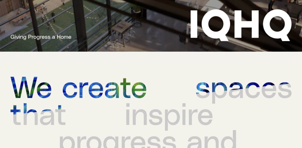
IQHQ
Who they are: Life sciences real estate developer
Why we love it:
IQHQ’s website features oversized typography and creative image layering, where scrolling reveals a seamless video-to-text transition for a striking visual effect. Minimal copy paired with beautiful photography lets the imagery communicate value. It’s a sleek, modern approach that feels refined and impactful.
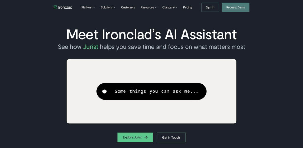
Ironclad
Who they are: Digital contract management software provider
Why we love it:
Ironclad’s website makes a statement with its clean and professional B2B design, relying heavily on thought leadership and third-party validation. An engaging demo clip automatically plays in the hero section, teasing visitors into watching the full video. Client testimonials with headshots up the credibility factors while highlighted client logos and industry accolades do a stellar job at reinforcing the company’s authority and trustworthiness.
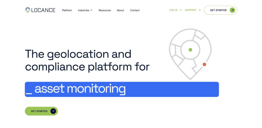
Locance
Who they are: Geolocation platform provider
Why we love it:
The Locance website combines clean design with subtle, well-placed animations that bring the geolocation platform to life. A scrolling statistics bar beneath the hero section quickly establishes credibility while industry-focused sections make it easy for visitors to see the platform’s impact across various sectors. Overall, a smart and streamlined experience.
Pipeline360
Who they are: Marketing software + service company
Why we love it:
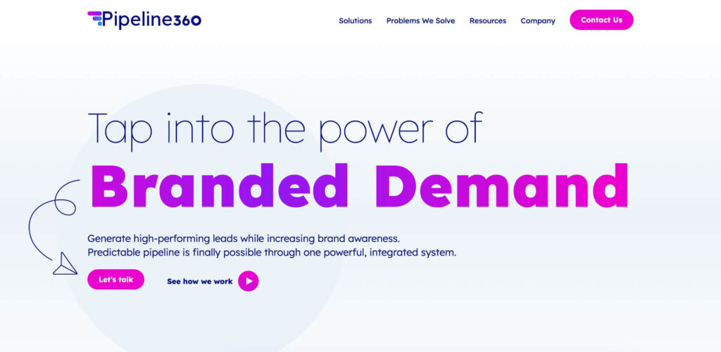
The Pipeline 360 website is a true standout, bringing a fresh, vibrant vibe to the B2B space. We love the refreshing use of bold magenta and purple accent colors, almost imparting a B2C feel, but packing serious substance. A subtle motion gradient in the “Branded Demand” headline adds flair, while fun, conversational copy keeps the visitor engaged and intrigued. Clean navigation, proof-packed case studies, and modern custom graphics make this B2B website design a winner, guiding visitors smoothly through an exciting journey.
REC Solar
Who they are: Commercial Solar Power Company
Why we love it:
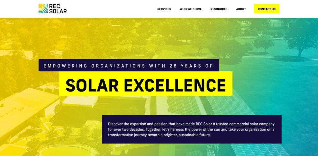
REC Solar’s website takes a bold, colorful approach that instantly sets it apart from competitors. It dives straight into solutions, making it easy for users to find what they need right away. With numerous case studies, the site highlights their decades of experience and proven results. Custom icons in the mega-navigation add visual interest and make exploring options more engaging, creating a user-friendly experience that’s both informative and visually compelling.
RedViking
Who they are: Manufacturing automation company
Why we love it:
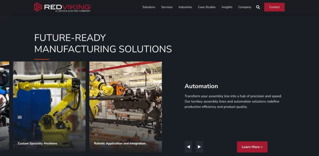
RedViking is giving site visitors what they want by showing, not telling, what they do. This B2B website is loaded with original photography of their cutting-edge equipment like automated guided vehicles and autonomous mobile robots. Customers in this industry need to visualize what this next-level equipment will do for them, and RedViking showcases plenty of case studies with embedded videos to draw in buyers. The company has a large number of services and solutions, but a streamlined drop-down navigation makes everything easy to find.
Sensiba
Who they are: Global accounting and consultancy firm
Why we love it:
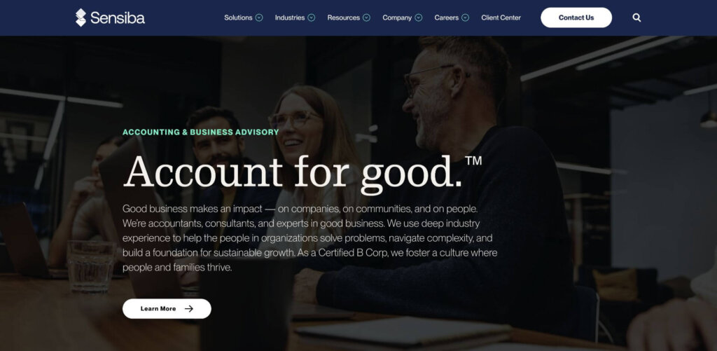
Accounting firms get a bad rap for being dull, but the Sensiba site turns that rumor on its head. The B2B website design combines elegance with engagement. Bold headlines and subheadings utilize a serif font while body copy remains sans-serif for a balanced look that feels both classic and contemporary. Resources and thought leadership are the draw here, highlighted prominently on the home page and cross-promoted throughout sub-pages to encourage engagement and conversions. A subtle touch of movement, like color shifts and interactive hover effects, adds a cool, dynamic vibe without overwhelming the design.
SKsoft
Who they are: Fintech company
Why we love it:
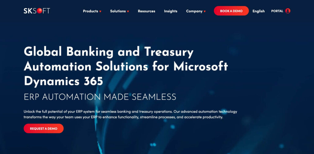
The SKsoft website is a perfect example of how to balance substantial content with clever design elements to keep it engaging and digestible. With a classic navy blue and white color scheme typical for finance and fintech, the pops of red add a fresh touch. The rotating news section in the hero allows for announcements while keeping the main focus on the company’s unique value proposition. A custom infographic simplifies their complex ecosystem, and well-used white space makes the content easy to consume.
SurveyMonkey
Who they are: Online survey provider
Why we love it:
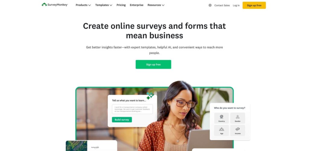
With a clean design that cleverly combines animation and product visualizations, the SurveyMonkey website creates an engaging user experience from the start. Its minimalist layout, ample white space, and clean, clear navigation prioritize usability. Customer success stories and third-party endorsements, including highlighted G2 reviews, provide strong social proof alongside straightforward and impactful messaging.
Vector Remote Care
Who they are: Software + services for cardiac device clinics
Why we love it:
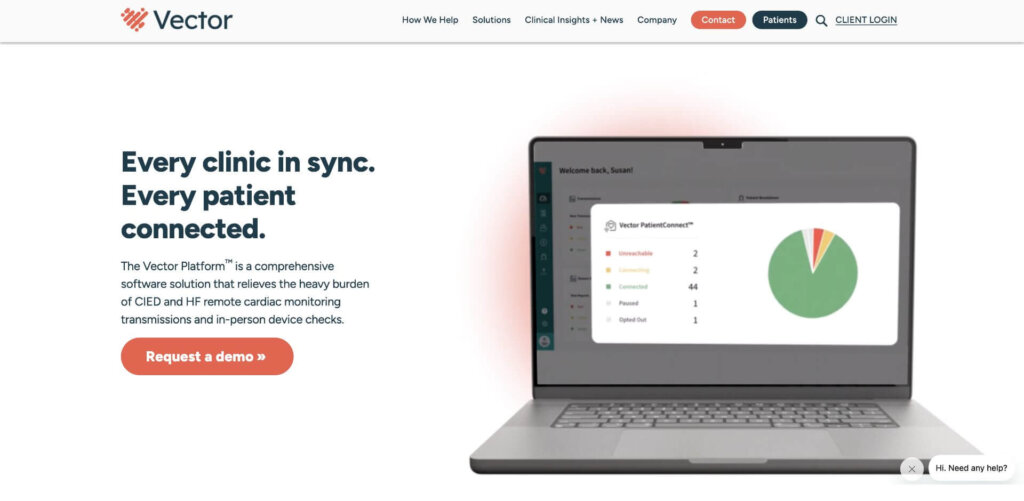
A challenge with many B2B websites is that the solution is so niche, it’s sometimes hard to understand what the company does. Remote monitoring for cardiac device clinics is pretty darn niche, but Vector Remote Care achieved the feat of making everything clear through smart content and design. The hero animation showcases the platform on a laptop that describes features and benefits right away. Scrolling down, Vector plainly states the problem their customers face, then follows up with the solution listing exactly what their platform does, coupled with infographics that illustrate the main points. The site also features a section addressing every buyer persona, describing how the solution can help each of them.
W International
Who they are: Advanced metal fabricator
Why we love it:
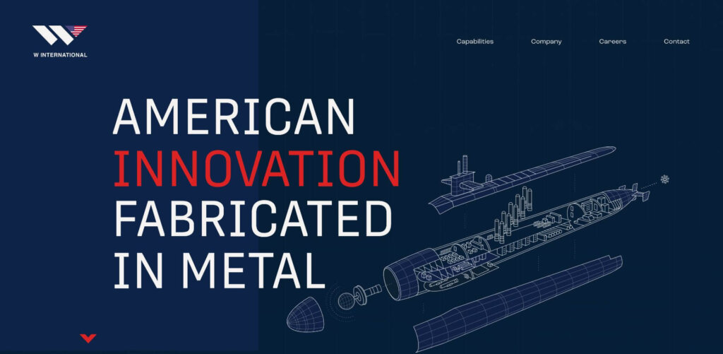
W International’s B2B website wows with stunning illustrations, engaging animations, and large-scale embedded video of their manufacturing floor, creating a visually dynamic experience. The dramatic typography captures attention while reflecting the brand’s professionalism. The site adds a personal touch by featuring a welder’s profile on the homepage and inviting potential candidates to connect with the family-oriented company.
What’s ahead for 2025?
Now that you’ve checked out the powerhouses of 2024, you may be curious about what to expect for B2B web design in 2025. Our web design experts have put together the 10 key B2B website design trends to expect in 2025.


