+53.6%
Sessions
+60.92%
Users
+36.3%
Organic Search Sessions
+46.01%
Organic Search Users
+6.99%
Average Engagement Time per Session
+55.48%
Engagement Rate
Date Range: 10/31/2023 - 1/29/2024 compared to 10/31/2022 - 1/29/2023
The Challenge
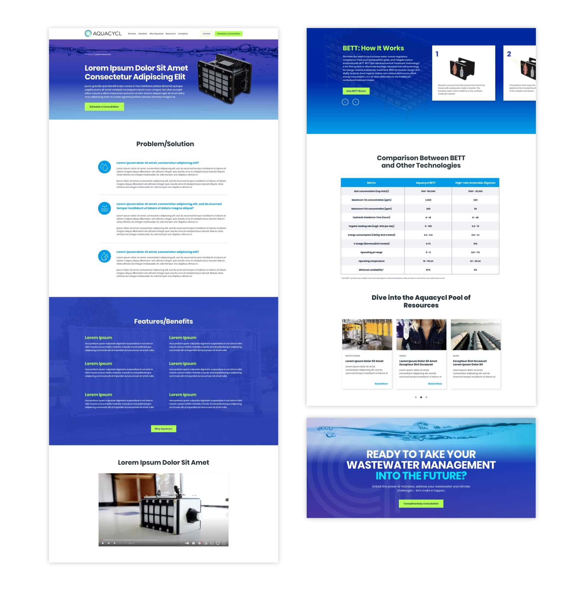
The team at Aquacycl, a technology company revolutionizing wastewater treatment, came to Bop Design expressing frustration with their B2B website. Their primary complaints were that the site was dated, lacked impact, and wasn’t converting website traffic. There were several reasons for this. Messaging was unclear with no content hierarchy, which made it tough for visitors to understand what the company offered. Valuable resources were buried and in PDF form, which hindered accessibility and the ability to be found by search engines. The team wanted to better communicate their message, showcase resources, and ultimately, drive quality leads and conversions.
The Solution
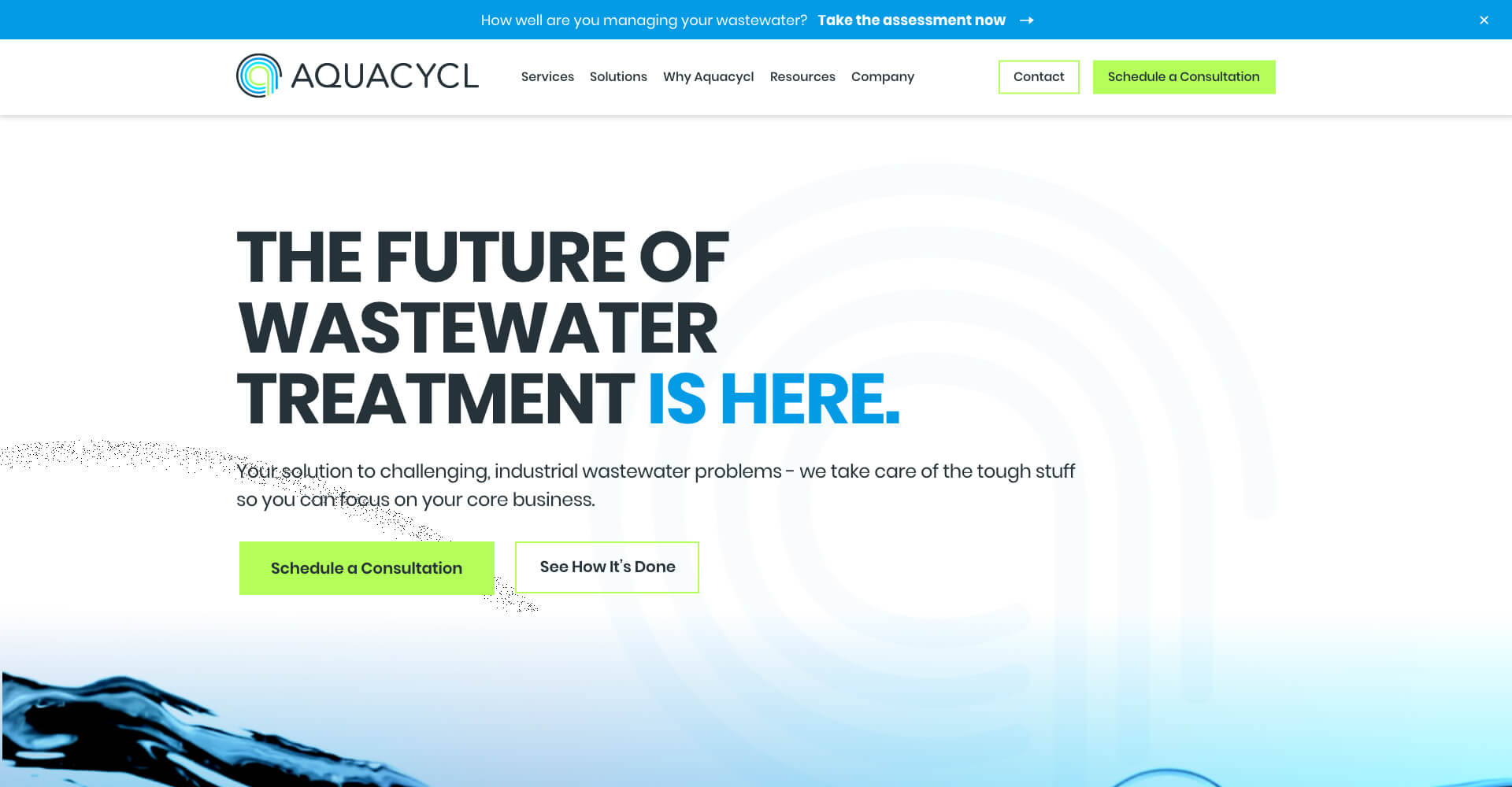
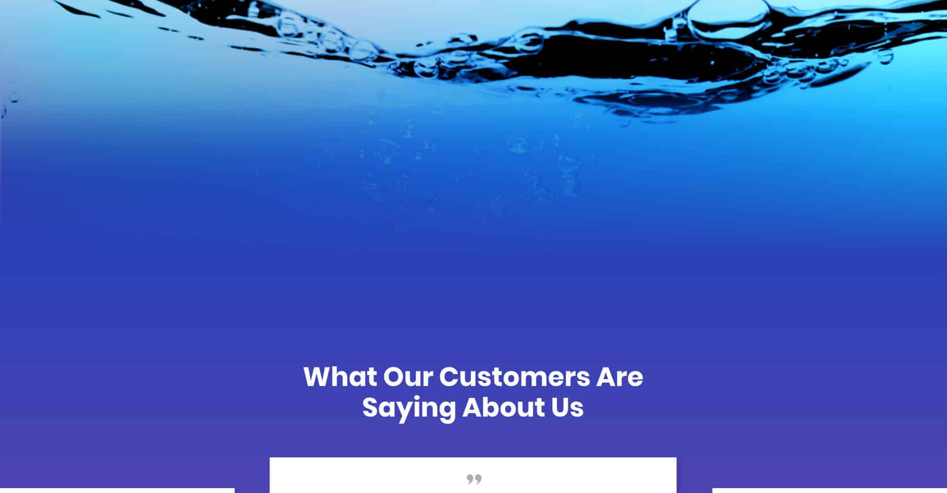
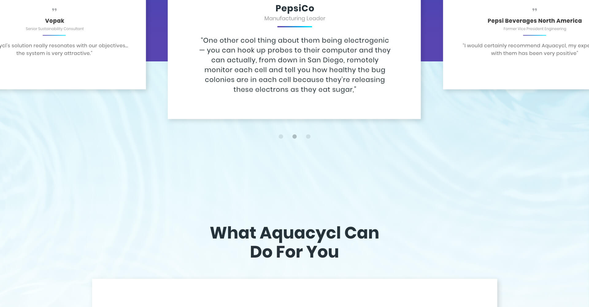
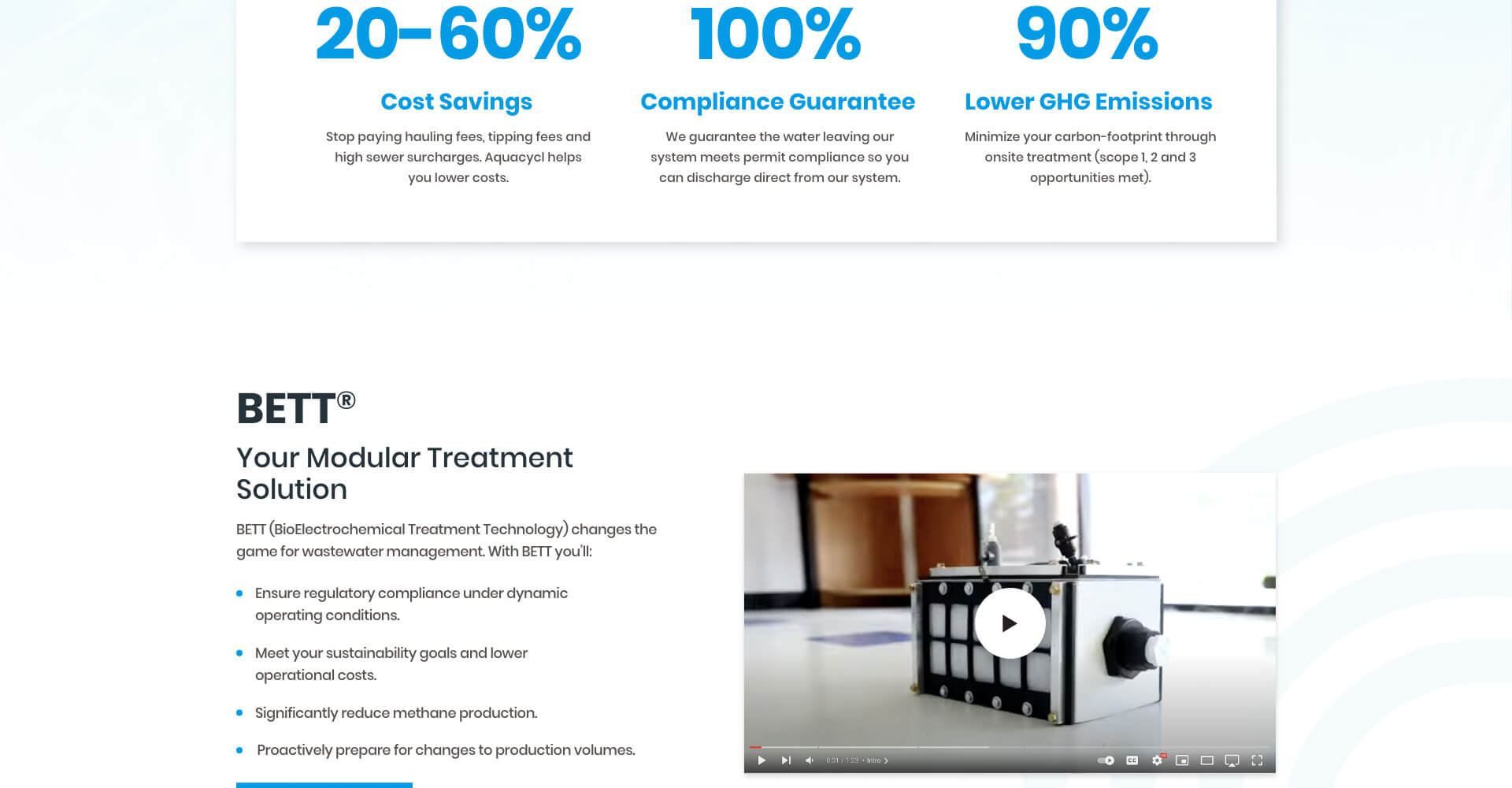
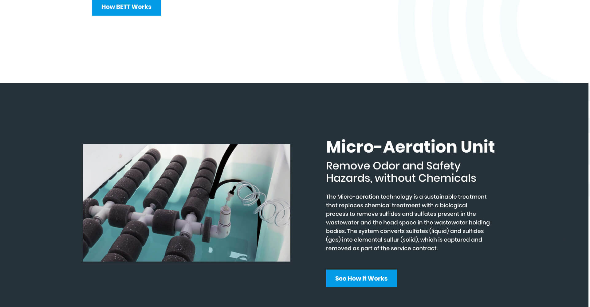
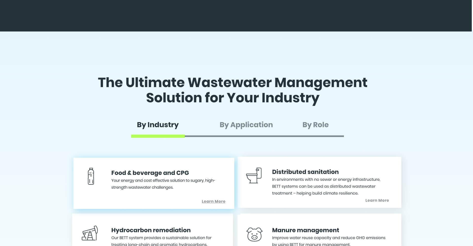
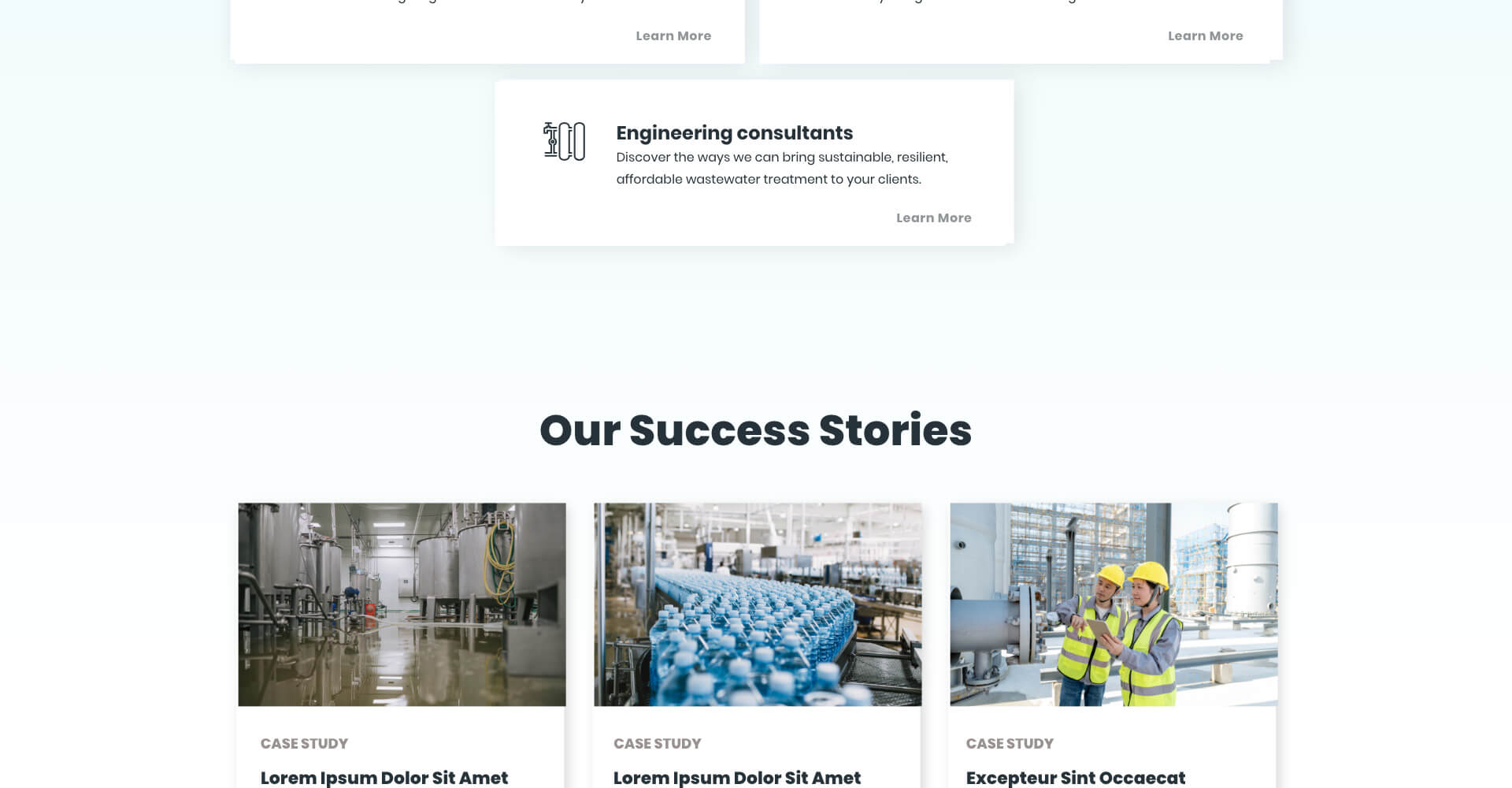
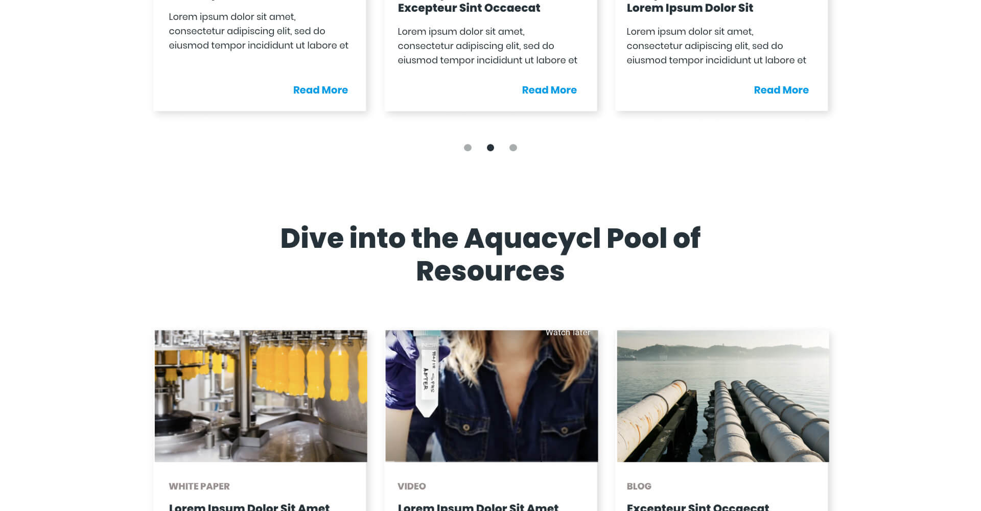
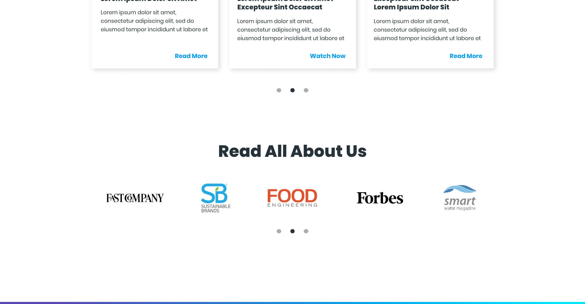
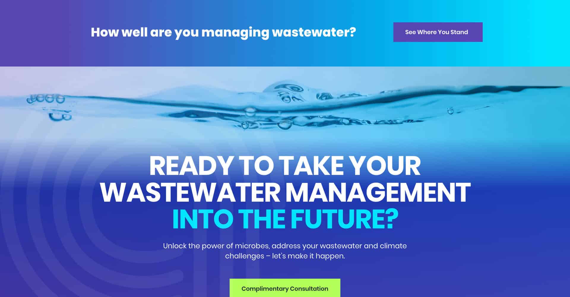
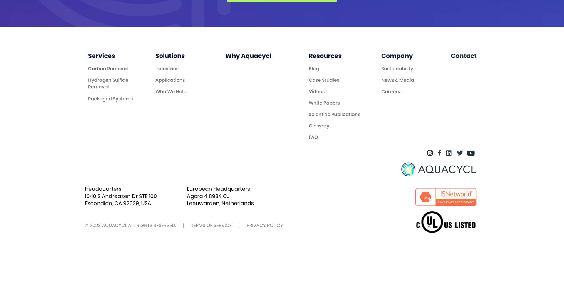
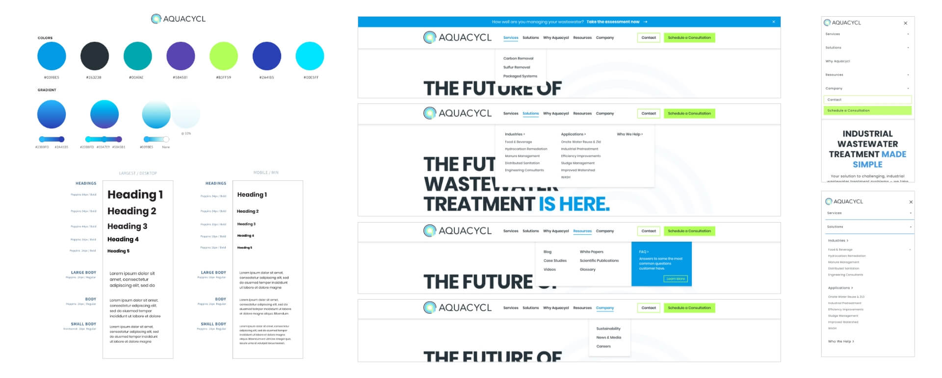
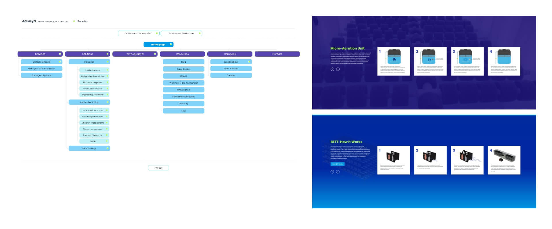
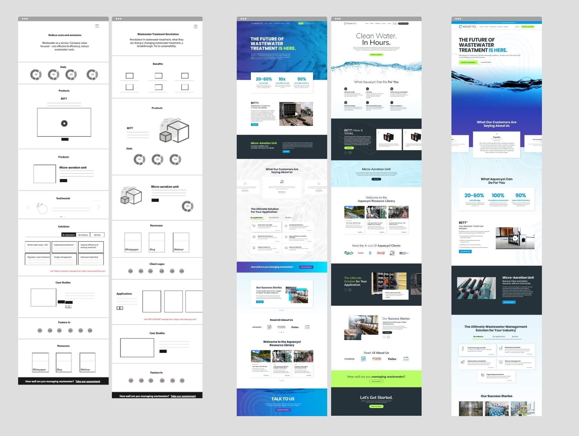
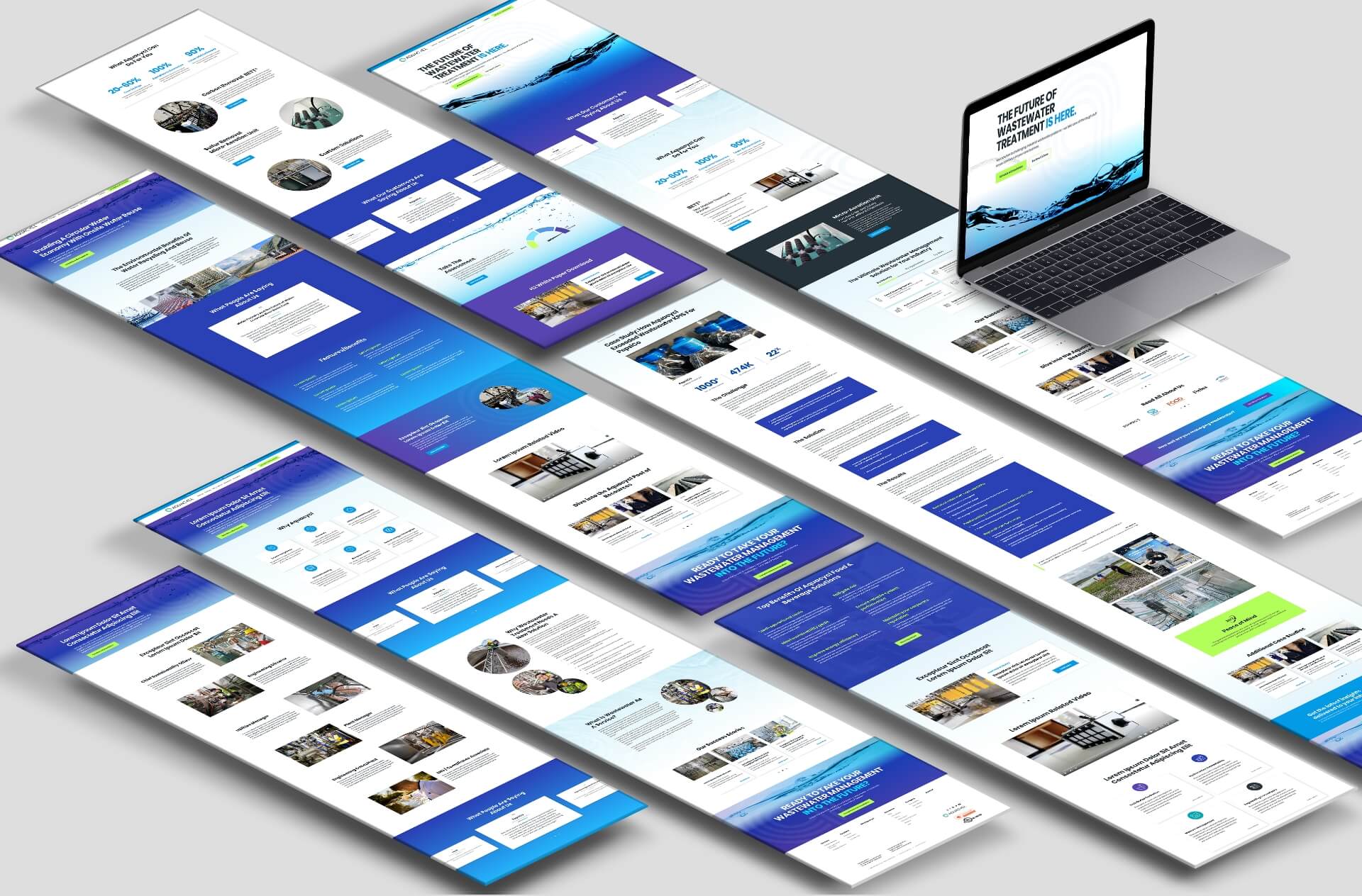
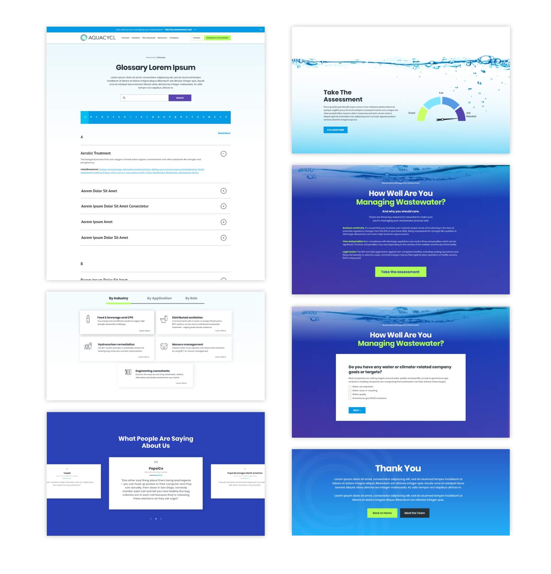
To address these challenges, our team started by integrating Aquacycl’s new branding into the B2B web design. Our designers went with brighter, more modern colors to go with the new logo, and incorporated calming water imagery to tie into Aquacycl’s brand identity. Our content team got to work by streamlining and organizing the messaging structure to clearly communicate the value proposition and solutions. Interactive carousels were implemented to guide users through Aquacycl’s offerings based on their industry or role, creating a personalized journey for each visitor. We also built out a user-friendly resource center, making case studies, white papers, blogs, and videos easy to find for visitors and crawlable by search engines. Lastly, we incorporated relevant keywords into the content to improve search visibility and attract the company’s target audience.
Results
Just three months after the B2B website launch, the metrics already showed great improvement. Sessions increased by 54% while users grew by 61%, indicating a significant rise in traffic. Additionally, the website began attracting more search traffic, as organic search sessions rose by 36%. Even better, the engagement rate increased by 55%, a clear sign that website visitors were interacting substantially more with the newly designed site compared to the previous site. Overall, the B2B web redesign was a smashing success, giving the Aquacycl team a cohesive, modern site that highlighted the company as innovative and forward-thinking, while providing an excellent user experience for site visitors that prompted them to convert.


Let's talk about your project
Get in touch to chat about how we can help you build a better B2B brand. Don’t be shy. We’re great listeners, and even better problem-solvers.
