+46.57%
Sessions
+88.79%
Organic Search
+111.45%
Engaged Sessions
+47.29%
New Users
+44.94%
Users
+44.72%
Engagement Rate
4/1/2024 – 7/1/2024 compared to 12/31/2023 – 3/31/2024
The Challenge
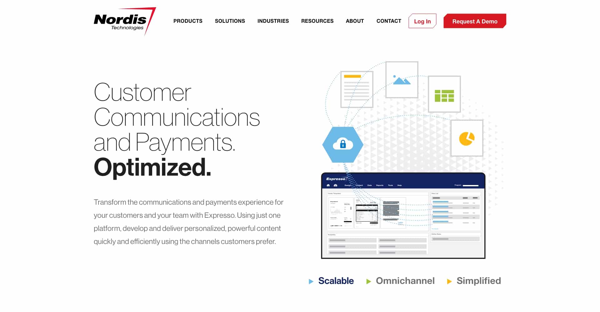
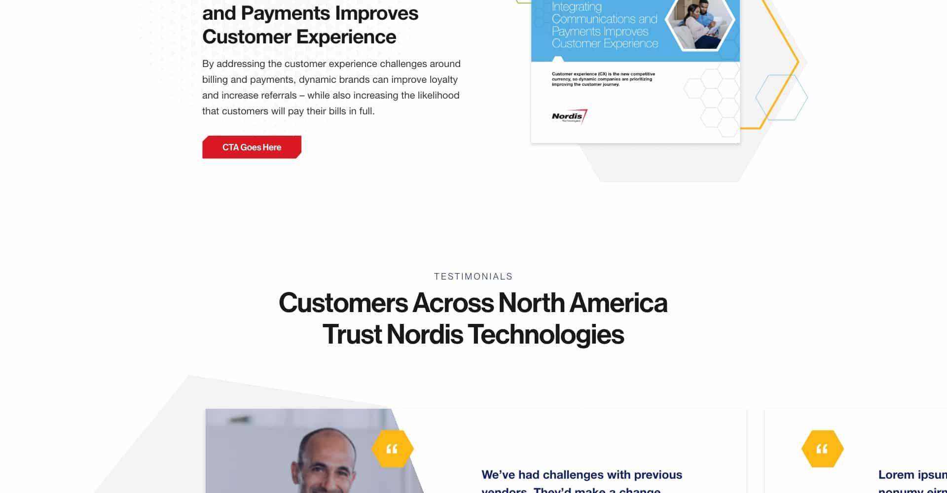
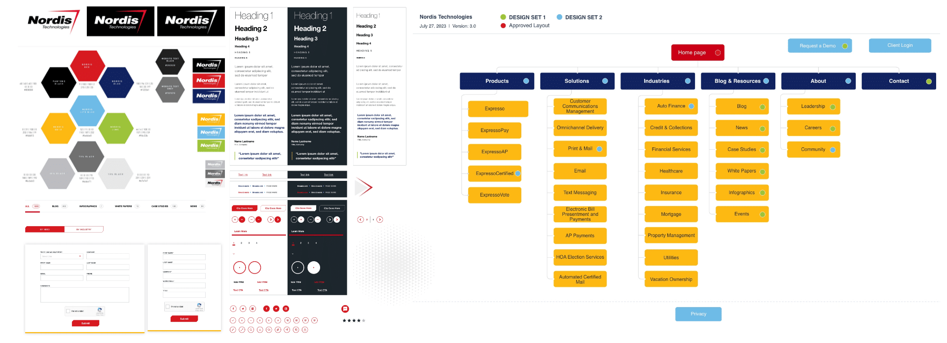
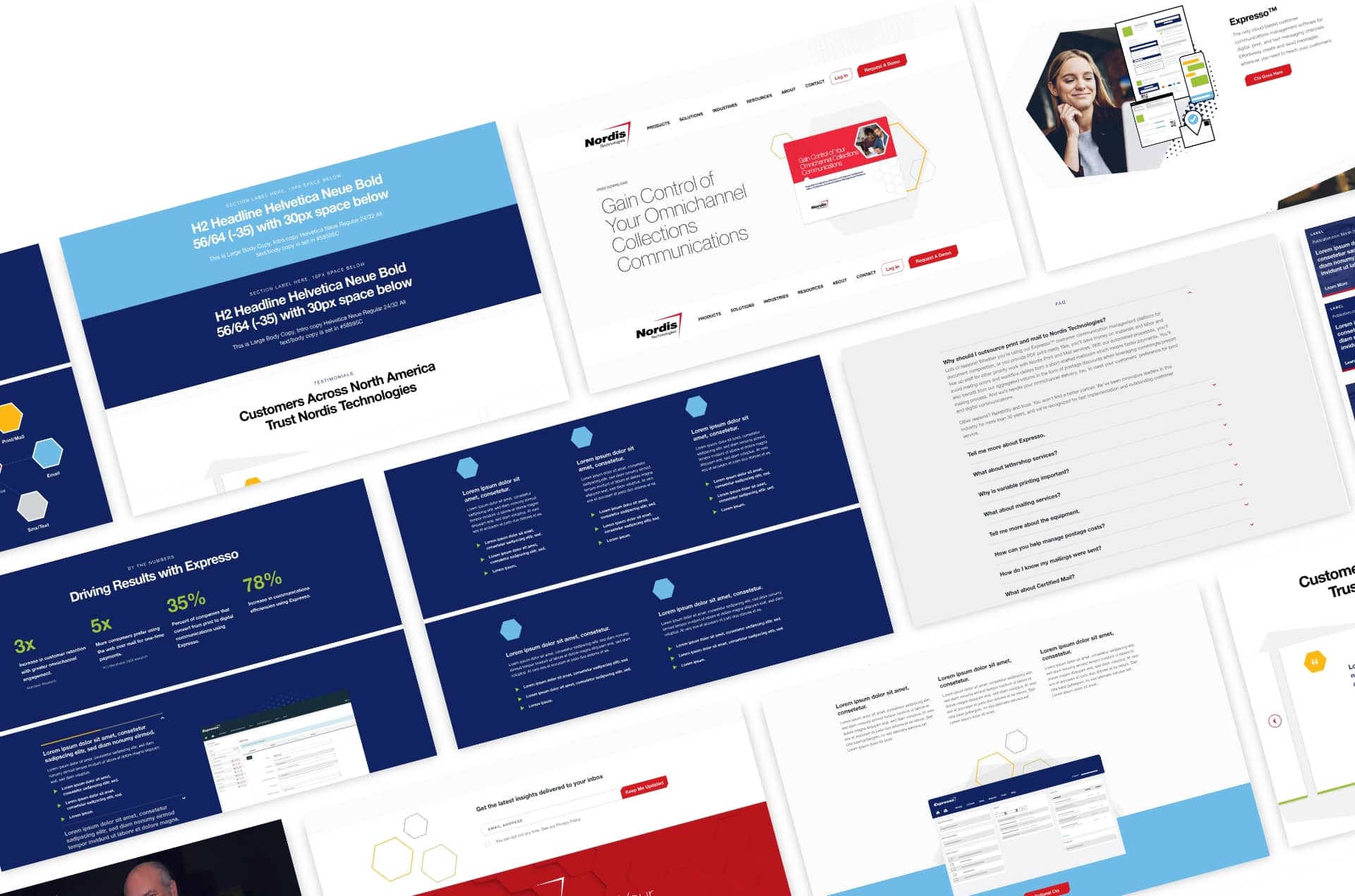
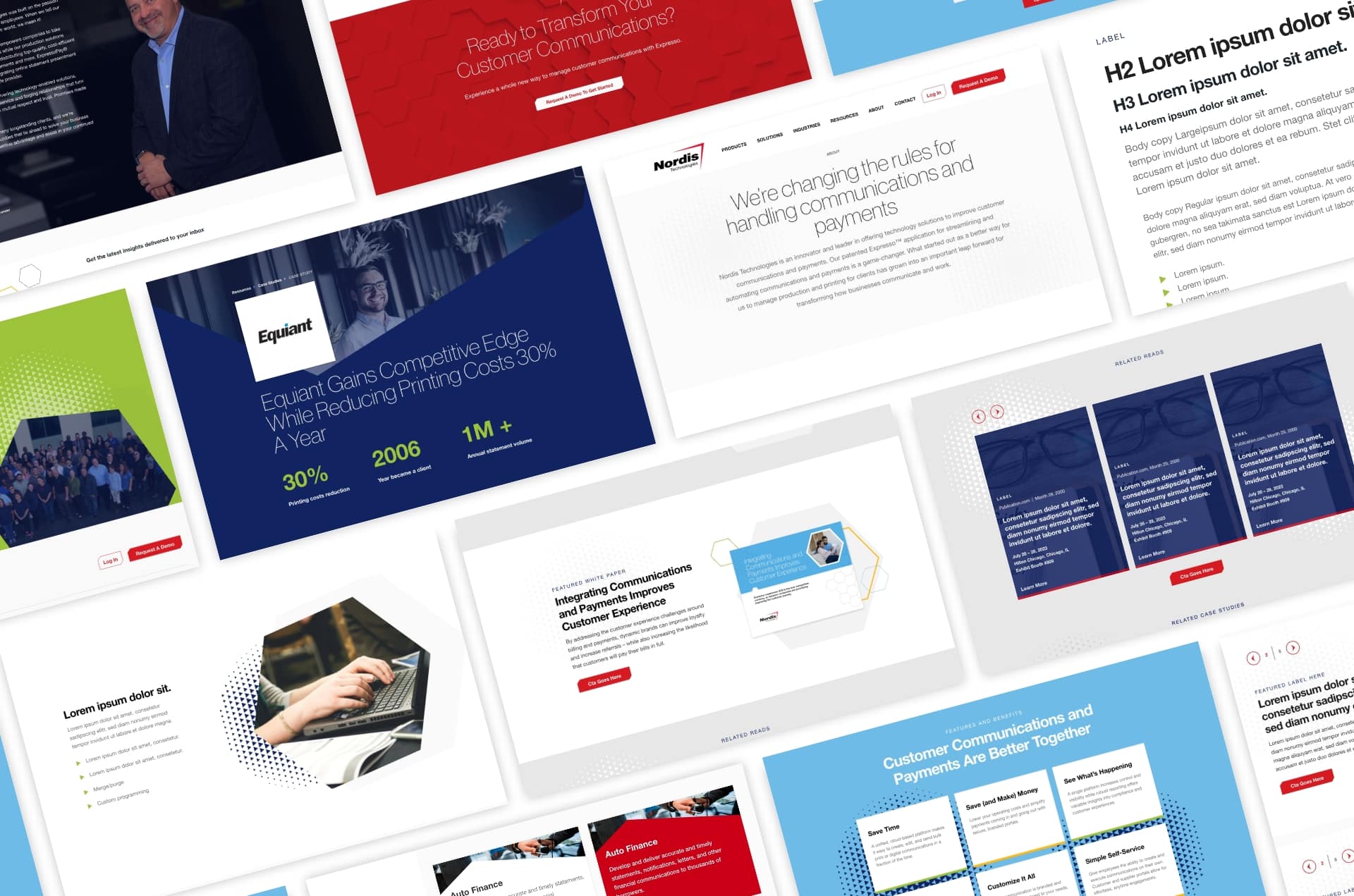
When Nordis Technologies, a company providing customer communications services and software, came to Bop Design, its website was underperforming. The design was outdated, it was overly wordy, and it just wasn’t garnering leads or conversions. Moreover, the company’s bright brand colors of red, sky blue, orange, and green weren’t being utilized properly and gave the site a less sophisticated feel. Our challenge was to streamline the content structure, amplify conversions, and upgrade the B2B web design to incorporate brand colors in a more professional yet still friendly and approachable manner.
The Solution
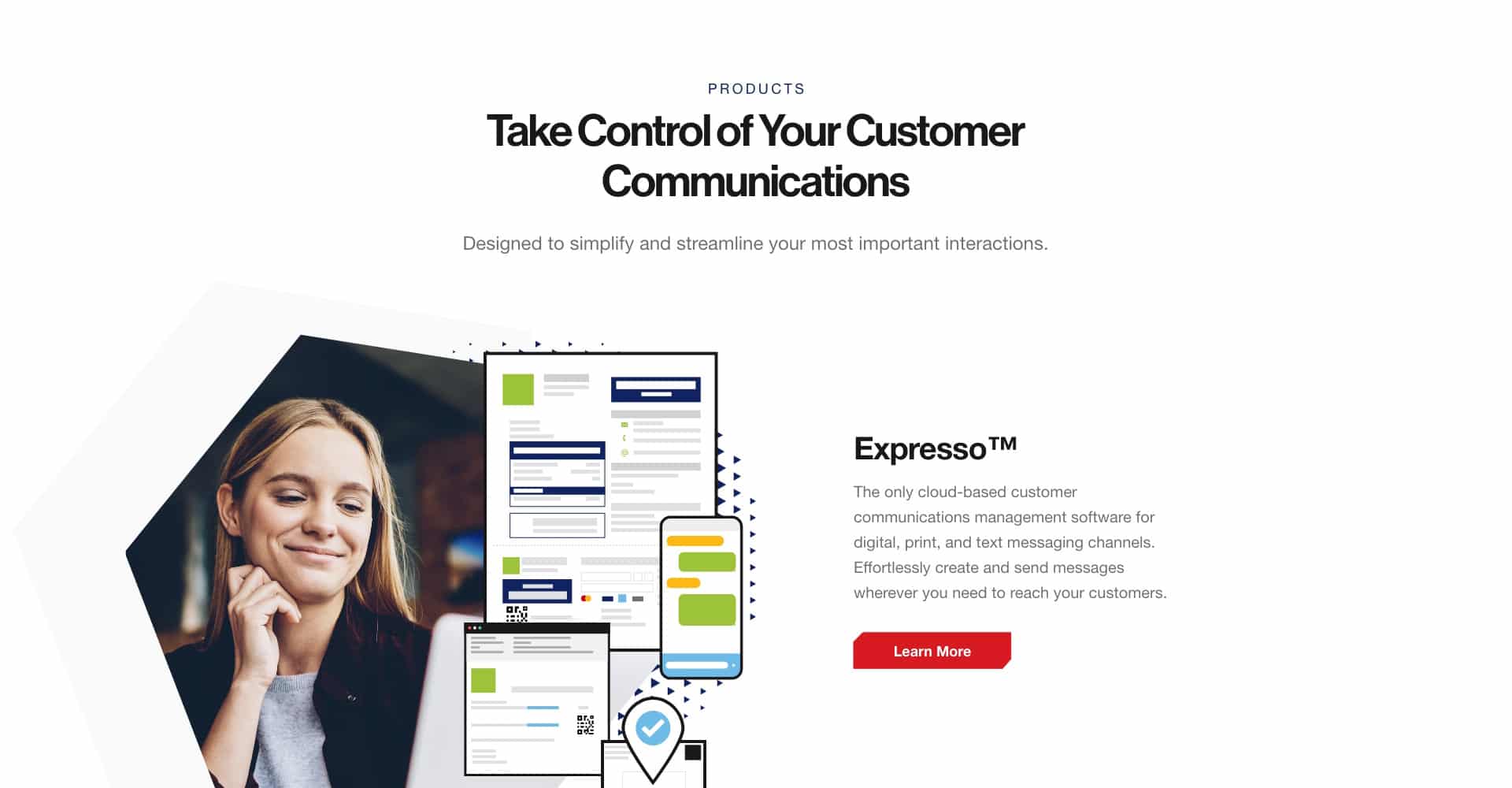
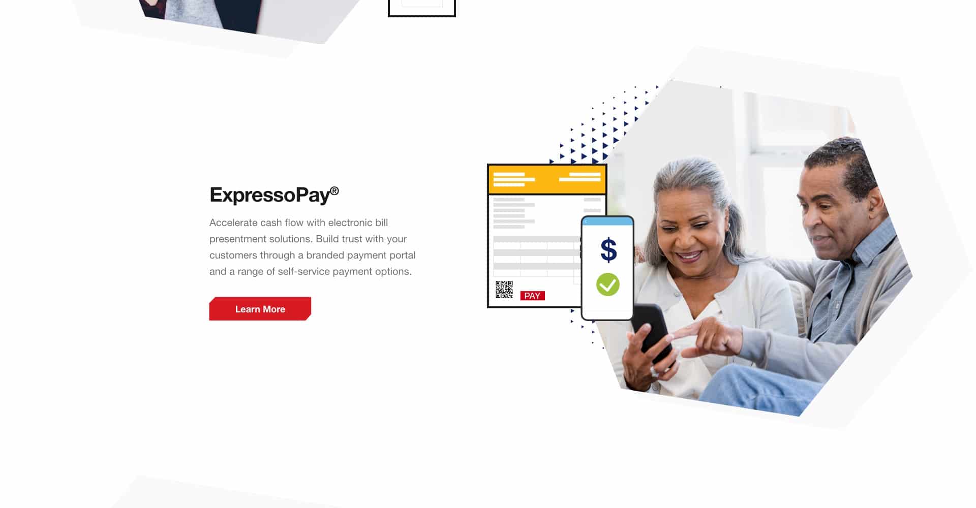
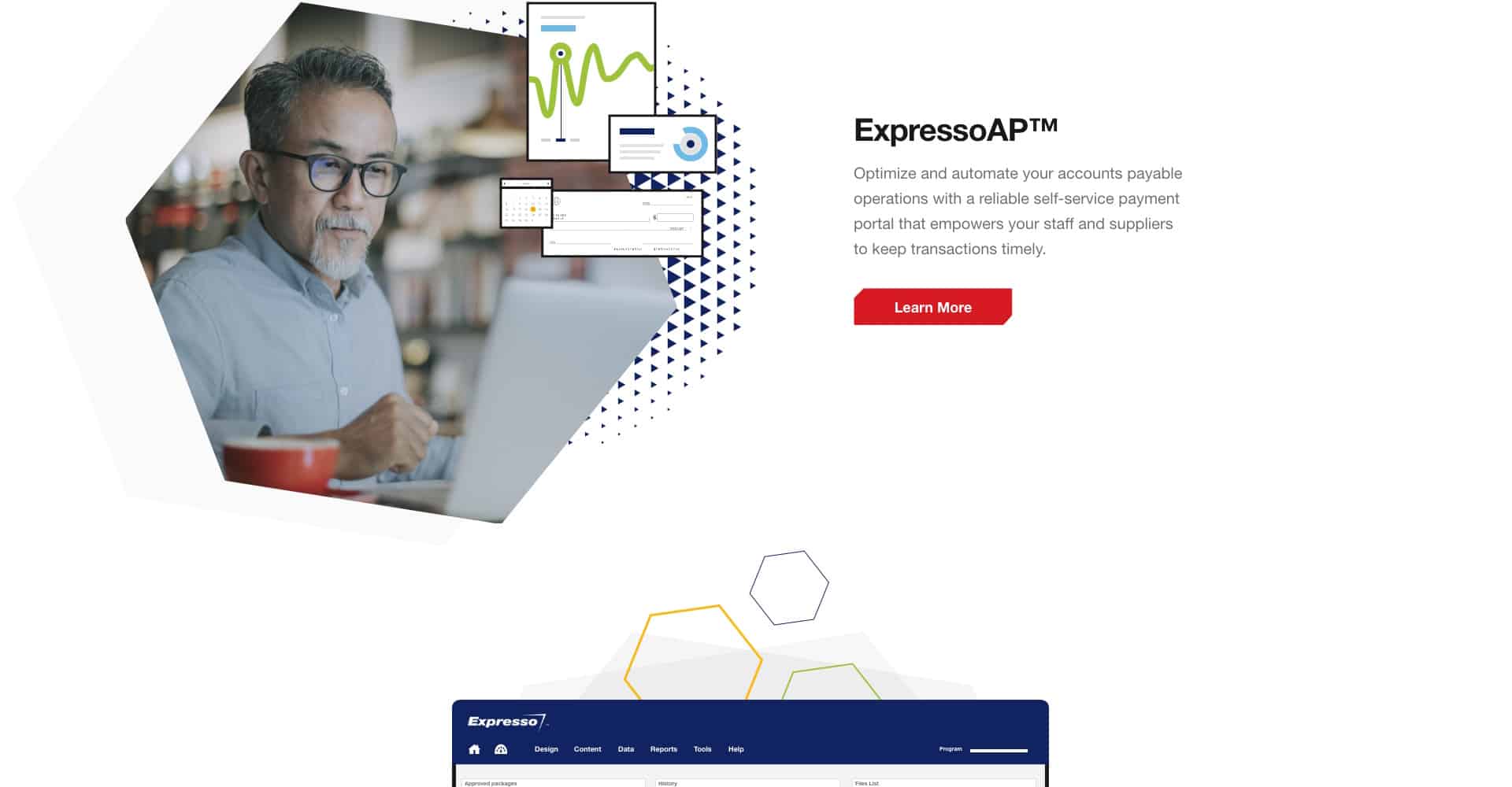
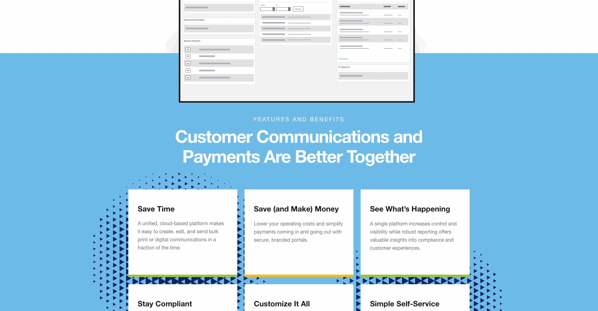
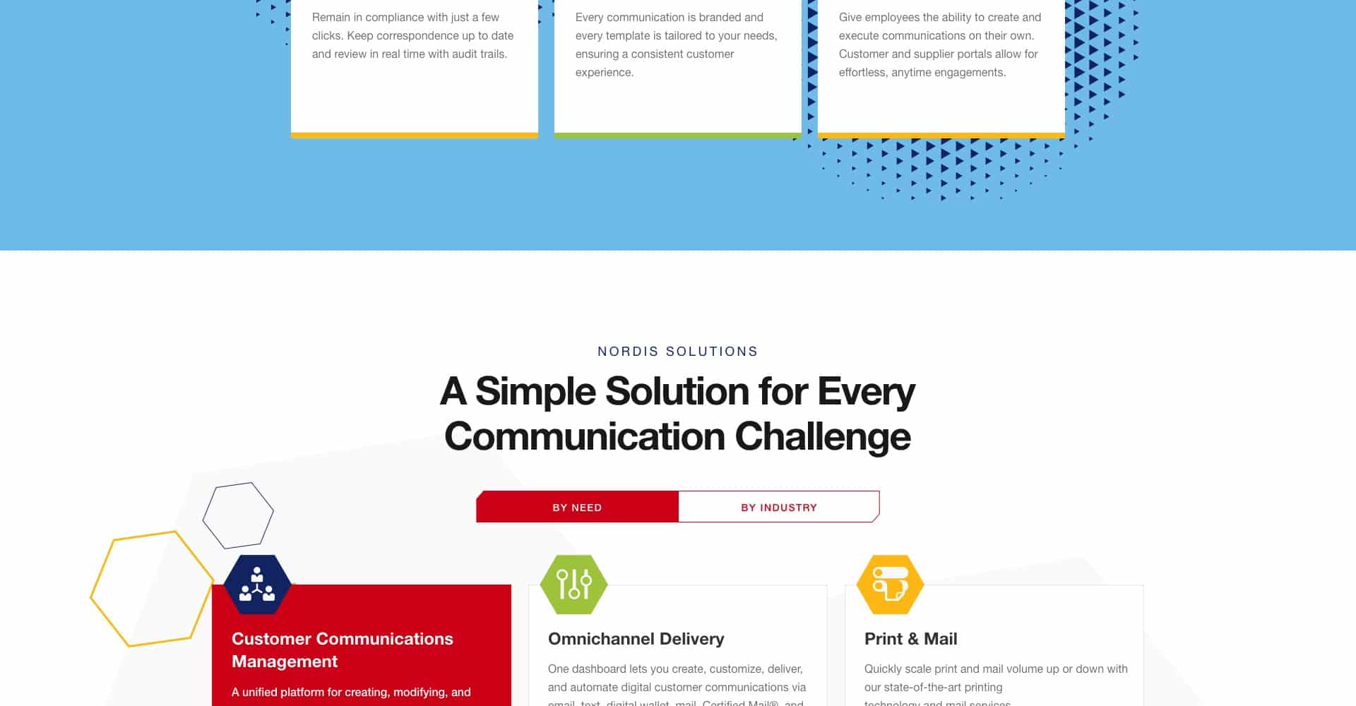
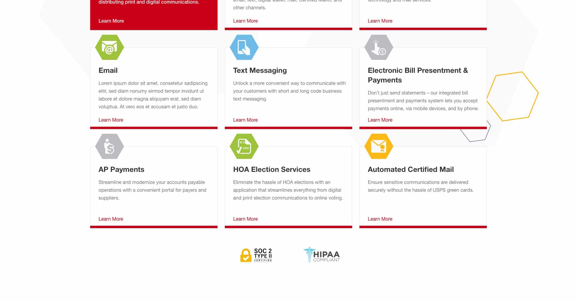
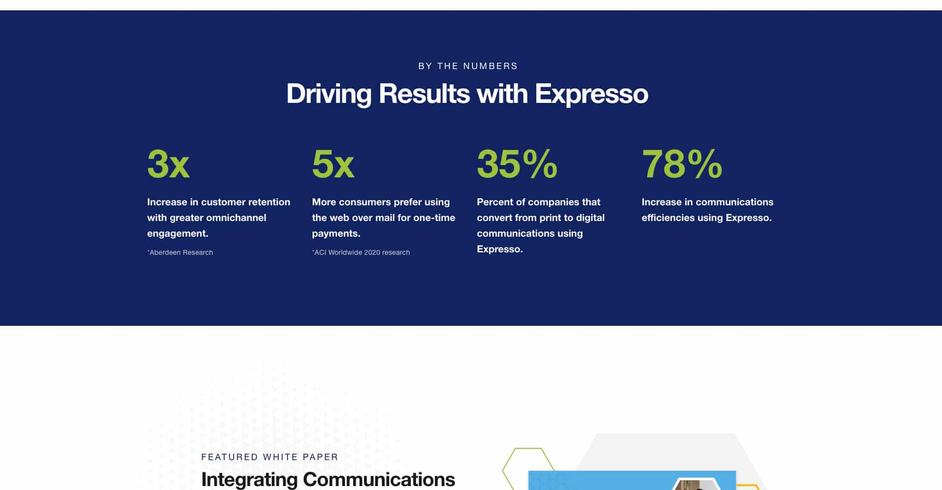
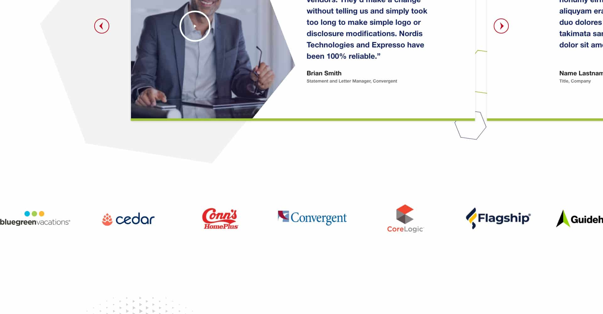
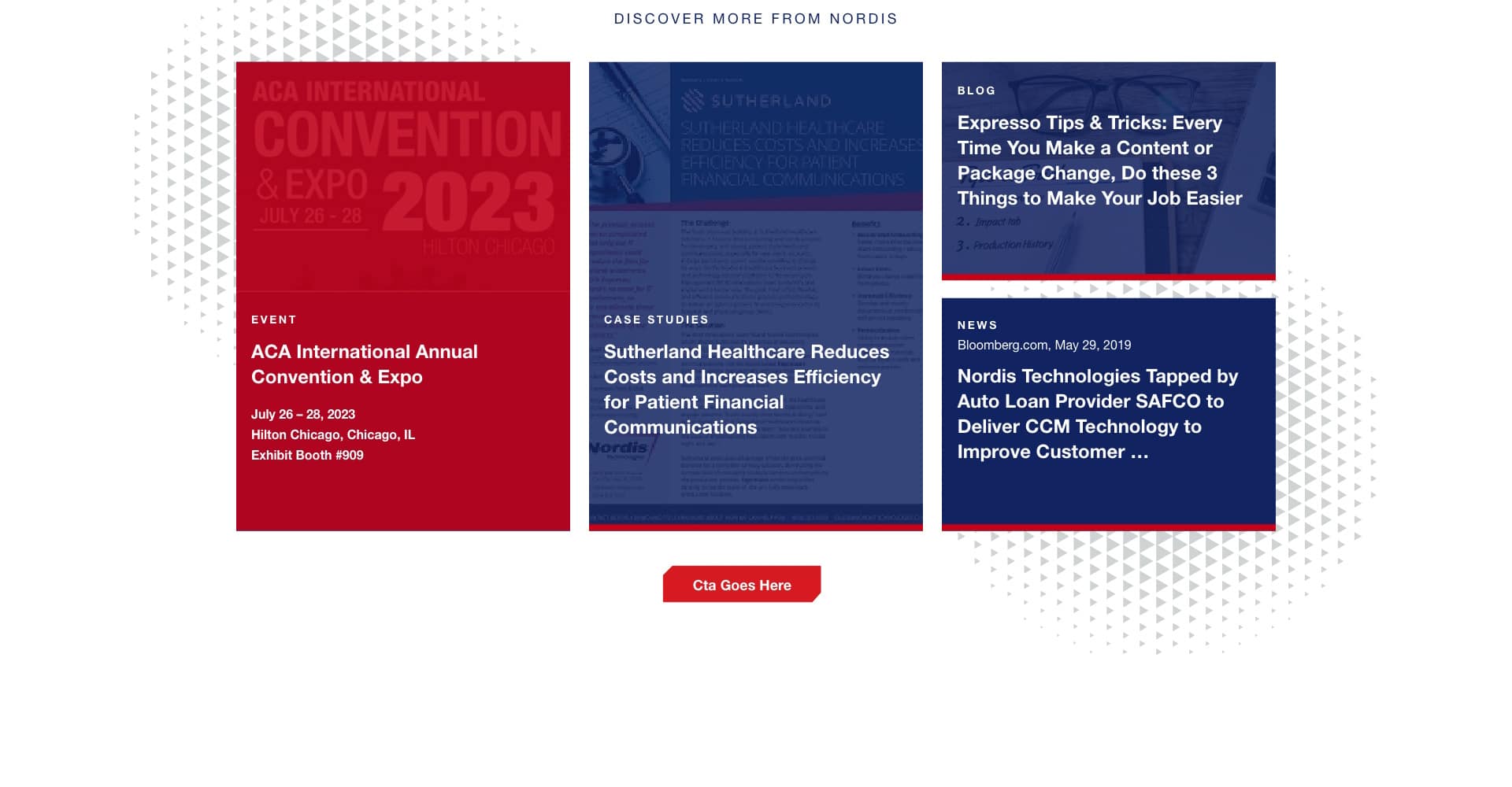
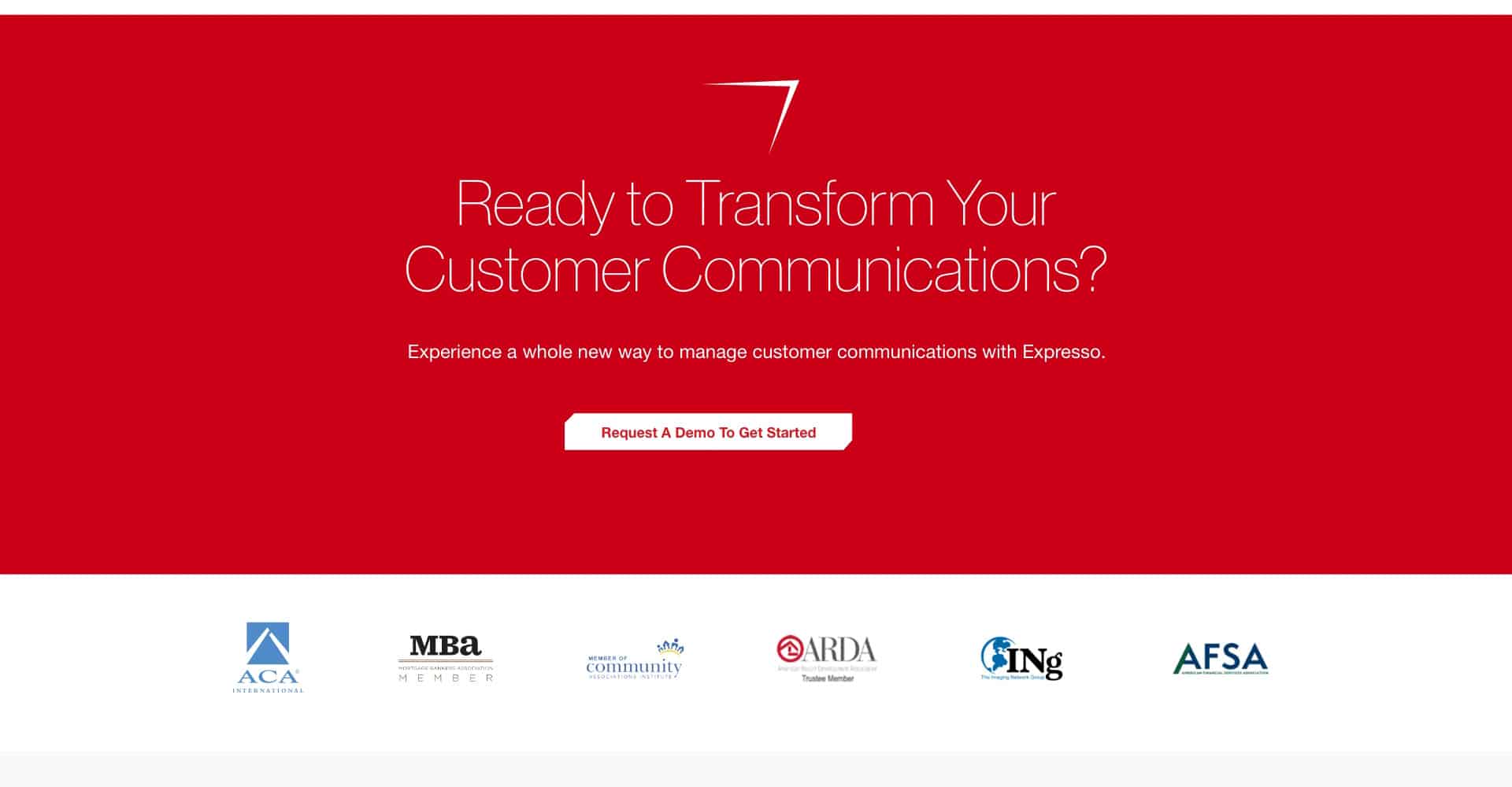
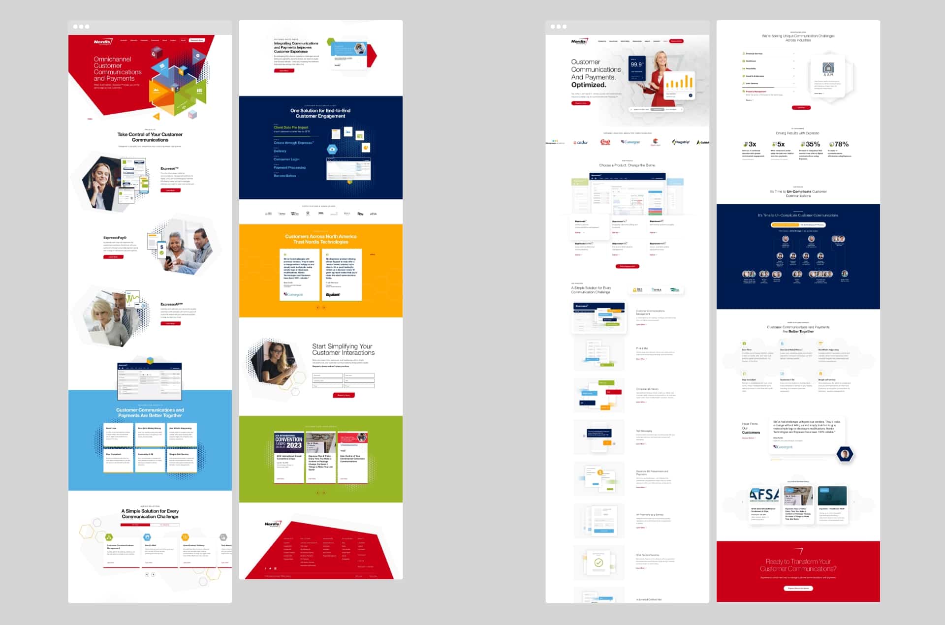
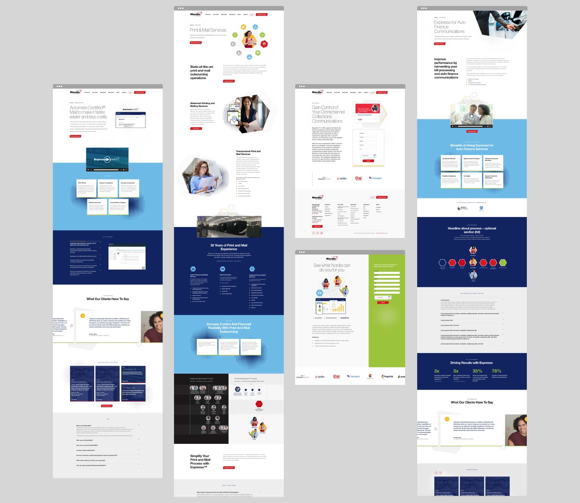
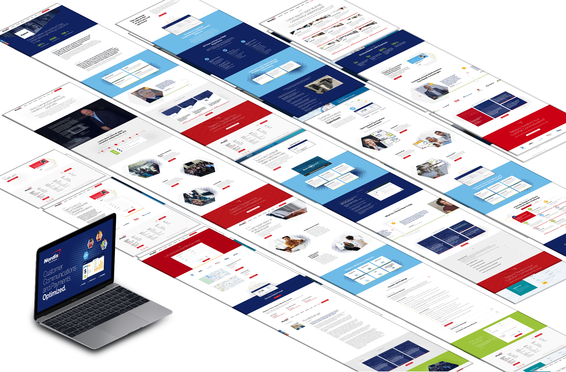
To begin, our design and content teams got together to create a home page concept that would “show, not tell” Nordis’ brand story in a manner that engaged the buyer and prompted them to reach out for a consultation or product demo. We introduced eye-catching, animated infographics that illustrated the company’s offerings but were still lightweight so they wouldn’t slow down the page load speed. Since the Nordis team didn’t have original photography, we combined stock images with unique shapes from the company logo to elevate them beyond standard stock. Our content team created an architecture that streamlined the way copy was presented, making it easy for the reader to digest. We also created a central resource hub with tabbed browsing to house the company’s many blogs, white papers, infographics, case studies, and brochures, making it simple for site visitors to peruse Nordis’ thought leadership content
Results
Just a few months after launch, we saw B2B website performance improve dramatically. We achieved the goal of engaging site visitors, with engaged sessions increasing by an incredible 111%. Organic search visits went up by 89%, illustrating that the site is now doing a much better job of attracting visitors to the site via search engines. New users coming to the site increased by 47%, enabling Nordis to capture new leads and bring prospects into its funnel. This B2B website redesign not only refreshed Nordis’ online presence but also aligned it more closely with its brand identity and business objectives. With improved functionality and a visually compelling design, the website is now a vital tool in attracting new potential leads and supporting its long-term growth strategy.


Let's talk about your project
Get in touch to chat about how we can help you build a better B2B brand. Don’t be shy. We’re great listeners, and even better problem-solvers.
