This isn’t an ultimate guide, it’s a mega guide with lots of information to help you build, revamp, or update your B2B website design. Whether you are a seasoned B2B marketer looking to optimize your website or a newbie just getting started with a potential B2B web design project (or anything in between), this is your guide to all things that matter for successful web design.
What’s Included
- Three website must-have strategies
- Top web design trends to be aware of
- Website checklist
- Conversion rate optimization (CRO) for web design
B2B Website Must-Have Strategies
Your B2B website is the vital core of your brand communications. Your website is often the first interaction ALL your prospective customers have with your brand so it’s crucial to have a website that works for your business.
Here are the top 3 must-haves to ensure your website successful supports your business goals.
Strategy to Drive High-Quality Traffic
A beautiful website is not much value unless you are driving high-quality traffic to the website. While a traffic strategy may seem like a no-brainer, after 300 website builds, I’m always amazed at how many marketers worry over every detail of the website design but rarely give much thought to how they will drive traffic.
Your traffic strategy should be multi-pronged – composed of organic search, paid search, retargeting, and referral. Documenting, evaluating, and managing this strategy regularly is also important to grow that traffic over time.
If you’ve been neglecting your traffic strategy, now is the time to give it attention.
Growth-Oriented Design and Content Strategy
Change is constant. Having a website that is user-friendly with great messaging isn’t enough anymore. A flexible website that can easily be updated is critical to meet business objectives.
When developing a growth-oriented strategy, you want to determine what your website needs now, what it will need 3 to 6 months from now, and what it will need years from now. Implementing a design and content infrastructure to support that growth will help you push changes quicker when the time comes.
Strategy for Managing Inbound Leads
Yay – the hard part is over! You’ve got form completions, quote requests, white paper downloads, and chats – now what?
Not all inbound leads are created equal, and not having a strategy for moving them through the funnel can hurt your ROI. Turning leads into long-term client relationships takes time and the collaboration of both marketing and sales teams. Always have a carefully thought out strategy for the lead handling process.
Ask and answer these questions:
- What does the person see when they submit a form? What is the message?
- Who receives a notification of the form submission?
- Is the form submission working properly?
- Are any form submissions going to junk/spam?
- Who is responding to the lead?
- What is the time frame max set for responding to leads? (An hour during business hours?)
- How does the salesperson follow up with the lead (what are they saying) and what are the responses?
- How often does the salesperson follow up?
- When is a lead considered closed?
This is just a short list of questions, but these are essential for ensuring you company has a strategy in place for managing inbound leads. Never assume everything works or that someone is responding. Ask!
Top Web Design Trends
Before we get into the web design best practices, let’s take a look at the top trends that are driving B2B web design and development today and in the near future.
Website Chat Continues to Grow
While website chat features are certainly not new, they’re becoming more and more prevalent, particularly for B2B companies that tend to have long, complex sales cycles.
Live chat offers two great benefits for users:
Smaller Commitment
Website visitors don’t have to fill out a long form to get some real answers. Depending on how your chat is set up, they may not need to provide any information at all.
Quick Answers
Sometimes, a visitor just needs a quick question answered by a product or service expert. It’s often a great way for the visitor to make sure your product or service provides what they need as they build the case for purchase internally. If you don’t offer what they need, your firm likely isn’t the right fit and it saves everyone time.
Chat tools have made great progress recently with AI—bots that help guide your website visitors in the right direction. Drift is one you’ve probably heard about before but LiveChat also allows you to create bots with templates.
Accessibility Expands
Accessibility is exactly what it sounds like—making sure your B2B website design is accessible to users of all kinds, despite differences in physical or cognitive abilities. Accessibility first started to come into the spotlight with high-profile court cases like Domino’s.
Following accessibility guidelines is ideal but creating a truly ADA-compliant website is a complex, muddy, and expensive process (often costing $100,000 or more) that can affect how your B2B website design looks. For example, WCAG (Web Content Accessibility Guide) 2 level AAA compliance, the highest level of accessibility, requires a contrast of 7:1. In the Bop Design logo, the text color (#45545f) on the background color (#e6e7e8) has a contrast ratio of 6.31—so even this would fail!
The good news is, there are tools to help alleviate this problem. UserWay and AccessiBe both sit on top of a website and give users the ability to adjust elements of the website to suit their needs and preferences.
Privacy Matters More and More
Privacy became a big deal to the internet when GDPR went into effect in Europe in May 2018. Various parts of the world have since implemented their own privacy laws, with California leading the US. In fact, with Proposition 24 passing in the 2020 election, California has recently increased privacy regulations. And remember, California’s laws don’t apply only to businesses headquartered in the state—they apply to anyone who has customers or users who reside in the state!
Laws and requirements change based on where your users are, how large your business is, what type of information you’re collecting, and whether your B2B website includes display ads or not. It can be really overwhelming. We strongly recommend going with a third-party solution like Iubenda. They employ attorneys who help keep their solutions compliant with the ever-changing laws throughout the world.
Voice Search Optimization Is Hot
People are getting more and more comfortable with asking their phones for information—and phones are getting better at providing the right information.
Of course, a lot of people are still asking questions like, “Who’s that German guy who sang and was in the beach show in the 90s?” But that doesn’t mean B2B companies should ignore voice search. If MailChimp can run a successful ad campaign on bus shelters in 2014, the B2B companies can be successful with voice search optimization in the 2020s.
The big thing to remember in voice search is conversational tone. Most users speak very informally when using their phones to search. So, optimizing for a phrase like, “why is Salesforce a good CRM?” is probably more valuable than “Salesforce: the optimal customer relationship management software.”
B2B Web Design Checklist
For businesses seeking to increase leads and boost sales, building a professional B2B website is important – but it’s not enough. The website must also be optimized to encourage visitors to convert.
Below is a list of essential elements to include in your B2B web design to ensure you are set up for converting visitors into new leads.
Clear CTA
A clear call-to-action (CTA) is essential to get website visitors to perform a desired action, such as filling out a contact form, downloading a white paper, or reading a case study. If a potential prospect lands on your B2B website, they want you to lead them to the information they need to make a decision. Don’t expect them to know what to do next. Guide them. Establish your company as their personal guide to deciding whether you are the right fit to help them accomplish their goals.
The CTA should be immediately visible from any page on the website. The CTA can be at the top, on the right side of the page, and/or at the bottom of the website page. It should be easy to distinguish from the other elements on the page.
CTAs for Different Stages of the Buying Process
Not every website visitor is ready to schedule a call or consultation with your sales team. Particularly for B2B buyers, they may often have six or more interactions with your brand before they reach out to make contact. As such, it’s important to give them actions to take at every step of the buying process.
How do you do this? Create CTAs that don’t require much on their part.
- Invite them to sign up for your newsletter.
- Point them toward your blog or resources section for more information.
- Tell them where they can learn more about your products or services.
- Guide them to the information that discusses the features and benefits you offer.
- Let them know where to follow you on social media.
- Advise them to complete a RFP form.
- Show them where your pricing sheet is located.
These CTAs will vary on the types of products or services you sell, but the above list should give you a good idea of what to include.
Straightforward Navigation
Even if your company offers a variety of services or products, your B2B website design should include a clean, straightforward navigation. Straightforward navigation gets your website visitor to the information they need as fast as possible. If they can’t find what they need in 30 seconds or less, they will likely abandon your website and go back to their online search.
Creating a straightforward navigation is not easy. Working with an experienced B2B web designer is your best bet since they are well versed in taking complicated service or product offerings and organizing them for website visitors.
Defined Services or Product Offerings
As a web design agency, we’ve seen a lot of websites. Often, B2B companies come to us to design a website that clearly shows their services or product offerings. Their number one complaint we hear, besides having an outdated design, is they don’t feel that their current website showcases their service or product offerings well.
This is not a time to be cute or imaginative with how you define your services or products. You need to be clear and direct. If you offer software for hospitals, say so. There is a difference between service and product offerings and the benefits and features of those offerings. Before you can get into the value of what you offer clients, you need to state what you offer.
Easy-to-Find Contact Information
The websites that convert well have easy-to-find contact information. Even if you want prospects to complete a form on a website, be sure to provide other ways to get in touch with your company. Your B2B website design should include where you are located and a phone number that a live person answers. Prospects may have various reasons for why they need to call you rather than completing a form. Make it easy to get in contact with your company.
Resources Section
As mentioned above, prospects may not be ready to set up a call with your sales team. They may be determining their budget, or whether they are ready for your product or services, or they may need to sell internal stakeholders on why they need your products or services.
High converting B2B websites have some form of a resources section. It doesn’t need to have a ton of guides, case studies, blog posts, or other resources. It just needs to have the essential resources your prospects need to make decisions throughout the buying process.
If you have a high-value piece of content, such as a white paper or e-book, don’t be afraid to gate it behind a form that requires a name and an email to access. However, don’t gate all resources, especially resources that are targeted towards the very top of the marketing funnel. Those users are less likely to convert if a form is gated.
Credibility Builders
Why should a prospect convert? Why should they trust you?
Show them with credibility building elements. Credibility can be built in a number of ways.
Below are a few ways to build credibility on a B2B website:
- Logos of companies you work with
- Industry associations
- Industry certifications
- Client reviews or testimonials
- Videos of you and your team
- Case studies or use cases of your products and services
The credibility elements you include depend on your industry and the clients you serve. If your industry is highly regulated, government certifications may be important. If your industry is highly competitive, customer testimonials may work better to build a case for why your company is the best fit.
Target Audiences
For B2B companies, it’s often crucial to include information about who you serve and who your clients are. Even if you can’t name your existing clients for privacy reasons, it’s important to describe the types of firms you work with.
This can also help with building credibility and trust – prospects like to know that you have expertise in working with firms similar to theirs. For example, if you work with only Biotech firms, indicate that. Ideally, your “Who We Serve” section is clear enough so an ideal prospect says “that’s me!” and then completes a form for more information.
5 Things B2B Websites with High Conversion Rates Have in Common
The more conversions you get on your website, the more opportunities you have to connect to your customers and create a sale.
While we’ve already shared a checklist of what a successful website needs to improve conversions, here, we take a look at specific examples from high conversion websites.
1.Easy to Complete Forms
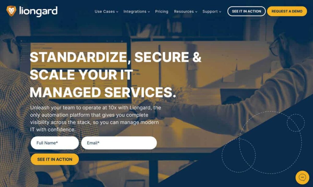
Make the initial step of reaching out to your company easy for prospective customers. Try to keep your forms as short and sweet as possible by omitting unneeded information.
Liongard’s B2B website is a great example of how a simple straightforward approach gets prospects excited to request a demo. Remember, users are less likely to commit to filling out a form if they feel like there is a huge time investment. Forms can also feel invasive or sketchy if a user is asked to provide too much information about themselves.
2.Strong CTAs and Strategic Content Flow
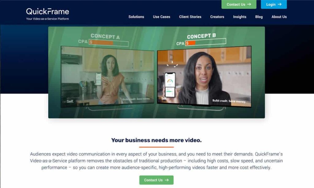
It’s really important to guide your visitors through the buying journey by using strategic call-to-actions. Effective, direct CTAs convince users to act and give them a clear path to follow.
They should briefly explain how your product or service will help, then give a clear, easy way to take the next step and reach out. QuickFrame’s “Contact Us” CTA is compelling and visually interesting—inspiring users to contact for more information.
3.Create Content and Offers for Every Stage of a Buyer’s Journey
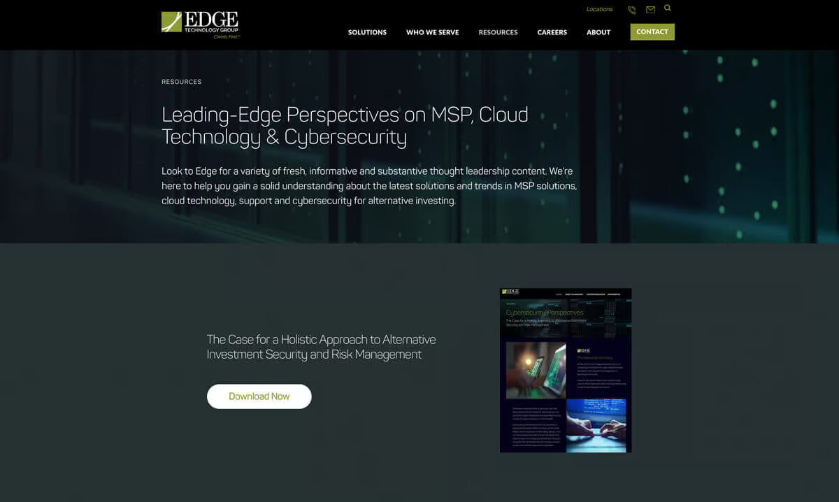
Not everyone who visits your B2B website is at the same point in the sales funnel. This makes it extremely important to offer a variety of “offers” throughout your site. The average customer engages with 3-5 pieces of content before talking to a sales representative.
Edge Technology Group does a great job of providing informative, downloadable resources for its clients and potential prospects. Becoming a solid resource in your industry not only increases conversions, but also makes you a leader and expert in your industry.
4.Create Trust with Third Party Validation
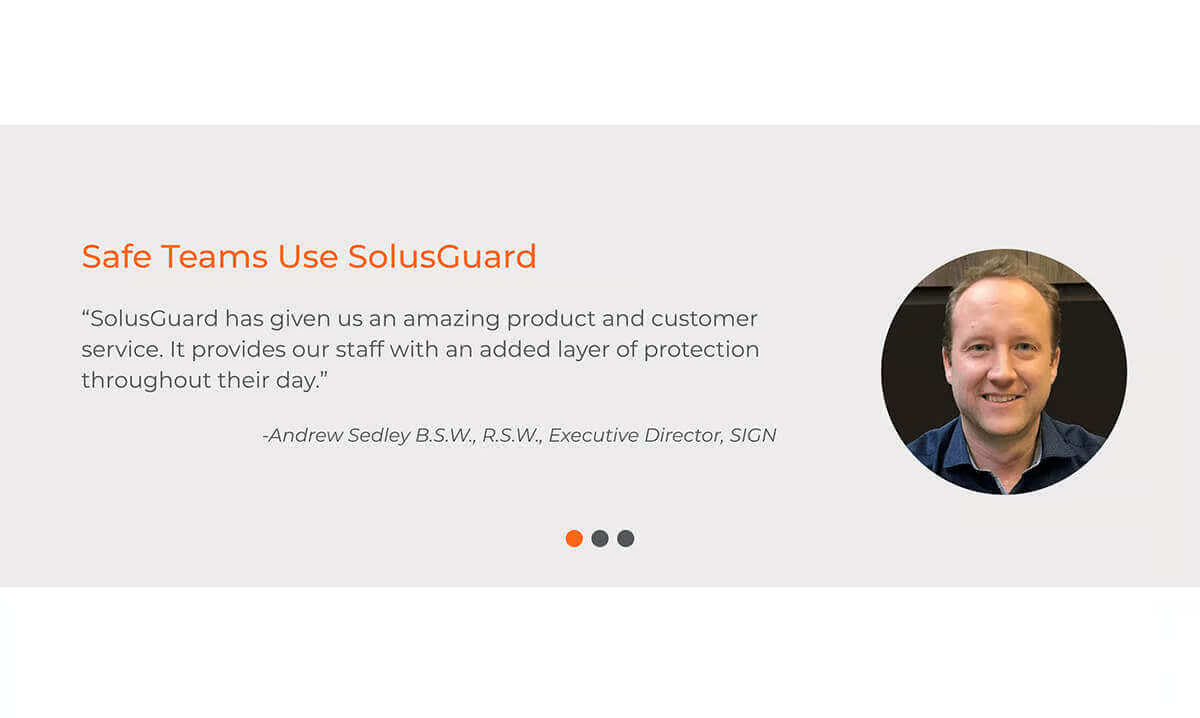
Adding testimonials, reviews, and logos improves buying confidence. Solusguard’s website is a great example of well-placed testimonials and logos. If we say something about ourselves, it is typically taken with a grain of salt. But if someone else says it about us —it is seen as much more credible.
Buyers want to mitigate risk and feel 100% certain that they are making the best buying decision. Third-party validation in a B2B website design gives prospects the confidence to reach out or make a purchase.
5.Faster Website Load Times
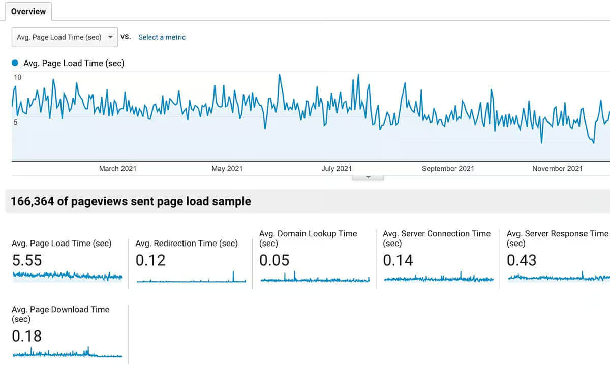
A 1-second delay in your site speed can result in a 7% reduction in conversions. Page speed is a critical element of every website in 2020. Google and other search engines penalize sites that load slowly—but more importantly, so do users. They stop visiting, bounce, and don’t buy.
Make sure your B2B website host has well-tuned servers, keep website image sizes as small as possible (without compromising quality of course) and get rid of any third-party scripts that you aren’t using.
Following these 5 steps will help you stand apart from the competition and create higher conversion rates.
We hope this mega guide had several things of interest for you to guide you in the website optimization or build process. Be sure to check out the Bop Design Blog and Resources section for other helpful B2B marketing and web design tips.
