B2B website design services
Effective web design is crucial to any B2B marketing strategy. A compelling B2B website design and disciplined content marketing plan help nurture a lead from a general inquiry to a specific opportunity to a committed relationship. Not only does it allow a visitor to navigate your website intuitively and quickly—finding information in the least number of clicks—it encourages visitors to convert into valuable leads. Find out what Bop Design can do for your company, contact us to schedule a B2B web design consultation today.
What is B2B web design?
Effective B2B web design is a polished, custom digital platform that integrates your company’s branding and messaging to appeal to your ideal buyer. Business-to-business (or B2B) website design varies from B2C in that it often must appeal to a variety of decision-makers across levels of leadership and vastly different needs.
B2B website design trends for 2025
B2B website design trends are constantly shifting – and because of that, it’s obvious when a company hasn’t kept up. To maintain a modern, top brand image, you need a website that leverages today’s best practices in design and development.
Thinking about updating your beloved but out-of-date B2B website in 2025? Keep reading to understand the latest web design trends, and why they’re so important.
Here are the trends shaping the future of B2B web design in 2025.
Today’s B2B buyers have a healthy skepticism when viewing the websites of potential partners. That means it’s more important than ever to develop messaging that is transparent, easy to understand, and builds credibility.
Those concepts might sound nebulous, but there are a few concrete ways to earn a buyer’s trust through your website design. For example, if your company has environmental and social governance (ESG) targets, providing data on your efforts and results can grab you a spot on potential customers’ shortlists. Similarly, including client logos, testimonials, and case studies offers social proof that your products and services are worth the investment and provide measurable value.
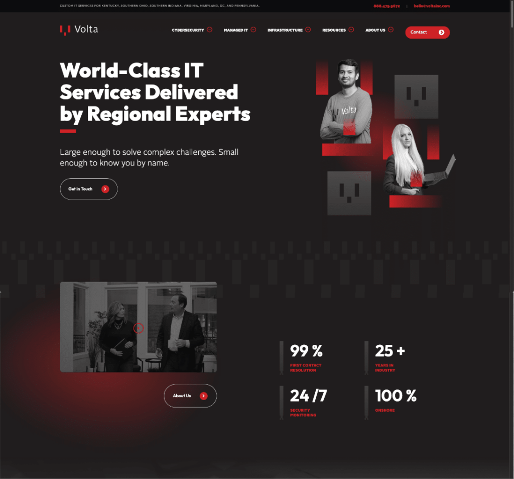
We’ve seen the results firsthand. In 2023, Volta asked Bop Design to revamp its messaging to convey its experience, knowledge, and industry expertise. Within three months, Volta’s website saw increases in both traffic and engagement from prospective buyers.
Imagine walking around a store with no aisle signs, where all the products have been shelved at random. If the store is in a good location, it might still get plenty of foot traffic – but how many of those people are going to make a purchase?
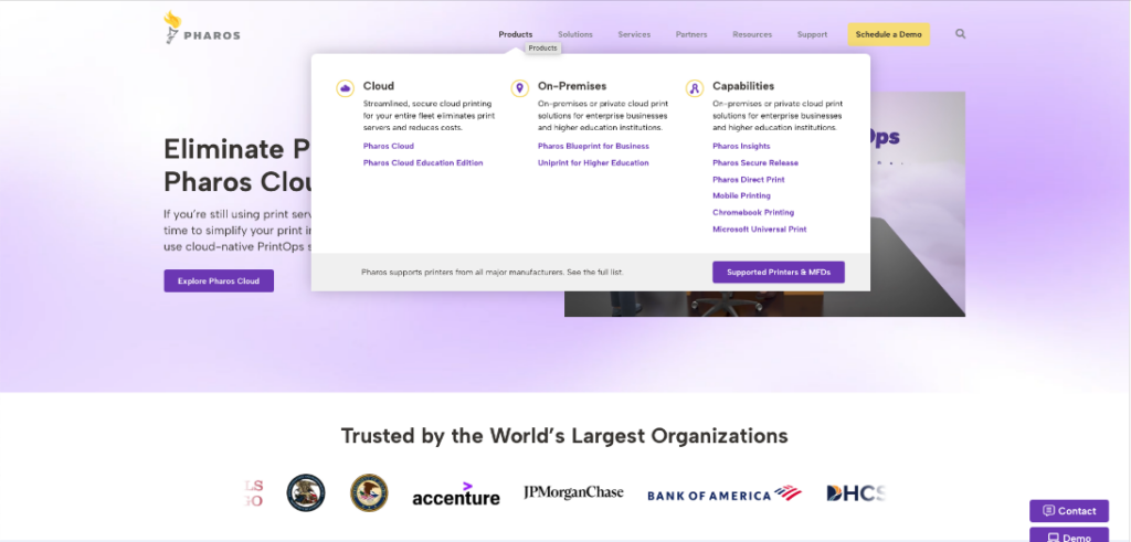
Today’s top B2B web agencies approach a website’s user experience (UX) with this idea in mind. In 2025, we’ll see websites break down their products and services by industry, region, capability, and other categories to help buyers self-identify where to find the best information for their needs.
We’ll see this trend extend to individual page designs as well, with interactive elements that let users quickly see and select the information most relevant to them.
Digital accessibility isn’t just a “nice to have” website feature. It’s essential to ensuring a great user experience for any potential buyer. That’s why we’re excited that accessibility is a 2025 B2B web design trend.
More and more, we’re seeing B2B websites feature high-contrast colors, closed captioning on product videos, straightforward copy, clear menus and links, and other accessible web design elements. Just recently, we helped Haskell & White incorporate these features into its website redesign. In the first two months after launch, the firm saw a 96% increase in leads!
In 2025, we expect this trend to accelerate and become table stakes for success in both B2B and B2C markets. The W3C website offers fantastic information on web accessibility, but the best way to get started is to talk to an expert B2B web design agency like Bop Design.
If the stress of new data privacy laws and internet cookie restrictions has you craving a box of Thin Mints, you’re not alone. While this trend provides challenges for tracking website usage, it’s important to keep your B2B website compliant with the latest rules. To protect your business, you’ll need to:
- Make sure your privacy policy is easy to access and understand.
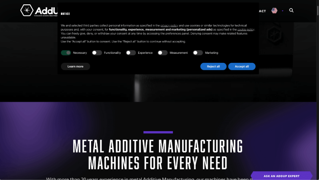
- Generate appropriate cookie banners and record user consent.
- Include consent checkboxes for marketing campaigns.
- Depending on where you operate, stay up to date on laws like GDPR, CCPA/CPRA, and VCDPA, and ensure your website data management is compliant.
B2B web design in 2025 isn’t just about a great online user experience. Today’s B2B websites operate as part of complex, omnichannel marketing efforts, and require advanced features to support a seamless customer journey from start to finish.
For example, if you’ve jumped on the AI bandwagon and have an AI-powered chatbot, you’ll need the bot to operate effortlessly within your website. That could include everything from triggering specific messages based on the page a user is on to delivering user engagement data along with chat histories to your team for lead nurturing.
Other advanced features could include integration with your CRM, plugins for SEO and CRO, functionality for live webinar hosting, and more.
Static stock images are so 2010. As we move into 2025, the best B2B websites will feature interactive elements, scrolling animations, and custom graphics.
One of our favorite animations is the concept of parallax scrolling. Parallax scrolling creates a dynamic, almost 3-D effect through layered visual elements that move at different rates. In addition to looking *super* cool, parallax scrolling animations can direct a user’s attention to different elements at key points on a page.
Don’t be fooled into thinking this web design trend is a passing fad. Motion and animation have been gaining traction for a few years, and are proven to increase user engagement and drive leads. After one Bop Design client launched a redesigned B2B website with interactive graphics and parallax scrolling, they saw a 17% drop in bounce rate, plus a 9% increase in sessions.
Increasing page speed is a trend that’s been increasing in importance year over year and month over month. Google has been prioritizing page speed as an SEO factor since 2018. Numerous studies have shown the benefits of fast page speed on engagement and conversions.
And yet, nearly a third of B2B buyers cite slow website speeds as a major pain point in the digital buying journey.
Part of the problem stems from other website design trends. Motion graphics, chatbots, and videos are great for engagement. But if they aren’t implemented properly, these elements can weigh down your web pages and do more harm than good. That’s why it is critical to work with experienced web developers who can create engaging websites without sacrificing page speed.
Like page speed, mobile-first design isn’t a new trend. However, because many B2B websites still get most of their traffic via desktop, the industry has been slow to adopt the app-like mobile experiences of the B2C world.
Luckily, mobile-first design for B2B websites is “trending” upward for 2025. B2B buyers are now routinely using smartphones and tablets during the buying process and expect your website to function just as well there as it does on a laptop. Not only should your mobile site look good (i.e. not scrunched up with oversized images) – it should also be designed for simple navigation and interaction throughout.
Most B2B websites did not qualify for the 2024 Olympic games, because they aren’t flexible or adaptable enough.
Even if your website has all the front-end bells and whistles users want, a rigid CMS can make upkeep a nightmare. Without a flexible CMS, you’ll need developers to build new product pages, publish thought leadership content, change graphics to reflect product changes, or update key content over time. We can tell you from experience: Companies that have to go through all that usually end up with stale, out-of-date content more quickly and more often.
Pro Tip: At Bop Design, we use custom-built WordPress backends using ACF or a WordPress page builder like Elementor to give clients true ownership of their websites.
First, there was maximalism, the days when a “good” website was jam-packed with information and images and filled every possible pixel of your screen. Then there was minimalism, the age of simple web elements surrounded by white space.
In 2025, the newest B2B web design trend is what we’re calling “Maximalist Minimalism.”
This concept combines the best of both worlds. It balances white space and sans-serif fonts with bold colors and plenty of graphics. It’s clean and modern, but visually engaging, with mix-and-match elements that weave together different areas of the site for a cohesive experience
7 B2B website design best practices
Web design is such an exciting industry to be a part of, especially when you get to see innovative, lovely designs. While there are a vast amount of beautiful, functional websites, there are also a ton of ugly, overdone, useless websites.
Based on our experience, we’ve compiled a list of the best B2B web design practices to ensure web designers are creating functional, useful websites.
It can be easy to get caught up in the concept of a website and forget about the end-user. A successful website isn’t just a lovely visual piece, it’s a portal for attracting your target audience and giving them the information they need to decide if they want to become a new client.
Before we start a new B2B web design, we get the low-down on the target audience.
- Do they know the company’s brand or services?
- Are there several different target markets?
- What makes them the same or different?
- What do they care about?
A common mistake we see designers make is focusing on the target audience at the beginning and then forgetting about them at the end of the design phase. Always keep your target audience front and center, even when making changes to the design, layout, and images.
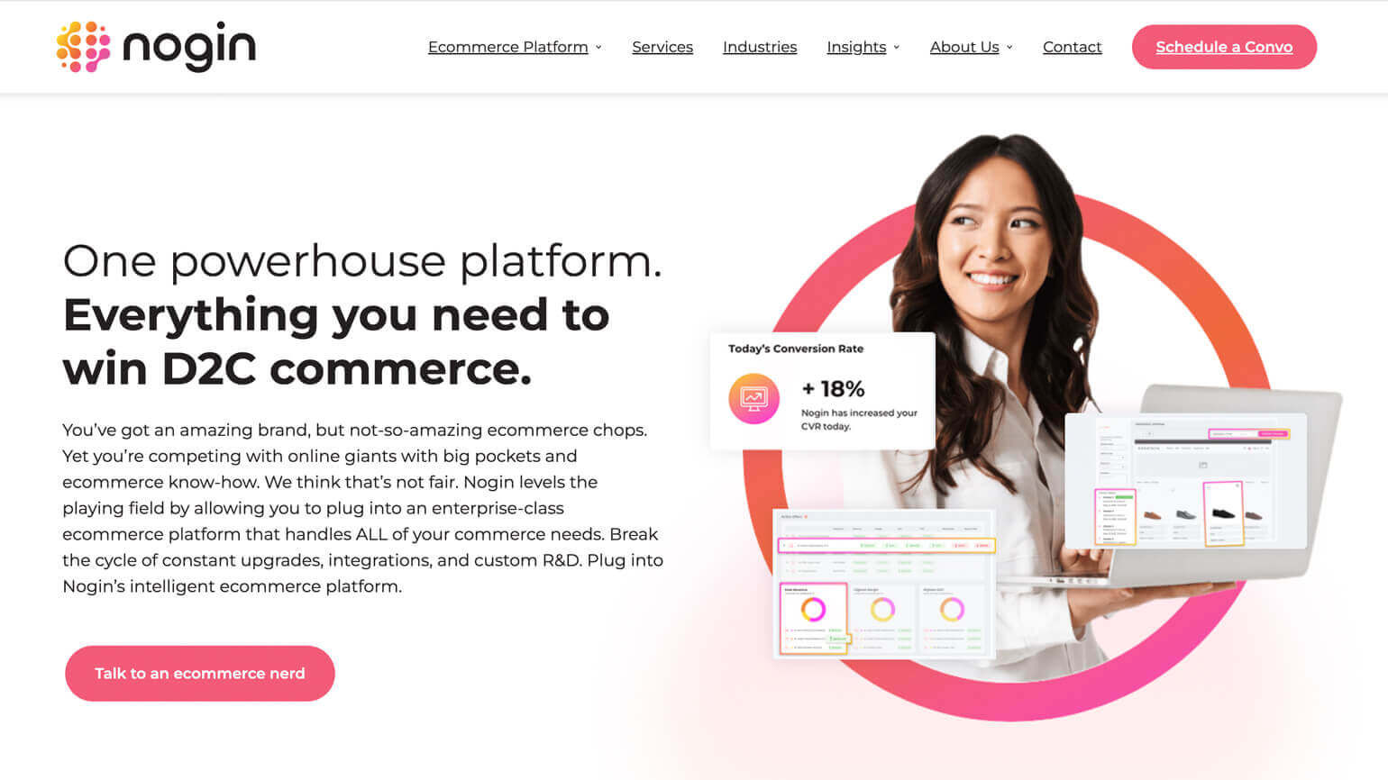
(The Nogin website directly addresses the target market with strong, direct headlines while also pairing visuals of their platform and services.)
Website design that lacks consistent branding is stressful and confusing. Everyone has a friend or family member who is unpredictable. You never know what they are going to say/do/wear and they are stressful to be around. Unfortunately, there are quite a few brand websites out there that are like this unpredictable person. It’s difficult to tell what their brand colors are, what their logo looks like, how they are positioning themselves, and what their value proposition is all about.
A best practice in B2B website design is to keep the branding consistent throughout the entire site. Only use the predetermined brand colors, logos, and messaging on every single page of the website. This applies to images, iconography, typography, and videos as well. A brand’s story should be evident and supported in the design.
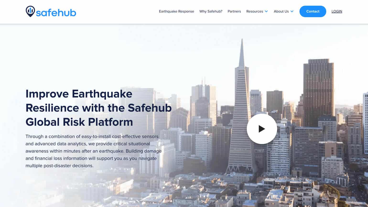
(Safehub has a clean, tech-driven look and tone which is consistent throughout the website.)
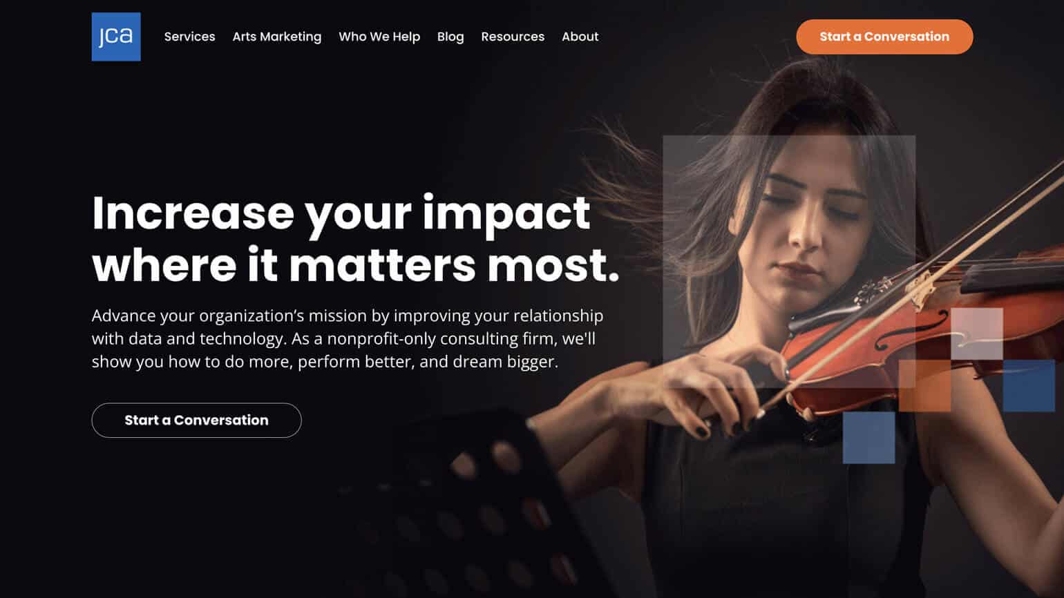
Flashy, complicated websites typically deliver a poor experience and end up being visually noisy. Effective websites often have simplified layouts that are easy to navigate and enable each design element to shine. As experienced B2B web designers, we understand that a website typically has to accomplish a lot and host a great deal of information – which can be done in a clean, focused and ultimately simplified manner. If too many design elements are competing on a website, none of them will do their job (engage the user).
(JCA uses color and compelling photography to guide the visitor through the website.)
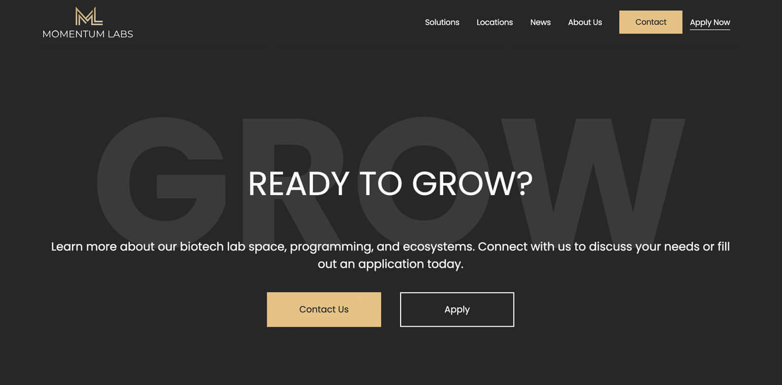
The main goal of a website is to attract a target market. The next goal may be to educate the visitor. The final goal should always be to entice the visitor to complete an action, whether it is to sign up for a newsletter, download a case study, or set up a consultation. Strong calls-to-action are essential to converting website visitors into leads or new clients.
Strong CTAs should be part of the initial B2B web design, not an afterthought. They should be placed in an appropriate place in the layout that makes sense for the target market. For example, a “Learn More” button may be placed higher in the design, while a “Contact Us” form may be placed towards the bottom of the design when the visitor is more educated about a brand or company.
(Momentum Labs uses large type and playful headlines throughout the website to help CTAs standout and convert visitors.)
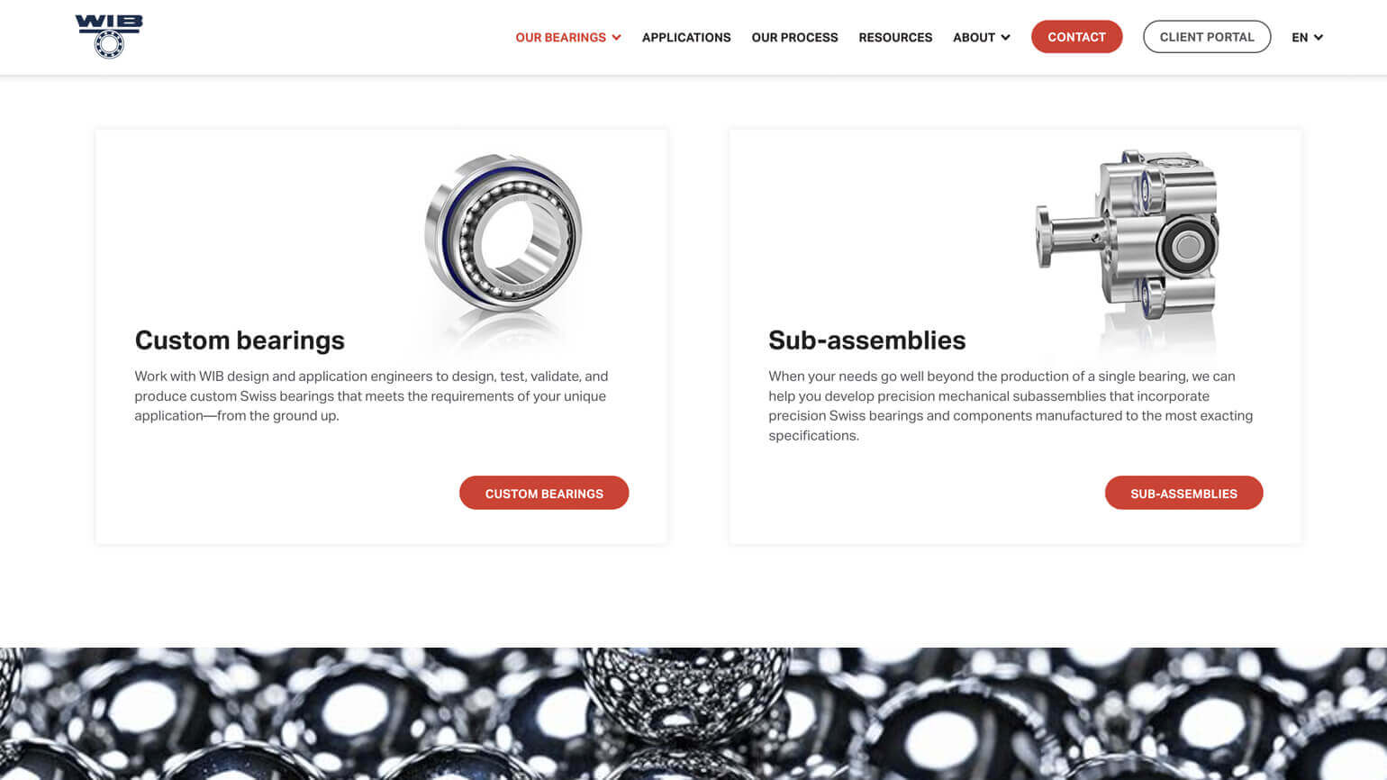
Smartphones now have 16, 20, or even 21 mega-pixel cameras in them. Remember, a phone’s main function is not necessarily as a camera. For this very reason, it’s imperative that all images, videos, and photos included in a web design are high quality. A fuzzy image or out-of-focus picture negatively impacts the credibility of a brand.
If your brand or firm isn’t able to invest in custom photography at this time, stock photography is actually a great option these days.
Great web designers balance clear, high-quality images with sizes that don’t slow down the website load time.
(WIB uses custom video and clear, sharp imagery that supports the brand’s overall message of precision and excellence.)
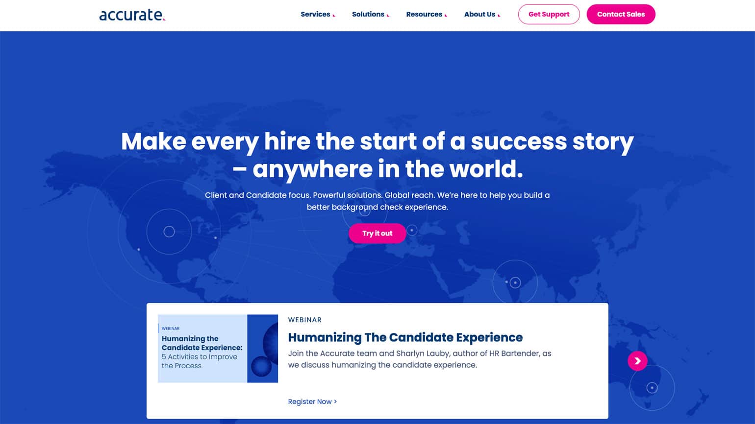
At its very core, B2B web design must be functional. This means that it should create a good user experience. Effective web design takes it a step further and enhances the user experience by creating an intuitive layout, telling a compelling story, and serving up what the user is looking for when they want to see it. For this very reason, seasoned web designers are taking an interest in the user experience (UX) to ensure their designs are anticipating the needs of the target market.
When looking to enhance the user experience, it’s important for a designer to put themselves in the user’s shoes. Also, it’s essential that the web designer considers how every element of the design builds value for the user and meets a need.
(The Accurate website design has a color palette and clean, easy-to-use layout that enhances the user experience and conversion rates.)
If a website is gorgeous but no one sees it, is it effective? The answer is no. Strong websites attract and convert visitors. For this very reason, B2C and B2B web design must follow SEO best practices to ensure the website is showing up for the target market.
While the list of SEO best practices for web design can be fairly long, a few best practices include:
- Sizing pictures for faster load times
- Internal linking to keep users engaged & on the site
- Properly labeling images for search engines and users
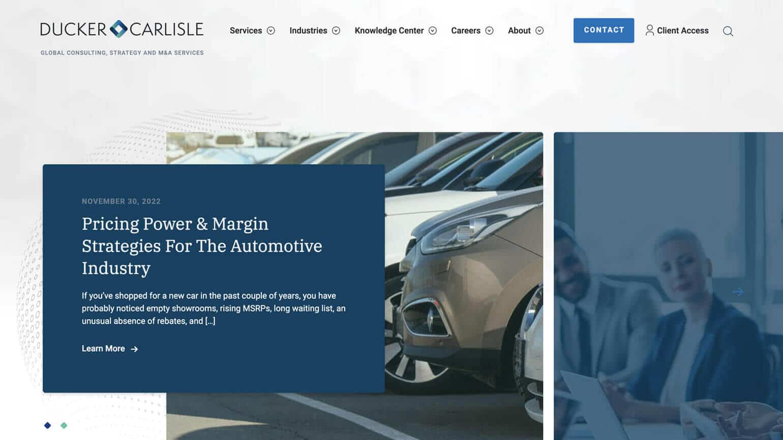
(The Ducker Carlisle’s photo choices, layout, and navigation follow SEO best practices for website design.)
At the end of the day, B2B web design can be innovative, interesting, and beautiful – but it also needs to be functional. Successful websites don’t need to have boring designs, but they do have to marry smart design with a great user experience.
B2B web design frequently asked questions
Websites your customers want to browse
The B2B web design team focuses on building websites that streamline content and feature efficient navigation—the most content with the least amount of clicks—so your brand message gets across quickly and clearly. The website content needs to be timely and relevant—compelling content that keeps a visitor on your site.
B2B web designs that nurture leads
An effective B2B web design communicates your brand message and entices your visitor to complete a desired action. There needs to be no mystery on why a prospective client should hire your firm over your competition. Our B2B web design team creates clear, compelling, and well-placed calls-to-action to turn website visitors into engaged prospects.
Websites that grow with your business
Our design team ensures your B2B website design is easily scalable so that you can integrate more functionality and content down the road with no issues. For instance, you may add new services, personnel or expand locations. The WordPress CMS makes it simple for a non-technical person to make content changes to the website. Ease of edits on the backend is critical for the future success of your B2B website design.
B2B websites that drive traffic
Your website has little value if no one can find it. Our B2B web design, content strategy and development is executed with the latest SEO best practices in mind so you’re ranking more prominently for target search terms. We identify geo-targeted and industry-specific keyword phrases that help you rank more quickly. Once the website is launched, we drive not only organic traffic but paid, social, etc. We want your B2B website design to not only be beautiful but to also be a gateway to new clients.
B2B website design for speed
Website load time is critical, not only for usability but from a SEO standpoint. At Bop Design, we understand that the cornerstone of an effective B2B website design is page speed. We will develop a website that performs optimally so that visitors stay on the website longer and visit more pages.
A team of experts
A well-planned website requires a team of B2B marketing professionals— brand strategist, web designer, web developer, content strategist, copywriter and SEO expert—in order to reach its full potential. Bop Design employs a team of specialists on all B2B web design projects, creating an effective brand platform to attract and engage ideal prospective clients. Our team has worked on a range of B2B website designs and marketing strategies.
You’ve seen the ads, putting together a website is as easy as 1…2…3! All you need to do is add your logo, change the colors, and put in some copy, right?
It’s true that certain website builders, like Wix or Squarespace, enable you to build a website fairly quickly. However, building a custom B2B website design is not so quick (or cheap). Here are a few reasons why those websites advertised on TV are so inexpensive and relatively quick to launch:
They are customizable templates, not custom builds
These website building services are template-based. You can choose a template and do various levels of customization, but it’s not a custom B2B website that is designed and built from scratch to meet your needs. Learn how to determine your B2B website objectives.
The functionality is already set, you get what you get
Being that these services make money on volume rather than individual pricing, they are fairly cheap to build. However, along with the minimal cost is minimal functionality. If you want to have custom animation or change how the CTAs function on your website, you are out of luck with a template. You get what you get with the existing functionality.
If you want to have certain features and functionality, your best bet is to work with a B2B website designer and developer who won’t “kinda make the website work,” but who will listen to your needs and make the website function or perform accordingly.
You do all the heavy lifting
Just as you can build a house cheap if you do all the construction, you can build a website cheaply if you do all the heavy lifting. That means you have to choose all the images, write all the copy, upload all your resources, position everything on the right pages, implement all the search engine optimization, and more. If want to do all the work yourself, a template website may work for you. However, if you’d like to maintain control without doing all the heavy lifting, you are likely in the market for a custom website design and build. Read Why does great web design take so long?
You get what you pay for, additional services are additional costs
The great part, and major drawback, of a template website is that you often get what you pay for, and only what you pay for. It’s important to read up on what is included in the price of the build and what will be extra. Is customer support included or billed at a monthly or hourly fee? Do you need some minor development help? That often costs more and you will be billed every time you ask for revisions. Any additional features or plugins will always cost extra and may be billed a recurring rate. It’s rare that it’s a one-time fee. While you can keep costs to a minimum if you don’t require any assistance, the costs can start to rack up if you want certain levels of customization for your website.
You have access to customer service, not a dedicated team
Many of the template website services advertise that they have 24/7 support –which sounds great. However, it often means that the support is offshored to ensure support is always available, even at midnight in Missouri. It also means that you are emailing or calling into a support center with a rotating staff. If you call or email twice in the same day, chances are you won’t even talk to the same person. They will likely have a ticketing system, but those are only as good as the people entering the notes.
Conversely, custom-built B2B websites are crafted by a dedicated team of 4 – 5 people. The advantage here is that you often only have 2 -3 points of contact and they become familiar with not only your business but with you, personally. There is a level of continuity and responsibility that the call centers just can’t provide.
The ideal market is small, mom & pop shops
If you are that template website builder’s ideal customer, then you should absolutely work with them. They will offer you just the right amount of value for your budget. These types of services are often best for one-person consulting firms and mom and pop shops. Many of your clients will understand that you are a small-scale operation and won’t be put off by a simple, straightforward website that isn’t 100% customized. Perform a 5-minute B2B website audit.
B2B custom websites are totally worth the investment if:
- You are looking to create a polished, professional image
- You need to build credibility with prospects, partners, or potential investors
- You are looking to establish your authority in your industry
- You are looking to build a living, breathing resource center
- You are interested in generating qualified leads for your business
There is a slew of other reasons to build a custom B2B website, but these are the main reasons why businesses consider it. For websites, just as in life in general, you get what you pay for. If you pay $50 – $100 for a website, it will look like an inexpensive website. If you invest in a custom web design, you will get a polished digital asset that accurately reflects your company as forward-thinking and established.
The length of time needed to design and launch a new B2B website depends on the scope of the project. The scope is defined by the number of pages, design elements, functionality, etc. For an average B2B web design with 20 standard pages, it takes about 16 – 20 weeks to design and launch the website from start to finish.
Again, this depends on the scope of the project. A one-page website with limited design and content will be less expensive than a 50-page website with integrated forms, an SEO strategy, and custom design and development. At Bop Design, our typical B2B web design starts at $25,000 and averages about $45,000.
Who you work with will depend on your needs, budget, the scope of the project, and your objectives. If you are looking for a critical digital marketing platform to generate leads, you should invest in a partnership with a web design agency. If you have an accomplished, extensive design team familiar with web design, you may just need the help of a developer. If you have a limited budget or are a small company, your best bet may be to work with a freelance designer.
We get this question a lot and it’s a great question, but it doesn’t have a simple answer. The truth is that a lot happens behind the scenes on a B2B web design project. What you can ask to see is a website project schedule sample. The schedule will show all the steps involved in the project and when you can expect to see activity/designs to review/development to review.
Yes. WordPress is one of the most popular content management systems and is the most widely used CMS. For this reason, WordPress has an extensive community for support, plugins, and is often the easiest to update for non-developers. At Bop Design, we only build B2B websites that have a WordPress CMS.
We recommend having the fewest number of people involved in the project as possible since it streamlines the process and ensures cohesiveness. You’ll need a point person to work closely with the B2B design agency, a person who can review and provide feedback (for most companies this can be a few stakeholders), and a person who is authorized to provide approvals.
Before starting a B2B web design project, it’s essential to have your messaging, main value proposition, core service/product offerings, and buy-in from your team for the project. If you don’t have any of these items, let your web design partner know so they can guide you through the process. Other things that are great to have are any copy input, custom images (if available), logos, and other assets.
We recommend discussing web hosting options with your web design partner. They often have experience working with a range of hosting providers and can provide suggestions based on your budget, bandwidth needs, and website functionality.
We know this isn’t an exhaustive list of questions on B2B web design, but we believe these are the main questions we hear from potential clients. Feel free to contact us with your question, or check out any of our blog articles listed below:
Custom B2B Web Design vs. Template Websites (Pros vs. Cons)
Questions to Ask Before Designing a New B2B Website
How to Determine Your B2B Website Objectives
Important Decisions You Must Make While Redesigning a B2B Website
What Makes a Web Design Company the Right Fit?
5 Important Questions to Ask Before Starting Your B2B Web Design Project
A Complete B2B Website Checklist
Should You Host Your Website Internally?
Pulling Together the Right Internal Team to Develop Website Content
The B2B Website Buyer’s Guide
The B2B Web Design Guide empowers you with the tools needed to research, qualify and select the optimal B2B web design agency for your firm’s needs.
The Ultimate Guide to Prepare for Your B2B Website Design Project
Are you considering starting or already planning for a B2B web design project? Even if you’ve been through the process before, you likely have many questions or may not know what to expect or where to start.
SEO for B2B Web Design + Marketing: An Overview
In this guide, you’ll get an overview of search engine optimization (SEO) best practices, detailed tips, and insights on how to get your organization on board with SEO.
OUR CLIENTS SAY IT BEST
“Working with Bop Design has really elevated our business. Bop is basically our extended team when it comes to marketing. It’s been a game changer, our online presence just looks right. If I had to summarize in four words how to describe our engagement with Bop Design, I would say it was easy, proactive, straightforward, excellent.”
Christian Tagliapietra, VP of New Projects
10 Key B2B Web Design Trends for 2025
Website Redesign Services: How to Find the Right Agency
Scrolling Animation Options for B2B Web Design: An Overview
B2B Branding Trends for Technology Firms
Boost Your B2B Website’s UX: Five Spots to Focus On
Google PageSpeed Insights for B2B Websites
Managing Business Listings Online: Common Errors to Avoid
7 B2B Website Design Trends to Look For in 2024
Crafting Exceptional B2B Websites: A Guide to Masterful Conversion and User-Centricity
The Ultimate Guide to B2B Website Design: Top Strategies for Unbeatable Results
Dark Mode in B2B Website Design: Considerations
Let’s talk about your project
Get in touch to chat about how we can help you build a better B2B brand. Don’t be shy. We’re great listeners, and even better problem-solvers.